It’s a bit of a cliche that your entry makes the first impression of what’s to come in your home. But, sometimes cliches are cliches because they are true. I’m feeling mine needs a bit of attention. In that vein, here are a few of my favorites from over the years.
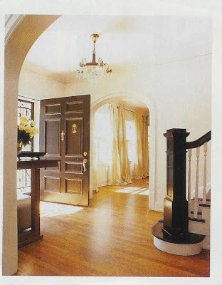
Traditional Home, 2002
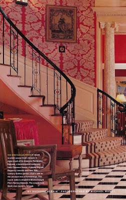
I love a red room, and while a red dining room is always yummy, isn’t it great in the entry? I have a friend who has a very gracious entry hall in which she used this B&F Harrow Damask paper in one of the neutral color ways – so sophisticated.
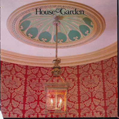
House and Garden, 1998
Ceiling of the same home – this lantern is gorgeous. Check out Charles Edwards if you really want a little lantern-envy.
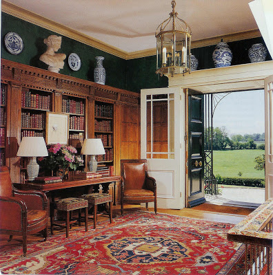
Architectural Digest
The entry as library would be particularly cozy if you had the space. Don’t miss the needlepoint benches under the table. Greek key on the sides, floral on the top, nailhead trim. Devine.
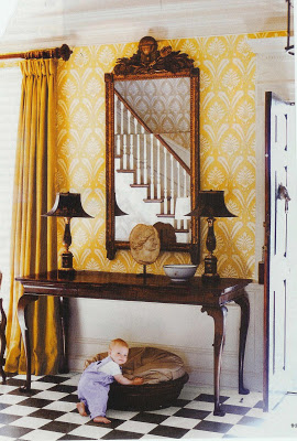
I believe this room is Suzanne Reinstein.
Since yellow seems to make my heart sing, I fell in love with this room at first sight. The black and white floor is so graphic and classic. I don’t think the appeal is just the little boy, although I’ve had a few of those around as well.
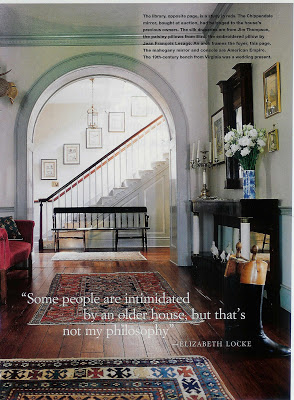
Elizabeth Locke’s home, House and Garden, October 1997
Ok, here we go. This is in my top two. The floorboards, the gracious curve of the arched doorway and the duck egg color of the wall present the home and it’s owner as a package you would like to know a little – or a lot- more about.
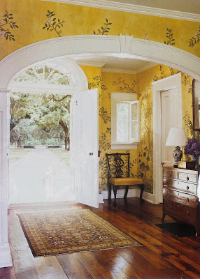
Gracie Wallpaper is special where ever you choose to hang it. It seems to me that we see it most often in dining rooms and bedrooms. And then there is this. I might never want to leave it, “Oh, I’d love some tea. No, no sugar. No, here’s fine.” Notice that there is no wainscoting; could you ever let your children go over there to play? This might be perfection. Yellow, I know. I can’t stop looking at it.
Ok, and for the beach house…I never mentioned a beach house? Oh, well I don’t have one, but I might. I mean, you have to be prepared for these things.
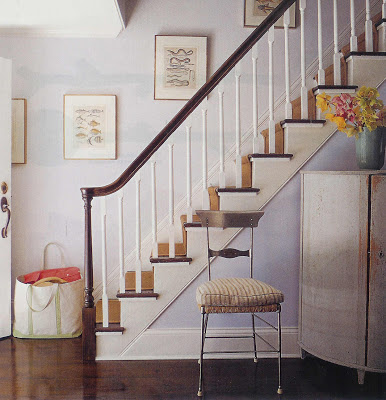
Elena and Doug Atkins home, Sag Harbor, NY, Elle Decor
Clean, fresh, L.L. Bean tote at the ready. I like these sea creature prints, in fact, I gave a friend one with eels for his Sag Harbor home after seeing an eel in the water by his house.
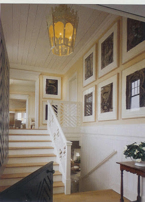
Southhampton, NY home, architecture John Mayfield, design Mariette Himes Gomez, Architectural Digest
I was captivated that this homeowner had a full Numbers series by Jasper Johns in his beach house. There’s a good reason to get out of the city.

hmmm, is it foyer or beach house that you want, I say just go for both! Love the ones you shared
check out my site http://pvedesign.com/
I am an artist and would love to do an illustration for your blog!
pve design
PVE – the whole house, for sure. And the Johns series as well as long as we are dreaming. I’ll check your site today, thanks for the invitation.
My goodness! What’s not to love about these entryways! The ceiling in the third photo down (from HG) is amazing!!!And I remember the home of Elizabeth Locke- that was a good one 🙂
My vote is for the Gracie wallpaper. Though I am big fan of Mariette Himes Gomez too.
I LOVE the Rheinstein entry in that Charlotesville home. Looks like it would work with the architecture of your lovely home.
I have an entire folder on my computer devoted to entryways (maybe because I purchased a mirror for my entryway last year, and have not yet found something that goes well with it…so my entryway feels unfinished). I love your picks!
Yes to all – Peak, the entire Locke home was very special.
Courtney, I’ve been flirting with that black and white floor in the entry since we moved in – I just can’t commit yet.
Sarah – You have no idea I can stew about something like that – my one silly chair in the LR sat, begging to be re-covered for 5 years before I found “the thing.” 5 years of different fabrics draped over it’s back, sadly, not quite right.
And,Asylum – the Gracie – ah, yes. When the Master Blandings are out of the nest, perhaps…
I am with you “yellow makes my heart sing”. I love the Suzanne Reinstein foyer and the Gracie wallpaper!! Great pictures all of them.
Just stumbled upon your lovely blog and these rooms are so BEAUTIFUL I was drooling! Thanks so much for sharing, I am off to read some more!
Melissa