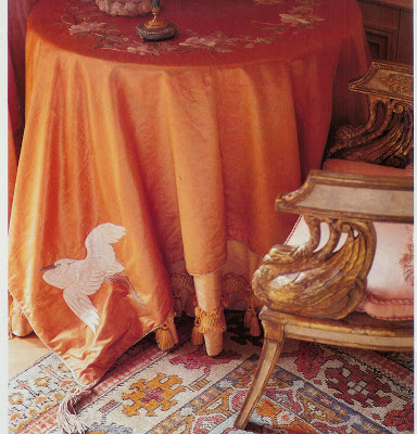
 Recently, Jennifer at BiblioStyle posted about one of my favorite design books, Colefax & Fowler, The Best in English Decorating. It was the first design book I purchased, and the thing that struck me was the amount of detailing in the rooms. It can be over-done, of course, but the thing is, it makes every room so special. All those details become discovered treasure.
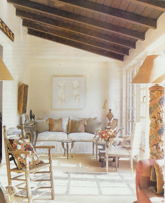
Sela Ward’s Beverly Hills home circa 1999.
Notice the one tassel on each pillow.
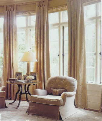
This chair is a symphony of details, yet none of them are screaming. Tufted buttons, contrast welt on only the cushion, waterfall skirt. Lovely.
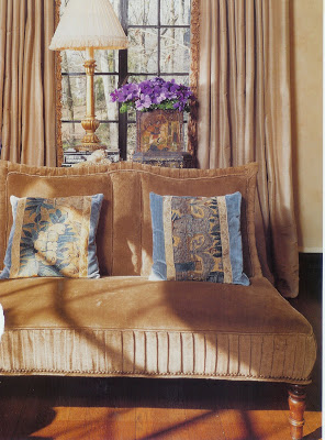
The pleating on this settee is a great detail, especially as the room is predominantly neutral. I also think the antique fabric on the pillows and the addition of that hint of blue is very sophisticated.
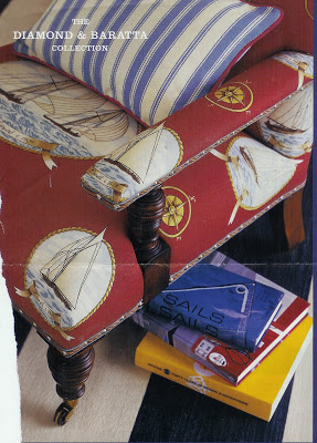
This is from a Diamond & Baratta Collection for Lee Jofa ad from 2005. I adore the trim on this chair and hadn’t seen anything quite like it before. It’s tape, then cord, then nail head. Those D&B guys are always more is more – it works great here.
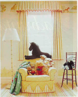
Are you surprised this charming girl’s room (well, the room is charming; let’s assume it’s mistress was, too.) was the work of Mario Buatta? I love the detail of the chair skirt. Oh, and short curtains. I think Mrs. Parish would have thought that very “appropriate.”
Top photo: Manhattan home by designer Ronald Bricke, House & Garden 1999.

Colefax & Fowler is one of my favourite books also.
I so agree with you about the importance of details. They’re like the little surprises in a room!
God is in the details. Love the pleating on that settee.
Oh that top image is so lush! (I need to open my copy of that book again.) And I saved that sun room of Sela Ward’s too 🙂
Courtney, my text is misleading – that gorgeous shot was from HG in 99 – well before the embroidery craze. I’ve loved it forever.