
I’m not sure how I missed this. A couple of weeks ago the New York Social Diary interviewed Thomas Britt. I don’t know if you ever read the Social Diary; I’m sure I got started after being referred by another blogger. They profile interior designers about twice a month. The funny thing is, their interviews always sound a bit Sasha Baron Cohenesque.
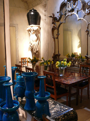
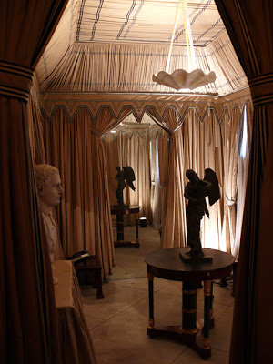 A tented room always appeals – as does the snappy black and white stripped ribbon trim.
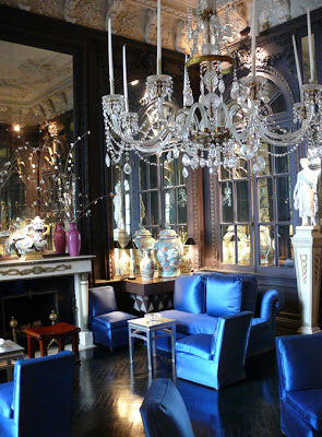 The blue satin upholstery reminds me of the Paley’s brown satin in their drawing room by Parish Hadley.
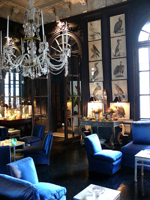 These birds, I love.
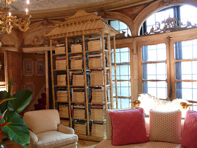 This room was inspired by the Royal Pavilion at Brighton; it feels like one of the ivory pagodas all grown up.
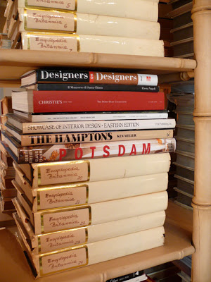 Parchment covers most of the books. Quite charming to own a set of Encyclopedia Britannica.
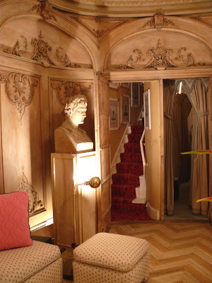
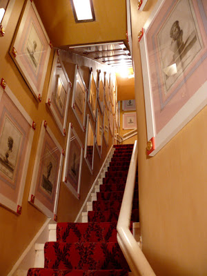
Nervous throughout much of the interview, he’s particularly concerned that the photographer will go upstairs. Not allowed. Too much of a mess.
This is my kind of guy.

Fabulous! Love the dark (black?) walls with satin seating, very glam indeed!
So many wonderful details in this space, the pagoda bookshelves, the chevron floors–and it is refreshing to see hand written labels for his Architectural Digests in this age of fancy binding.
Wow! I love all the detail, that dark room esp. is my fav. Thanks for sharing and as always I love your commentary.
~Kate
I love the birds and the turquoise too 🙂
These rooms are beyond, beyond for me. Can’t imagine what it would be like to live like this. But, yes, I was studying that dark room so closely last night – those walls, black? dark grey? Amazing. And the details. Wonderful. And he’s wearing denim. Spot on.