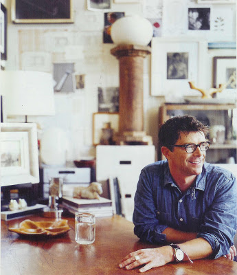
OK. I think I’m back on track. Fortunately for me, you can’t see that my house is a disaster, but somethings are under control.
While everyone was fawning over the cover girl and her cool Hamptons hide away I was flipping back and forth through a much smaller layout on Thomas O’Brien. (He’s just darling, isn’t he? He must be nice. He has his glasses custom-made; I appreciate things like that.)
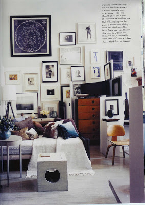
I’m not sure why House and Garden ran this spread. We’ve seen his apartment before and I don’t think much has changed. And I don’t think I care. I had already given him ample points for making the largest room in the apartment his bedroom, the ultimate modern salon.
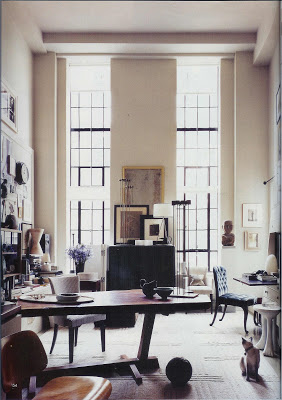
I guess that is where I was focusing on first glance. This time all the detail of the apartment unfolded for me. I certainly would not pretend to know how Mr. O’Brien chooses his things, but while this home is stylish, it doesn’t appear styled to me.
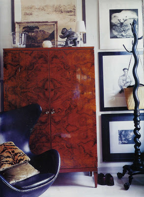
I am a sucker for black and white art so his wacky gallery wall is so alluring. I also love that the egg chair is in black leather. I feel like I’ve seen it in every zany color and pattern. Isn’t he chic and cool in his smooth, black silhouette?
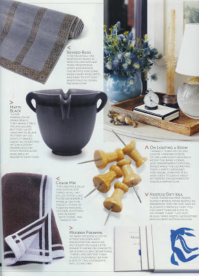 I like Tom. And, I owe him, right? He inspired yesterday’s post, and today’s and, guess what, tomorrow’s as well. He introduced me to Gio Ponti pottery which is so interesting. And he told me he gives his friends Matisse paper cutout books. He didn’t just open his door, he opened his soul a bit. I see it all over his home.

Great post Mrs Blandings! I adore him and his style, and I couldn’t agree more with you about how his interiors look stylish by not styled (I did a post about it a little while ago). I was wondering why H&G covered this apartment too, it was only in Elle Decor a few months back, I’m sure, and not much seems to have changed. But the man certainly has amazing taste.
I loved the wooden push pins from this layout. His use of black and white art on white walls lets the tones in the wood furniture jump out at you. You can really see the beauty of the burled-wood and even the plywood from the Eames chair feels warm.
Yeah Thomas!! Great post. Um how did I miss this one from H & G. Well, he is an inspiration and thanks for sharing.
~Kate
Like Suzy said, good point about his house not looking styled. My copy of H&G is MIA so I hope to read this article soon.
Suzy – I do think it’s a bit odd, but agree, the apt. is wonderful, I was happy to see it again.
Brilliant – you keep living up to your name. That is my thought exactly on the black and white art. Even though there is a lot of “stuff” here, each piece seems to stand out.
Kate – it is a really short article and there is a lot of good content in this month’s issue. I couldn’t remember where I saw it when I need to go back to it.
Peak – so sorry about your HG – you know how crazy it makes me when I feel like “everyone else” has their’s and I am in the dark. It is a good issue – though Elle Decor and House Beautiful were both knock-outs this month as well.
I love Gio POnti’s ceramics