So, flipping through the much-mentioned vintage magazines, I ran across this:
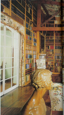 Uh-uh, wait for it.
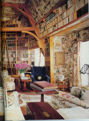
The main library of the Carcano estate, Estancia San Miguel, in Argentina. House and Garden, Jan. ’86.
The chintz, en suite, vaulted ceiling and a library to boot. Note the sisal rug with the antelope skin on top. I mean, stop. But then, and here’s the thing – you have to read the articles, don’t tell me you just look at the pictures, I can’t stand it- the article tells me the fabric is a design of Philippe de Lasalle (1723 – 1804.)
We didn’t cover Philippe de Lasalle in my broadcasting classes. So, to the web. Seems M. de Lasalle was a fabric designer and merchant.
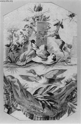 Design for silk weaving, with Alter of Love. 18th c. gouache and watercolor, Museum of Fine Arts, Boston.
While little is known of his early life, although he was apparently an orphan, he apprenticed under several silk manufacturers and merchants. He was known for his painterly affect, a artist’s eye for space and balance. As was popular in his day, he used a lot of realistic flowers, birds and insects in his designs.
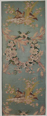
Les Perdrix (The Partridges) Silk, circa 1771, Metropolitan Museum of Art, New York.
It is a special skill to translate the concept of a painting to a loom. de Lasalle was known for perfecting a technique called point rentre, basically, outlining the figures in black. While he did not develop this relief effect, it helped increase his celebrity.
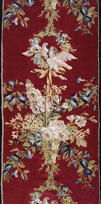
Silk and linen, for the summer palace of Catherine II, Art Institute of Chicago.
And he was a bit of a celebrity. His friend, Voltaire, recommended his work to Catherine the Great; she commissioned several pieces for the Russian Palaces. One critic claims he was a combination of artist and businessman, catering to a very select high-end clientele.
Seems Jennifer and I are in good company.

Patricia! You out did yourself with this post. How wonderful to have this issue of H & G, and what interesting background you uncovered. Thanks for sharing.
BTW: In Atlanta, an antiques dealer currently has a booth at Interiors market draped in Le Lac 🙂
FABULOUS!!! Too much of a good thing is never enough! (Or however that saying goes). To me at least, the copious use of Le Lac here is not overwhelming…I think the books and the wooden beams break it up. Do you know who the designer was? Thanks Patricia!!!
Jennifer – the article does not mention a designer, but it doesn’t say Teresa Carcano did it herself, either. Although, the article mentions that the gauchos on the ranch did the upholstery – and that Carlos wallpapered one of the rooms. The photographer was Oberto Gili, who I think did a couple of those still life covers that I adore. I knew you’d love it. And yes, the beams and the books make the difference between wonderful and “whoa.”
Great post! The background info you were able to uncover is most impressive. I was fortunate to nab 7 yards of “Le Lac” when Boca Bargoons was closing their Roswell Rd location (Atlanta). I’m planning on using it in my family room on a 48″ tableround. I have been pouring over magazine clippings to see how it has been used in the past. Of the 15 colors in the print, deep blue is not one of them. Somehow, it works in this room.
Inspired, thank you. You are a lucky girl, indeed. I noticed that the blue chair is the only thing in the room not in Le Lac – and that there is no blue in the print – yet it works. Peak of Chic did a great post on primary colors used together – seems like it wouldn’t work, but it does.