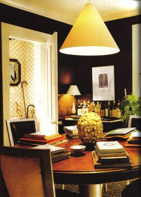
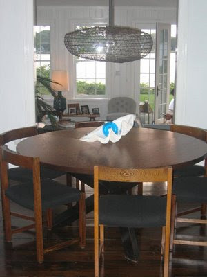
For a while now, this light from Albert Hadley’s dining room in Southport, Connecticut, has been bouncing around in my head. It’s a bit similar to the ubiquitous shades that are here and there and there. But not. It’s sculptural and unobtrusive, but still has impact. You know how things go, once you start to notice something, it turns up everywhere.
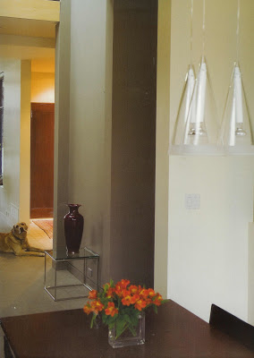
These are Flos in a room by Andre D’Elia, courtesy of Farrow and Ball, The Art of Color. (I am hoping they don’t sue me; I held off as long as I could, but can’t help posting a few images.) I like these in glass, I really do, but it’s the metal that really gets me.
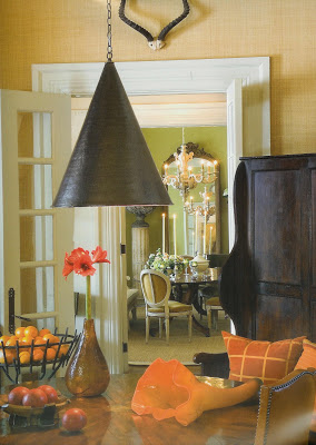 Again, Farrow and Ball, this time Barry Dixon. This is perfect. Well for me, anyway. Again, sculptural, almost industrial; black, or almost, in direct contrast to it’s traditional setting.
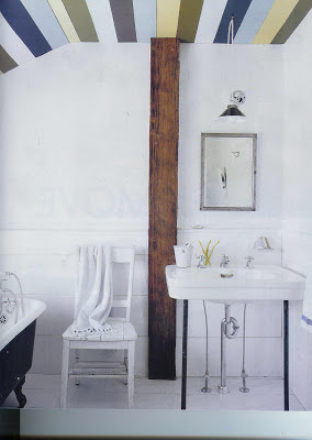 This image is from the December, Elle Decor. Photographer William Waldron and his wife, Malene have done a lot of the work on this New York farmhouse themselves; she designed and painted the ceiling. I do like a girl who will wield a paint brush. The light is from Paula Rubenstein. Crisp, clean black and white that mirrors the tub. Perfect.
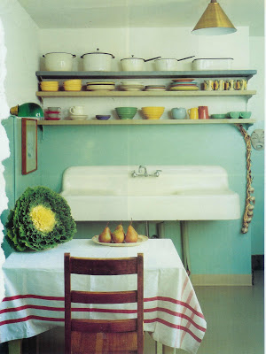
Different altogether from the others, of course I’m attracted to the aqua and red, vintage pottery, that white and black enamel ware and the sink. Is it me or are angels singing? And come-back brass? Yep, on the fixture. Except this is vintage; House and Garden September 1992.
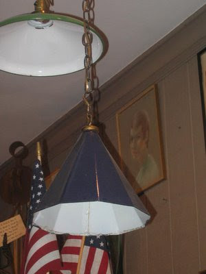 Will he take my advice? Unlikely. He rarely does, though I am always flattered he asks. As for me, I could not stop thinking about this handsome royal blue lantern from Christopher Filley. The youngest Blandings boy has a room just at the top of the stairs. It would be such a treat for me to see it as I’m bringing up the shoes and the books and the Legos. And as for boy number three, you’re never to young for good design.

Oh I think the deep blue lantern would look so great in a boy’s room — a forever piece.
Courtney – I’m e:mailing your comment to Mr. Blandings, who replied upon seeing it, “We already have a fixure in that room.” Small minded people have no place in the design world. 🙂
The Barry Dixon cone lamp IS perfect. I love it combined with the grass cloth wallpaper and antlers–textural and contemporary next to a more traditional dining room. Nice!
And that painted ceiling in the bathroom is pretty cool too.
Brilliant – yes, exactly what I was thinking, but you said it better.
Hadley dining room is GORGEOUS. Love the cone. Great post!
I love this cone design
This looks so fresh after being bombarded with round and oval drums for the last few seasons.