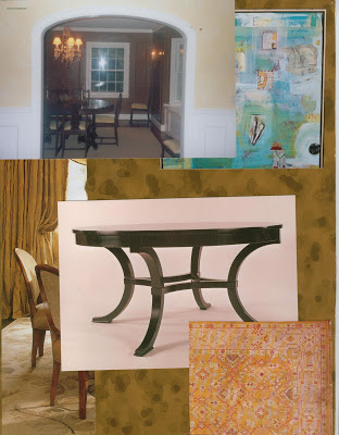
This was the original concept for my dining room. Nina Campbell tortoise paper, yellow silk curtains held back, round table (Dessin Fournir) and an oushak. Jazzy art.
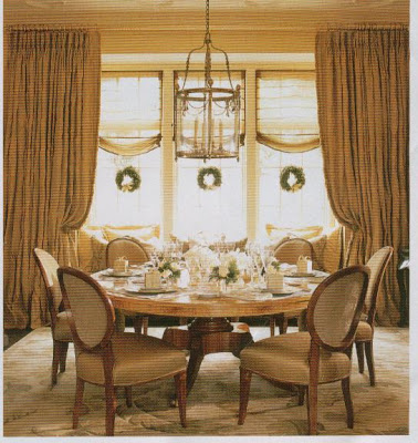 Phillip Sides, Southern Accents, November/December, 2001.
Yes, I did notice my bay isn’t quite this size. And, no, I won’t be using, what, four widths of fabric, but still. This was the idea. Seven years ago. An idea whose time has come.
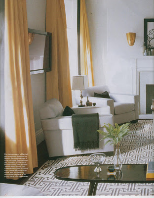
Maybe it was Gambrel’s sumptuous Clarence House taffeta curtains in Elle Decor this past November that has spurred me on. It’s a little hard to tell from these pictures, but there is a brown border running down the leading edge.
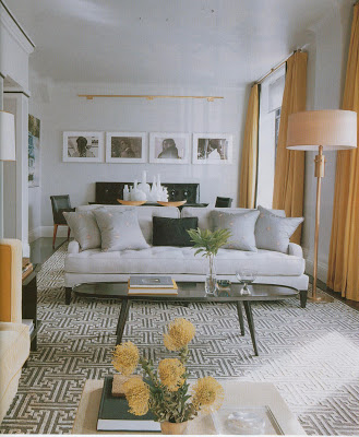
I, too, was thinking gold leaf iron rods (his may be brass, but I don’t think so) mounted to the ceiling. I will need the center support over the bay.
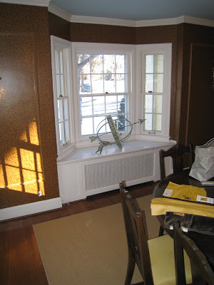
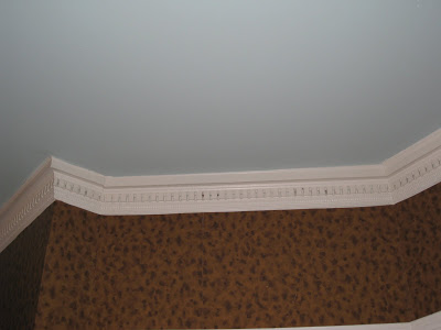
It’s not your eyes, or your screen, the ceiling is blue. Not smudgy turquoise, although I wanted to use the description, more of a robin’s egg.
My first thought, seven years ago, was silk. I like this Cowtan & Tout, but every time I see it in my head I’m concerned of my reaction if someone were to say, “Did you get those at Restoration Hardware?”
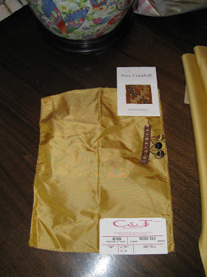
I don’t have a problem with Restoration Hardware curtains, in fact, I think they are well made and a handy short cut. But if you are going to have custom, well, it should look it.
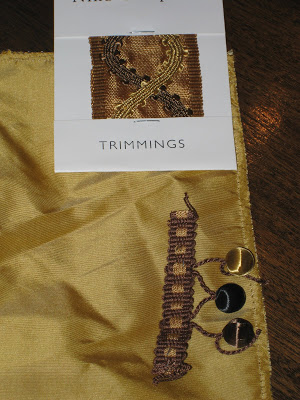
Bachelor #2 is a decadent wool. It has an amazing hand; the drape is divine. There is a natural sheen to the right side that gives it a dimension I adore. I think because of the color, it won’t be too heavy in the warmer months.
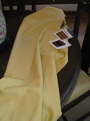
This is the leading candidate, I must admit. The nagging question is the finishing. Should they hang straight? Pull back? I think the ball fringe is out, no? A tape? Gorgeous and long and straight like your baby sitter’s hair in the 70’s? I don’t know.
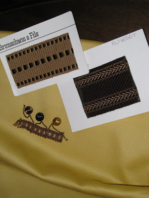
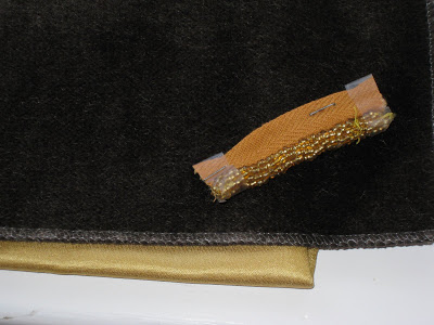
I am going to do a cushion for the window seat. It can be removed if we need to serve from there until the matching demilunes are discovered. Chocolate mohair, pretty sure on that. I had originally thought the beaded trim, but it’s all taking a more restrained tone now and I don’t want to make window seat feel like a hussy.
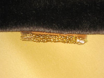
A little shine is in order, though. How about a satin contrasting welt?
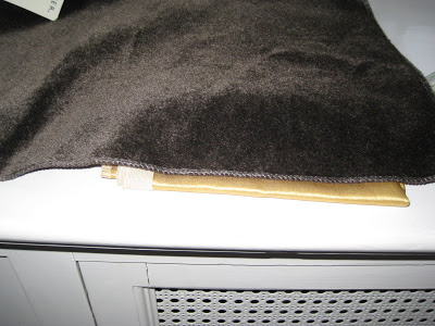
This is not the mystical powder room project; I’m ready to order.
So, I need your advice. Did you keep that all straight?
1) silk v. wool
2) curtain trim
3) pulled back v. straight
4) beaded trim v. satin welt
5) a different idea altogether
6) Gambrel is fantastic, yes or yes
It’s a lively crew and I can’t imagine we will all agree, so no hard feelings if your “vote” doesn’t win. I’d like to order ASAP. Help a poor girl out, will ‘ya?

Yay project! I really don’t think you can go wrong with any of these choices. My only two cents to add is that I do think a trim on the curtain will separate the men from the catalog-order boys.
Glad to know I am not the only one with a weird lust for my old babysitter’s long and shiny hair.
This is going to look fantastic. Thanks for bringing us along.
1) wool
2) curtain trim
3) pulled back
4) beaded trim
5) Love yours
6) Gambrel is fantastic, yes
1. the wool is gorgeous, but I always go for silk draperies – without an ironed in pleat, more billowy. I like the tape, not the balls = lead edge and hem.
2. mohair is nice on the seat – but omg, i hate that beaded trim!!! sorry!!! just do a micro self welt. are you sure about the chocolate with the wall color?
ok – here goes = I’m questioning the drape scheme – I think you need to adad roman shades in the windows – to the ceiling. the white is too white on the bottom? should it be painted brown to match the paper?
should the drapes be cream instead of yellow? I am questioning the yellow and brown, I suppose. Seems more like a 60s/Werstler color scheme.
1) wool (will wear so much better) with a goblet pleat
2) the B&F, leading edge and bottom
3) straight
4) satin welt
5) tortoiseshell bamboo blinds at the windows
Look to your examples that you have shown for inspriration. They are all very simple drapes, no fussy trims. That wool is just BEAUTIFUL -definitely go with that! Install wall brackets so you can have the option to pull them back or let them hang straight depending on your mood!
Love the wool, and straight for sure with the darker of the two tapes at the edge (like the Gambrel drapes) In combination with some of those roman shades Cote de Texas suggested but in a pattern fabric, beaded trim near the bottom of these. Satin welt on the cushion.
-wool
-tape (I would like to see solid or Greek key)
-If solid tape or flowy pattern on tape pulled back, if greek key or other graphic pattern on tape then straight
-satin or self welt
-love the idea (your style is timeless)
-yes and yes
Mrs B -Not to be dreadful, but I just noticed the colour of the satin for the piping. No. I meant the same dark colour as the cushion, but in satin.
Where are the curtains going? Inside the bay or along the front? I personally would do London blinds (1/2 way between widow and cornice) in your chosen fabric and trim instead of curtains.
I love the colour combo and almost used the same paper in our DR, but the peanut gallery rebelled. As it never does, I took heed (once in 20 yrs., not bad).
Oops, I meant the ball trim for the roman shades. Not the beaded.
BLUE CEILING??? YOU ROCK! you know i love me a blue ceiling!
1) wool
2) tape
3) straight
4) welt
5) No!
6) YES!!!
Hello Mrs. B,
My persuasion is to dress a window the way I prefer to dress myself……wool is timeless, makes a seamless, seasonal transition……as for the ornaments and adornments, a welt is beautifully sublime and doesn’t look pimped out……..you impress me as a classic, smoothly coiffed lady – So that answers the straight VS pullback question (pull back being the gel-set/brush out devotee)……..
I would capitalize on the fabulous ceiling blue….Have you considered a fabic with nuances of blue in it? I would try blue! Would be scrumptious with the chocolate mohair.
It appears, by the shadow, there is another paned window in the room?
As for additional frosting (i.e.shades/blinds) on the windows, NO! I cannot find it in me to obstruct or cover beautifully painted, paned windows with shades/blinds. I disagree with suggestions to shade/blind your windows. Fabulous curtains speak for themselves, and in my book, in a sublime, quiet way……no need to compete.
Cheers from the north……Alison
I have to ditto Jennifer!
1. wool, it looks so incredibly rich( ps have you looked at the Bechamel from Rogers & GOffigan? it’s a wool that makes my heart flutter) I also think you could go just a wee bit more yellow in your gold ala Gambrel. But perhaps it is just the photo.
2. Curtain trim fo’ sho. It does as someone said, seperate the men from the boys. I say do a tape —the choc one with the little chevron on it. I love ball trim but I think this is not the place.
3.V. straight, especially if you are going to do a gilded iron rod.
4. Skip the beaded trim, it will become magled and look Z gallerie-esque. Sorry to CdeT but please do not do a self welt in mohair. Selfwelts in mohair or velvet, even if micro, always look a bit sad to me. I think the contrast satin will be lovely.
5.Your idea is fabulous. Stick with it! I do however like one of the comments about tortoiseshell blinds. The would look fabulous layered WITH the curtains. A touch of Billy Baldwin don’t you think?
6. But of Course!
I think that is more words than you would like to see from an anonymous commenter!!
Dashing around doing errands — and though I’d drop in my two cents worth of comments. I vote for the gorgeous wool with simple straight lines. I do love the idea of a window seat cushion — how about add a contrasting gold silk roll cushion to the back — to lean against the window? Love the idea of tortiseshell brown bamboo blinds! But love the blinds in your original inspiration photo too! Hard to choose — but your room is already lovely and you’ll glow as its hostess anyway!
Jan at Rosemary Cottage
Fun project!!
Hmm,
1)wool
2)yes curtain trim
3)straight
4)maybe the beaded trim…
5)you’re on the right idea, yes!
6)And Gambrel is a total fantastic yes!!
1)Wool
2)Tape….me,I love to choose/look at trims almost as much as fabric.
3)Straight
4)Satin welt,no contrast.I find just the gleam & texture contrast enough.
5)Keep on keepin’ on with your badself.
6)YES!
traight and long and simple on the gew gaw. i love a graphic punch in a room. i love the dark running edge border. love. you have some great options for it too.
i think with the fabric choices, the age of the house, the crown molding detail etc., balls, fringe and the like– will make it old lady. my choice i long and straight with a strong border for garphic wow. oh and i LOVE the brass. love it.
1) Silk (for the glamour and shine at dinnertime)
2)Tape
3)Straight
4)Satin welt
5)No, love your idea.
6)Yes!
I’m awed and grateful that you would have taken the time to help me out. This is advice many people would pay many dollars to receive. I’ll keep you posted on the order. Then I’ll show you the finished product and you can review!
Mrs. Blandings,
I’m a little late to the party for your email just arrived. I too, prefer the wool. I think I would avoid the trim and go for a great tassel perhaps? Someone recently did a write up on beautiful tassels in the last day or so. If the room ever changes than the curtains stay but you don’t need to worry about a clashing trim piece. I love the chocolate along the bottom. I did that myself. I like a bit of a puddle on the floor myself. Go Gambrel.
the wool curtains, hanging straight with the lighter brown tape (less contrast-y) on the leading edge. pulled back curtains seem a little dated, and not so right for the room anyway. no beads or balls- simple and tailored. the brown and yellowy gold is a fab color scheme, and will look rich and beautiful for years to come. loving a gilt or brass rod too.
whoever said tortoiseshell matchstick blinds is on the money- one each window, inset.
mohair for the window seat is fine (how can you ever go wrong with mohair?), but no self welt EVER with mohair or velvet- it ends up looking like a pipe cleaner!
i would match the satin for the welt to the brown of the mohair- no contrast color welt- your fabrics are rich enough to hold simple tailoring, no need to tart them up as one might if they weren’t as luxe in feeling.
i’m another fan of your blue ceiling!
no matter what direction you take with the window, have fun and show us the results- i’m sure it will be great!
What about re-thinking the color of the curtains in the room? How about choosing a fabulous silk fabric in the coloration of the wall covering which appears to be a milk chocolate. I would add a taped trim that adds color and dimension. The curtains should be lined and interlined with a soft interlining which will give them shape and substance. Keep the lines of the curtains simple; but think about adding a valance that attaches to the ceiling (possibly a wide boxed pleat with a slight scalloped edge). It can extend accross the bay and then grass or tortoise shades can hang beneath. Consider painting the top of the window seat the background color of the wallcoveing and also paint this same color on the face of the radiator. Add a cushion to the seat in a mohair, again in a chocolate brown with a silk cord welt. Then collect old pillows in a variety of fabulous fabrics and colors. If the cushion and pillows are too much, particularly in the summer months, Think about having a piece of antique mirror fitted for the top of the seat. It will be a great showcase for any sculptural piece you might want to show off!
Fabulous – love the wallpaper too by the way…
1) definitely the wool, its very chic and will definitely say CUSTOM
2) trim
3) straight
4) no
5) YES!!
oh, I meant to say, 4) satin welt, but in the same colour as the mohair…which I think someone else said too.
I left “comment” and it must have been sent to the moon-
ditto peak of chic
or
Bold graphic print, like billy Baldwin.
Curtains are a bit too grown up for me, so a bold pattern could be fun, young and mod.
I ruined it because I read all of the comments before making a comment, and now I am hopelessly influenced.
Although, I second the person’s opinion about Rogers & Goffigon. They will send you a crate of samples if you call the rep who services your general geographic area (assuming KC does not have a showroom that carries R&G as Atlanta doesn’t have one either!). R&G make the most divine solids in beautiful colors and textures.
Have you given any consideration to trimming you drapes in lights? I can get you some on brown cording.
I think the wool sounds neat (was this bean counter supposed to say “looks”). Straight drapes. We have a little mohair going on and I love it..did trim in the same fabric (I believe it would be “self”). If you ever think someone might actually sit there (you’d be surprised) you may want to reconsider the beaded trim.
Mrs. Grizwald, so good to have you back in town. Agree the wool is, in fact, neat. I like my curtains like I like my scotch. Not really, I hate scotch. And the beaded trim is nixed. You are right up there with the design professionals. Accounting degree be damned!
In all this discussion I am surprised that no one addressed the proportions of the bay window and how they differ from the adjacent window. Any curtain design for the bay must be adapted to the single window, and that isn’t always an easy task. Fabric and trimming selection can be debated until the cows come home. What’s really at issue here is the jarring off white used on all the woodwork! It’s plainly out of key with the rich scheme you are planning, it will compete with the curtains, and that bay window will never have the unity you desire. Paint the woodwork a creamy caramel, or perhaps something that tones with the walls, and your window issues will fall into place. (PS: I cast my vote for straight curtains suspended from a fat pole rod. See Roger Banks Pye for the Green’s dining room)
Toby – I appreciate your feedback. I can totally see your vision here. My original concept was based on a David Hick room, see http://mrsblandings.blogspot.com/2008/02/hicks-tops-kellys-tricks.html
I actually like the contrast of the brown and the white. We’ll see how it all plays out. Part of the process is the trying and the tweaking. I can see it so clearly in my head, I think it will be a success. If not, it will need to evolve. You know I am a big Banks-Pye devotee, so relish the opportunity to look back at his design. Thanks for the input.