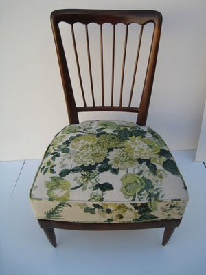
Courtney has posted a few really great, fresh florals in the past week or so. The latest, top, is featured on a vintage chair at Downtown, in L.A., of which I have heard but never visited. Downtown, I mean. Well, L.A., too, come to think of it, but that is neither here nor there.
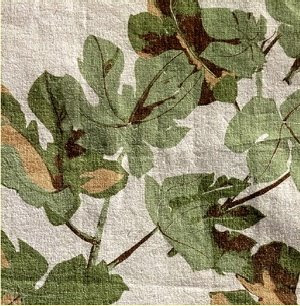
And my other fave is a Peter Dunham print that comes in three colorways. All shades of green and white. I’ve quit saying I don’t like a color. I used to say I didn’t like green, but really what I don’t care for, for me, is, say, hunter green. Apple green? Yum. The kitchen of the dream house was painted such a fabulous color of apple green when we bought it that we have kept it. It photographs poorly and always looks too mint or too manic, but this is it.
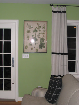
My, I am meandering today. We had a (not-so-much, only-two-inches) snow day yesterday and I’m having a little trouble focusing. Anyway, when Courtney posted her Peter Dunham prints, I told her that I have an antique print that could have inspired the fabric.
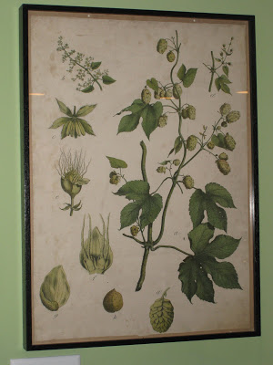
It didn’t. But it could have. It did inspire me. I did not know quite what I wanted for this spot, but had committed myself to keeping the room green, black and white. Not that anyone knew that, or would notice, but I did.
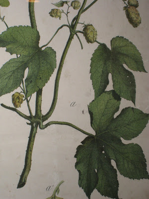
So, the wall space that I see everyday, several times, as I head out the door to school, to the store, to work, stayed blank. Waiting. Then, one day, breezing through Pear Tree (a fabulous spot in Crestwood) I saw this. At first I feared it was too big, but was delighted to find it just right. This is my long-winded way of thanking Courtney for the post, as it made me see the print again. On my way out the door to school and to the store and to work. Sometimes we need to be reminded that the best things have been right there in front of us all along.

Great post – I followed you all the way to thanking Courtney – love green, black and white, at least here I do! And I love Peter Dunham prints!!
If I could be green and white, that’s what I would be.
Everything green except for the dreaded P.I. aka (poison ivy)
It’s probably just me, but that fabric looks to be running the wrong way.
The print is beautiful! It brings so much to the room. I’m glad you kept the green walls — just love black, white and apple greens together!
Love the print! Is that black grosgrain ribbon I see on the drapes?
HoBC – it could be. Are you standing on your head?
londoncalling – grosgrain is always a good guess at the dream house, but it’s actually an old French table cloth that I cut into four pieces for curtains. Can you imagine the table it covered?
Love the green, white and black theme. I especially love the print. My comments yesterday were never posted. What happened? Did I offend you or did they get lost in the airwaves? I wanted to say how much I loved the chair and huge blossoms on it.
That’s a beautiful print Patricia, and it’s perfect in your kitchen. So glad you chose to keep the walls green in your kitchen- they’re very striking!
I’m so terribly impressed at your inventiveness for turning a tablecloth into curtains! Love seeing the shots chez blandings.
artist – must be in cyber space somewhere – I’m so sorry I didn’t get it. I rarely reject a comment, and doubt yours would have been offensive.
p&g – I had to coax the shop owner to sell it to me once she knew what I had in mind. She’s seen the pics and we are still friends.
On the chair Mrs B, on the chair…
HoBC – oh. My mistake. Although I am still laughing at myself. Yes, I see your point.
That must’ve been some table. BTW-May I request your advice on my kitchen sink delimma? I’m stumped. http://www.londoncallingloudly.blogspot.com/2008/2/everthing-but-the-kitchen-sink.html
I’d love to see your kitchen! You have the best style!
Isn’t it great when you find just the right thing?So glad you did!
Lovely print! It really could inspire a whole room. 🙂