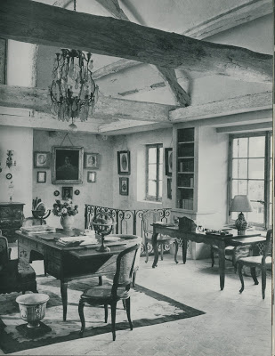
 Not long ago, Patricia van Essche sent me a present. I do love presents and I keep going back again and again to admire this one. House and Garden’s Complete Guide to Interior Decoration, Sixth Edition, 1960 is a treasure trove of timeless rooms. The book is beginning to fall open on the page with the image above. The section is titled “The country look: a union of elegance and ease.” Many of us aesthetically focused folks quest for those things that are a union of elegance and ease. We can certainly see why the editors chose this room to illustrate their point.
A converted mill is the charming setting for this “flock of lightly scaled chairs” and while the mill itself might not be so easy to come by, many of the elements of the room are available at the click of a mouse.
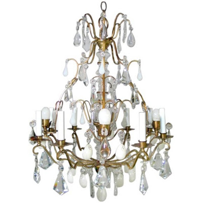 Bronze and crystal chandelier.
 Bronze and crystal chandelier.
The chandelier is one of the most dramatic touches and oh how it swings from the yards and yards of chain that suspends it.
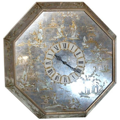 1940’s Chinoiserie wall clock.
 1940’s Chinoiserie wall clock.
The clock in the image is lovely, but on my search I ran across the Chinoiserie one above and could not resist. Octagon, too, and Roman numerals. It’s great to have a piece in a room that has both tones, silver and gold, so you don’t feel locked into one metal or the other.
 American illuminated globes.
 American illuminated globes.
The globe and the armillary sphere provide graphic, masculine accents to off set the feminine lines of the chairs and the ceramics.
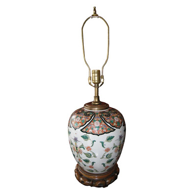 Chinese Famille Vert lamp.
 Chinese Famille Vert lamp.
The book describes the room as having rough pink plaster and red tile floors, this Famille Vert lamp would work nicely with the warm tones of the space.
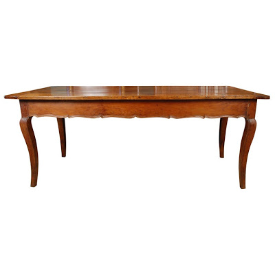 Period Louis XV French farm table.
 Period Louis XV French farm table.
“Furniture is seldom elaborately inlaid or ornamental in the formal manner.” hence the French farm table as desk.
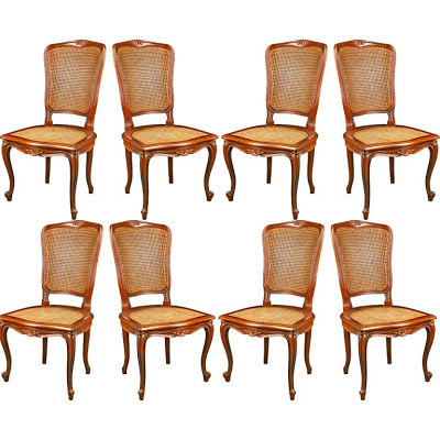 Set of eight French chairs.
 Set of eight French chairs.
The aforementioned flock of lightly scaled chairs.
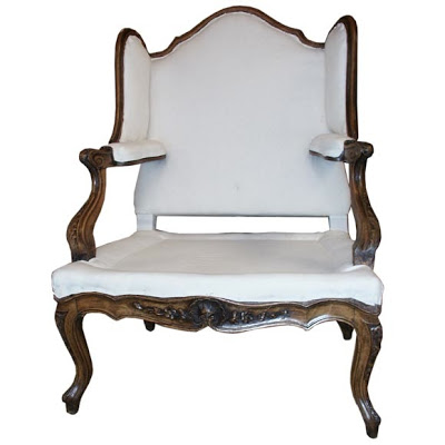
This over-scaled wing chair is stunning, but does not wear its original fabric, so one would have to choose between the drama of the piece and
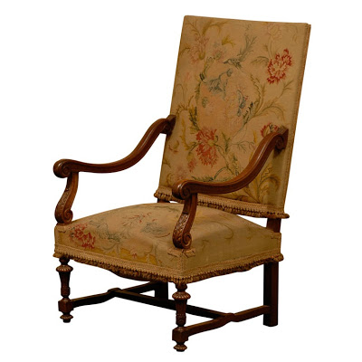 Louis XIV style chair, early 19th century.
 Louis XIV style chair, early 19th century.
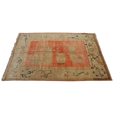
The rug in the photo is an Aubusson, but that has never been on my hit parade. The Samarkand above appeals to me more.
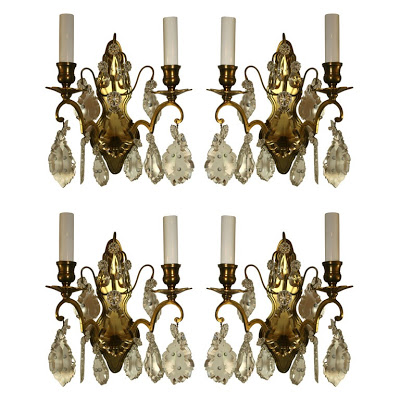
A little more bling in the lighting.
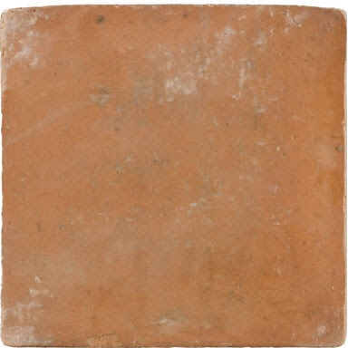
And the cool, chalky terra cotta tile for the floor. You could stick with the pink plaster or you could go with a different shade. Hmmm….what about a lovely shade of yellow?
All products except tile 1st dibs.com.

love the “instant ancestor”… fun post!!
Oh, you so nailed the ease and elegance of that room.
I love it! Change the von to van, (sorry, my darling husband cringes every time this happens) which is a lot! No biggie, just a o to a. A+ to you! I know you never won a spelling bee but you certainly do your homework. Encore!
Well, first, I’ve had my eye on that rug for a while. And the clock — what a find! The room seems ahead of its time, a sign of what was to follow with those exposed beams — or just timeless I guess.
Love your blog!! With that said, could you give me some of your favorite white paint colors? I am painting some cabinets in my bathroom during a remodel…
Patricia – forgive me – I’m horrified.
Courtney – I’m suddenly obsessed with tile floors – they are all over Met Home this month – and look, here, too.
Anon – Paint is so tricky and folks seem to think there are certain magic colors, but light changes everything. Find a shade you like and invest in samples or quarts; the only way to find the right one is to get it up on the wall – big swatch – and watch it all day long. Good luck!
p.s. white is the hardest.
Erika – it was hard to choose – there are a dozen great ones.
Great post Patricia! I love the idea of that chandelier in a somewhat restrained space. You always need a bit of glitz in a room, IMHO.
this interior is so grounded and “real”, like it grew organically with family and time..but how comfortable is it with it’s perched flock of chairs?
Hello Mrs. B.! And thank you for the link. It’s funny I’ve never liked the country look, being a city mouse. or so I thought… and then I remember some of my favourite rooms. Guess what? Yup. Beginning with the converted barn in Holland owned by friends of my parents. It was almost a dead ringer for the photo above!
Obviously we’re going to have to have a pied-à-terre in the City and a country place, too. If only to have a place for that fantastic rug.
E&E – every time I think, “That’s not for me” I see an example in a setting I cannot resist.
mrs. blandings,
I love simply white from benjamin moore
Also love lancaster whitewash which is a creamy white with a fresh greenish tint-
I love combining white and cream!
patricia
Elegance and ease. Finally, a mantra to organize my thoughts as I redo our den. That’s going to help me even if I’m going for something more “clubby” than “country.”
HI Mrs B
I would love to send you a photo of a home with rustic beams. How can I send photos to your blog? Thanks