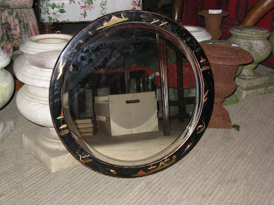
 These are too wonderful to pass up. I showed them to Mr. Blandings when I got them home and his initial reaction was, “What’s Chinoiserie?” It’s ok, he’s told me the square footage of our house and what a birdie is 150 times minimum. But he thinks they are really “cool” and that is really all that matters.
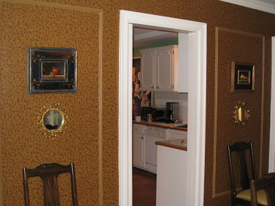
The original plan for the walls flanking the door to the kitchen was a matching mirror to the one below, then the paintings then the Italian mirrors from Christopher Filley. I bought the Regency mirror from Suzanne as well, but I wasn’t supposed to and it has been a sticking point ever since. But she did understand that it wouldn’t be a focal point and she was trying to help me find a near mate.
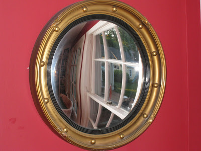
Which is what I was going to look at when I fell for these. So now the original will continue his lonely post, slightly out of place in the office. The new, beloved, mirrors are “on approval” in the dining room.
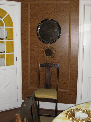 They need to be a little higher, I know, but I am sticking with original nails until the approval process is complete. The question is, still with Italian mirrors below? I like the gold repeating and the fact that the Chinoiserie are a bit staid in shape and the Italian ones are wacky.
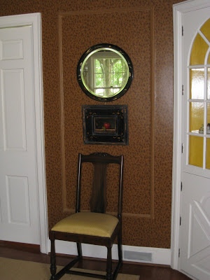 I don’t think all three pieces will fit and I’m not off the paintings underneath, but Mr. Blandings thinks they should go on this, blank, wall and then the room will be “finished.”
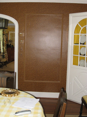 Hmmm….except for the curtains (which have been measured and are very close to being ordered if only I would type up the p.o.’s.)
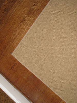 And the rug to replace the 15 year old PB sisal. Which is still available, so maybe it’s a classic now.
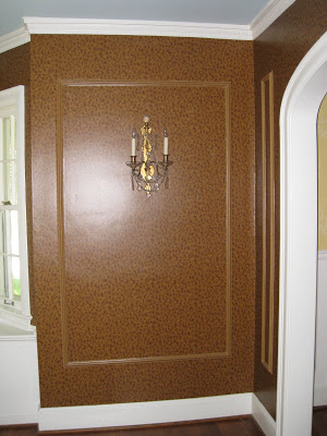 And the pair of demi-lunes that need to go here. Yep. Almost finished.

I think they’re adorable (the new little ones that is). And I LOVE the finish on your walls…is it handpainted faux-tortoiseshell? or is it a wallpaper?
Mrs. B – try the larger mirror on the bottom and the smaller mirror on top! but don’t drop the larger mirror too much more, maybe just a 1/3 way down – just a little below eye level – is the chair always there? shoot a pic and send it to me. something looks off now – maybe it’s just that the holes are not in the right place – but still – would like to see smaller on top.
ok, mrs blandings- honest injun time here (and i hope you were posting this looking for opinions, cuz otherwise i’ll just look like an ass):
the dining room as a whole- especially those walls? lovely.
the chinoiserie mirrors? lovely. REALLY lovely.
the square paintings with the italian mirrors underneath? lovely.
the chinoiserie mirrors with the italian mirrors underneath, OR with the paintings? not so much- the italian mirrors repeat the shape too much, so there is no tension, and with the paintings underneath it’s too crowded.
so i’d vote for the chinoiserie mirrors alone (they are large enough and striking enough, they don’t need to be paired with anything else),
or
the chinoiserie mirrors with a smaller framed painting or print underneath (preferably with a light background, not dark like your current set, – would help to provide contrast/tension),
or
sticking with what you have- the pairing of painting and small mirror underneath is pretty darn successful.
or
go for hanging all three- chinoiserie mirror over painting over italian mirror and ditch the chairs.
if do you go for change (options 1 or 2), i think hubby is right, and the paintings would look great hung one over the other on the blank wall.
once you have the demi-lunes (a must) and your new curtains, the dream dining room will truly be, well… a dream.
jus’ my 2 cents…
ps: the sisal is a classic, and keeps the room from being TOO elegant and formal. keep it.
Hello Mrs. B.,
Italian Filley & Chinoserie Suzanne compete too much and look rather off balance…..
Big head/little body like….too large of a shade on a small lamp like…..
Challenging to appreciate their individual beauty when in such intimate proximity.
Paintings & Chinoseries paired, absolutely!
The blacks are sublime together, square & round frame shapes & sizes weigh perfectly. Juxtaposition of different mediums adds interest.
The Chinoserie mirror above the painting is like a light on the painting – quite nice……
A spot-on, well executed balance, really.
The gold Italian Filleys look as though they disappear on your gold/brown dining wallpaper a bit?
Although, the premise of this has some definite sass – mirrors being, in and of themselves, vain, competing for position/prominance in the Blandings DR…..!!
Mrs.Blandings,
I love the double mirrors… maybe another tiny one above the middle one? Or would that be too much?
Hmmm,
Erika
I’m thinking the two pictures on the side wall, and the round mirrors on their own. Love how the mirrors will echo the pale yellowy-beige and brown taping on your curtains(whichever way you go fabric-wise).
Suzy – thanks! It’s a Nina Campbell wallpaper.
Joni – thank you, darling, I will as soon as I’m back from the orthodontist. I agree, something isn’t quite right.
Regardless of how you use them, I’m so glad you took them home. Please keep them! Great investment.
Maison21 seems spot on to me — Mr. B has some good ideas too.
BTW: I have a bullseye mirror just like that. Such a classic.
m21 – good observations, all. Will try the different combos and see how it plays out. Thanks for the comment on the rug, I think you might be right!
Anon – very nicely put, thank you for your feedback.
Erika – I know, it needs some fiddling.
Linda – the mirrors on their own maybe the answer.
I like the 2 mirrors together but would put the small one on top. Then hang the 2 pictures on the blank wall.
The dream house is very dreamy!
Yes — I vote for the mirrors to hang on their own — above the chairs. Then move the paintings to the blank wall — hung vertically OR — just for a bit of dash — include the Italian mirrors? Try one of the Italian mirrors above the set of the two paintings — and hang the other one below them. Just a thought!
Jan at Rosemary Cottage
Courtney – leave it to you to be the diplomat!
Jan – I like the idea of the painting/It. mirror combo on the other wall. I’ll give it a try tonight.
It is really looking great, and how could you possibly pass up those mirrors! At least you’ll use them, I have a habit of buying mirrors and stashing them in the closet and forgetting about them 🙂
~Kate