 On Monday, Decorno threw out the question to her readers, “Is it All Too Much?” And she posted a few rooms that made some folks furrow their brows and say, “geez, yes.”
 But, being a great over-thinker, I couldn’t leave it at that. (You should read the comments if you haven’t already; it’s an interesting discussion.) We of the shelter magazines and the tear sheets and the vintage design books, we like to see patterns. I’m not talking trends, the things of the moment that suddenly every it-girl with an it-address must have.
  A very valid question was, is the age of excess and trying too hard to be wacky (there is an old HG Mayer Rus column on “fun” in decorating on just this subject that is classic) a backlash against the Liagre of the 90’s? Perhaps.
 But, I think there are a couple of other things at work here. One is definitely the swing of the pendulum. Once we tired of the mid-century resurrection and felt the need to mix we might have gone a little fusion-crazy. If you can pull your period chairs in with the Nelson coffee table, then maybe you can add the antlers and the coral and the rococo mirror and the garden seat, too.
And the other thing is where you choose to gather your information. I’m not in the business of marketing or demographics, but I am fully aware that I while I sometimes enjoy domino, I am not its target market. So, if it’s geared to a younger market maybe that is why it’s seeming so frenetic to me. And, as one of Decorno’s readers noted, a lot of what we see is over-styled and I’m not sure that is the designers’ fault. Even in one of my favorite magazines I’ve noticed in the last few issues that many of the rugs look as if they have been unrolled just for the shoot. And it bugs me.
There are two publications that don’t seem to get a lot of press in the blogs I read. Metropolitan Home may be a bit too modern for some, but their features are not styled-to-death. The other is Western Interiors, which seems to be picking up some steam. This is not to disparage any of the other stalwarts of the news stand, just a nudge to cast your net a little wider to see what you might find. A reason to buy more magazines – who would argue with that?
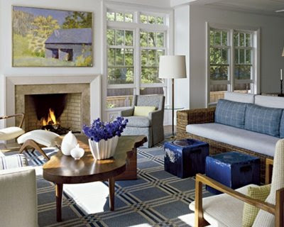
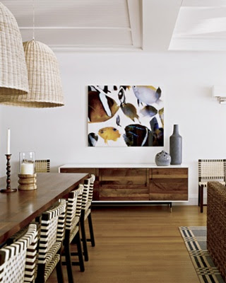
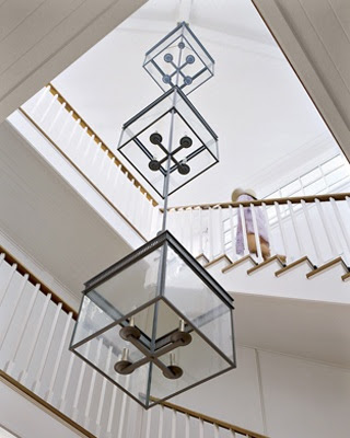
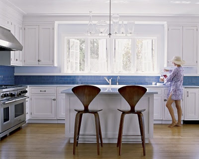
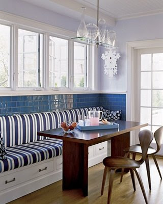
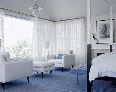
The images above are from Metropolitan Home, July, 2008. Architecture by Francine Monaco and interior design by Carl D’Aquino. Photography by Peter Murdock.

I hear you, Mrs B. Those two magazines are still a little hit or miss for me to subscribe, but I do buy them on and off.
I agree about exploring a wide range of magazines. Some of my friends in the design business really favor the international publications. But I think all that really matters is knowing your self and your true style.
I think domino has caused a sensation over the past few years because of its blend of the high end stuff with a few pieces from Target or Ikea. This appeals, I’m guessing, to women through age 45 — not just the 20 somethings. So I think some of their readers, yes, really got into the skull pillows etc. but others probably just like the spirit of adventure, being looser, if that makes sense.
This topic has led me to thinking about a couple of things. One is the difference between style and fashion. As Coco saids, “Fashion fades, only style remains the same.” I think this trend toward eclectic overload started when, as a reaction to all the published neutral zen, spa like interiors of the ’90s, design editiors were attracted to rooms designed to and for genuinely electic rooms that really reflected the owners love for these disparate items. What happened is that people liked them and started copying them, but without (for want of a better phrase) the “soul.” That is, they hired someone to do an electic mix, but they don’t love the items in the same way, and will send them all back to Goodwill when they jump on the next decor bandwagon. Related to that, the rooms in most magazines are like Hollywood starlets: so overly styled it’s hard to get a grasp on what is really part of the person’s asthetic and what is eye candy. I like it better when the rooms are obviously spruced up (I mean who wouldn’t hide the remotes if a national magazine was coming over), but still look like they do on a regular basis. I think of it like a resume, maybe a little stretching (leave out the junior in your title of “junior assistant designer”), but not calling yourself head designer.
Suzy – your comments were some of the best on Monday – what do you subscribe to?
Courtney – I think you’ve hit the nail on the head with why it seemed so fresh. I like domino, and I subscribe to it, but how I miss the elegant grown up pages of House & Garden.
Design Junkie – I should cut and paste this onto the post – a great observation.
My sister and I live speak often as we delve into our magazines. “Sister, did your see page 54″ We both chuckle and say simultaneously”- they must have a staff to keep that place clean” The cleaning factor always comes up, especially that hanging chandelier?
How does one live that tidy?
Each one of these rooms is just gorgeous! I love the blues and whites.
I love the kitchen, just love it. I admire the way they used that bright blue tile in the all white surroundings. Works perfectly!!
Maybe one of the mags could do a TRUE LIFE edition. Don’t allow any stylizing and show the rooms as is. My friend’s shore house was photographed for a shelter mag last summer and they came in and did the move and shuffle as mentioned. It still looked liker her house but undone. I would like to see what really sits on people’s coffee tables (who aren’t single…those w/ kids)
Sara
To the last anon – they do that already – on line – it’s called Rate My Space – all the unstyled houses and rooms you could wish for.
Mrs. B. – leave my garden seats alone!!!! don’t go lumping them in with coral and horns, pluuuuuze.
I’m not ready to start vomiting everytime I look at them.
great post, as usual. And I hate Met Home, sorry just do. Love Western Interiors though. I think they are aiming to be the S.Accents of CA.
Oh, Joni – I love them too. And I’m a little bitter about the antlers because we have some that Mr. B has found and they mean something to us. No need to apologize on the MH – wouldn’t take it personally.
Mrs B, to answer your question, I either subscribe or buy religiously: Elle Decor (US), House Beautiful (US), – used to buy the now nonexistant House & Garden (US), Vogue Living (Australia), Belle (Australia), Urbis (New Zealand), Home Journal (Hong Kong). And then there are the others that I buy off and on, Metropolitan Home, and Western Interiors are sometimes in the running, but I just recently realised I don’t really regularly buy any European magazines. So now I try to buy the French & Italian Elle Decor as well as World of Interiors. My rule is that it has to have at least 2 things in it that make it worth buying off the stand…otherwise I just end up with a tonne of magazines I’ve bought for one image!
Oh, and I forgot Domino. But I’m not sure if I’ll renew my subscription when it ends…