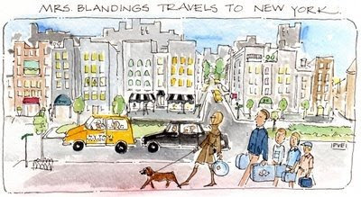
A few commenters have noted the change in Mrs. Blanding’s appearance. At his elegant home on Saturday night, David Jimenez mentioned Patricia van Essche’s charming illustration that I use for the header of the blog. It made me realize I hadn’t “seen” it in a while. I started Mrs. Blandings almost a year ago. For a while, her title was simply typed at the top of the page in red, then Patricia created the engaging illustration above just before I was headed to New York. Enchanted, I knew it must be my header, but blogger was a little trickier then and I couldn’t quite figure out how to do it. Eventually, I created the old image in Word (it’s funny how far you can come in a year), printed it, scanned it and posted it.
Did She Have a Little Work Done?
Courtney, at Style Court, was gracious and noted that it had a vintage feel. OK, so it was a little fuzzy, I’d get back to it later. I wasn’t thinking nine months later, but that is kind of how I work. After David’s comment caused a mental nudge, I realized I could easily update the header, which lead to a little more tinkering. The template is the same, but I changed it to a wider version to expand the margins a bit. “Wordy,” this keeps the text on Mrs. Blandings from looking quite so long.
I also changed the font. This is cleaner, I think, and I am a Arial user in “real life” so this is a better fit for me visually as well. And it’s larger, which might be a little easier to read on screen. Overall, I think it’s crisper. I initially changed the background color to white, and I must say I liked it, but I could not give up this gentle shade as I’ve grown so accustom to it.
I know it takes the eye a while to adjust to change. Hopefully, Mrs. Blandings just looks better and fresher, not different and strained as sometimes happens with cosmetic alterations. Or so I’ve heard.

I think it looks beautiful -much fresher (not that it wasn’t great before!). I think mine is due for an upgrade as well!
I did notice and like the new artwork very much. Lovely dog with lovely you out front, sherpas behind!
Personally, I’m glad you kept the blue background. It reminds me of a front porch ceiling. Very restful!
i’m a san-serif font lover myself, so your choice is pleasing to my eye. quite glad you kept a colored background as well- white seems so sterile.
I love it!!! It’s clean and neat and easy on the aging eyes. Good job!
The crisp feel and clean font really suit you, and the pale blue is so nice with PVE’s work. (For the record, I thought it was pretty great before too 🙂 Now it’s just outstanding.
Courtney – confirming your position as my #1 fan. 🙂
For what it’s worth, I miss the old format.
This new look felt a little like an ALL CAPS email when I clicked onto my morning read the other day. I’m still getting used to it.
I will be a good soldier, though, and try to embrace the change.
Posting anon as I don’t wish to offend. I’d find a way to read you even it if the font was webdings. 🙂
The new look is fantastic! So clean and fresh!!
Just great – now and then! The hubs is always after me to change the look of my blog – he hates the blogspot template(s). I don’t mind them, but yours is really much nicer.
I could be. Perhaps tied with Christian, aka M21, and a few others. Like all those Introspective readers!
Ok – mostly good. Anon – hang in, you never know, there may be “corrections.” I promise no wingdings!
I always say, “Botox or Bangs” and must admit, when I clicked and saw the new and improved, I thought it looked fun and fab, easy on the eyes. Mine seem to be failing. I could thread any needle back in the day and now I need a magnifying glass and to stand on my head.
Change is hard but it is always refreshing.
Thanks again for the mention. A year…. time flies when one is having fun. You are so fun!
pve
lovely!
Yes, we have ALL come a long way in a year. amazing. remember how technical issues were always so prevalent in the beginning. I don’t have those anymore. Now I just have “what should I write about” issues!!! and other problems. I would love a new header and all but it’s so moi – I just can’t change it. I love how Courtney’s blog is so perfect – the colors and Katiedid has a perfect color coordinated one too. I haven’t looked at your new header yet, so I can’t comment – but of course here I am commenting anyway! what a loser. I just reacted to you talking about how far we’ve all come. we 1 yearers are like a special sorority. imo.
Patricia, I love the crisp font and your illustration is so great I wouldn’t mind any amount of fuzziness. In general, I do have a harder time reading wide format blogs. Maybe it’s a sign of my ultimate laziness or aging eyes, but I find it tiring. Yours is such a visual blog and I find myself having difficulty scooping up the gist of the entry as a visual whole in the wide format. Like Anonymous said, however, I would read your blog no matter how it was formatted.
tc- that is an interesting issue I hadn’t considered. Let me ponder it for a bit.