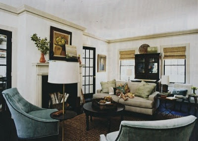
Cottage Living has a jazzy little feature this month on updating a living room.

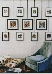
What really caught my eye was the photo grid system that the magazine’s assistant design editor Anne Turner Carroll used to display family photos. Courtney is contemplating a gallery wall in her home, and we have often wondered where the hardware for such a system could be procured. Carroll used a system from Walker Display.

When I went through this mental exercise before, I wondered if it would be possible to use Antique Drapery Rod Company’s pieces to pull it together. Their Bauhaus line would make a striking backdrop for any display.
 The one inch rods would be the place to start, with these brackets to support the endeavor.
 You might need a few depending on the number of pieces and the weight of the frames.
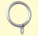
 Regular drapery rings could hold the chains; hardware stores usually have a pretty broad selection of styles and sizes. Don’t forget to grab a couple of handfuls of S-hooks that will fit the chain links.
 I’d stick with simple finials and voila! Antique Drapery Rod has a variety of styles and finishes to accommodate nearly any project. I’ve used them in the past (for curtains) and their customer service has been just dandy as well. Overnight delivery and you could DIY over the holiday weekend!
Katherine Hobbs home photographed for the July/August ’08 issue of Cottage Living by Justin Bernhaut.

mrs b- the link for antique drapery hardware doesn’t seem to be working…
Maison – apparently your browser (and mine) had trouble with the new name I concocted for the company. Thanks for the heads-up; it’s corrected now.
Love the living room pictured!
Mrs. B… in my recent posts about the house I visited, you can see that M. hung all the pictures with a similar system – a long brass rod along the top of the wall, and then pictures hanging from chains. That’s a more of a Victorian look than the Bauhaus you’ve demonstrated here. M says that you never have to straighten the pictures!
My husband and I (both artists and house-proud) follow the rule that the mounting system should never be more visually dominant than the art, or photos as the case may be. All you see when you look at the wall is the hanging system. So … definitely does not work for me!
Meg – I remember that now – I hadn’t thought about them not having to be straightened, but that totally make sense. Since I live with a herd of elephants, it would likely serve me well.
ms. wis. – I do understand. It seems to me that this gallery look isn’t so much about the individual pieces as the look of the wall or the room. I just had a great conversation with a friend about framing following your same reasoning.
I think John Saladino does something similar in many homes. Thanks for the hardware tips!
As an artist…this is an ongoing argument I have with clients. The art does not have to match the room!! The frame should not be noticed nor should the hanging system. Let the art be the star.I think systems like the one shown are great for starting out. They fill a wall until you can afford to buy a larger or important piece of art. They do have their place.
Courtney – there’s a particular VA-born designer who used a similar treatment in his parents’ home, but I couldn’t mention him again or he might truly think I’m stalking.
Dianne – I completely agree. In some instances, I’m sure fine art is hung gallery style, but I refer mostly to the flea market finds and good prints that have such terrific impact when treated this way. It is particularly great for family photos as well, since they often end up in a jumbly mess on a table top somewhere.