Courtney reminded me that it has been a while since we’ve had a pop quiz. (I can’t help but keep mentioning her, she’s been on fire lately.) For those of you who are new here, I post older images, allow readers to guess the designer, then post a current layout later in the day. As a reminder, winning is its own reward; the first to guess receives the satisfaction of a job well done, and, sadly, nothing else.
18 thoughts on “Summer School”
Comments are closed.

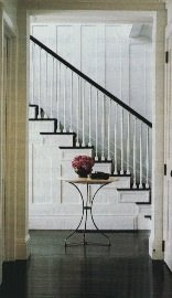
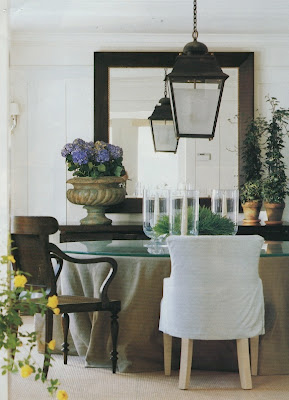
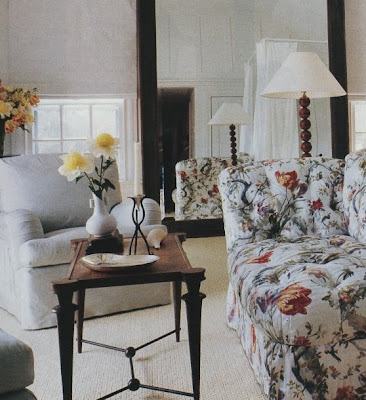
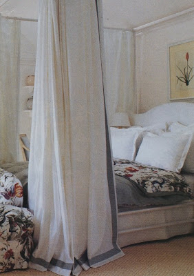
i guess steven gambrel!
i mean, aren’t they always steven gambrel? 😉
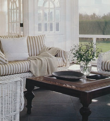
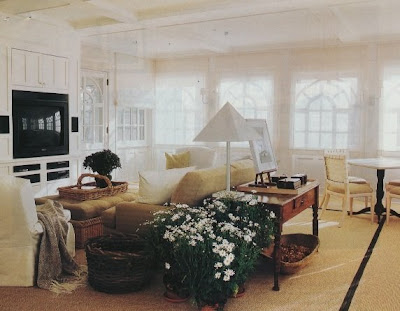
just kidding- i haven’t a clue, but i particularly like the pic with the potted daisies and the tent shade lamp… looking forward to your reveal!
Okay, first thanks for the shout out! I almost made a reference to you in my latest post because of the red stripes.
Second, I love the last bedroom! It looks familiar and I think I may have seen it years ago. I’m too chicken to guess the designer though.
m21 – I totally deserved that, but no. Stay tuned.
Courtney – So unlike you to be chicken – but I bet you’ll be surprised.
I’m thoroughly stumped! At first I thought Mariette Himes Gomez, but now I just don’t know!
Jennifer – that is something! Nope.
Miles Redd?
I have seen several of these before. But am drawing a blank. They are all lovely and obviously the same designer.
This one really has me stumped but I love all the neutrals!
Barbara Barry?
Michael Smith??
No, no and no. I promise, once you see it, you will see it. The floral is tripping you up. Take that out of the equation and it’s obvious.
Joe Nye?
I am dying to know..Isn’t it after lunchtime now?!!!!
I was going to say Vincent W. – but that last item with the chintz – pattern put me in a “quandry” and I said… could be but then again, maybe it is…
Oh well – it was fun!
Victoria Hagan?
I agree with pve. It so looks like V.W., with a client who insisted on chintz, which looks so out of place, if it is him. The white on white sconces and lamp. The large floor mirrors, and the glass over the table covering. A mix of rustic in a precise modern white and neutral environment. While this looks more heavy handed, the plants in terracotta pots and lots flowers fits. The attention to, and, understated luxury of the bed, that is if I squint and don’t see the floral.
I agree with pve. It so looks like V.W., with a client who insisted on chintz, which looks so out of place, if it is him. The white on white sconces and lamp. The large floor mirrors, and the glass over the table covering. A mix of rustic in a precise modern white and neutral environment. While this looks more heavy handed, the plants in terracotta pots and lots flowers fits. The attention to, and, understated luxury of the bed, that is if I squint and don’t see the floral.