Blogging being what it is, a sort of personal stream of consciousness, inspiration can come from many sources.
Courtney Barnes at Style Court (recently deemed one of the best classic design bloggers by domino, with which I happen to agree) did an interesting post inspired by Michael Smith’s philosophy that we create a back story for our designs and then work to fulfill them.
My copy of Smith’s book, Houses, arrived shortly thereafter. I, too, was intrigued by his musings on inspiration and the castles in the air that eventually become the sofa in the living room. “I think we collect images. We string them together like beads until we have a rough notion of what our dream house could be,” says Smith.
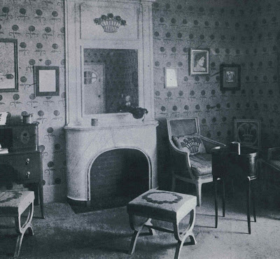
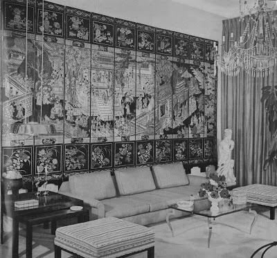
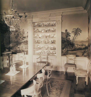
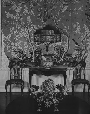
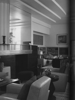
But what really piqued my interest was this: “Once in a while, I think about having a house photographed in black and white, just to see what it would look like.”
In the post, our admirable Aesthete quotes Hicks as explaining that the book is illustrated in black and white to emphasize the structure and planning of the garden. To put sentimentality aside.
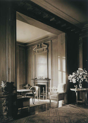
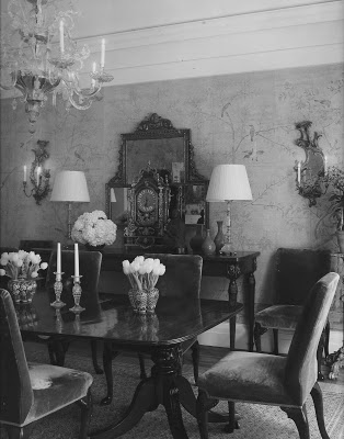
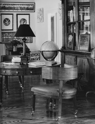
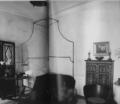
I am, usually, all about color, but I began to wonder how timeless a room would appear to be if the palette of the day were removed.
Could it be a test for timeless rooms?
I doubt Smith will have the opportunity to have a project photographed in black and white. It’s a tough sell. “Really, Margaret, I do think your readership will get it. And the advertisers. And the publisher! Genius, black and white, we’ll be the rage!”
No, I think not. But here, where no financial stake exists, we can study the structure a bit. Just today.
Some of these rooms are Smith’s and some are not.
But I think these rooms are timeless and you will see similar elements repeated in many.
It’s a testament to making investments in the tried and true and mixing in the trend of the day with discretion.
Two of my favorite houses in town are across the street from one another. One, a stately Georgian is chic and slightly formal. The other, a Tudor, is more relaxed but gracious and lovely nonetheless.
Two different designers and two different families, but one common denominator – good, strong, classic design and fresh, updated fabrics and placement.
I will post the color images tomorrow and you can see how they affect your impression of the rooms.
I highly recommend Smith’s Houses and Regency Redux by Emily Evans Eerdmans; both are beautiful and beautifully written. (And, if I were Ms. Eerdmans I would monogram nearly everything. Wonderful.)
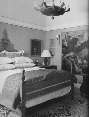 Photo credits as follows: Ralph Dutton, RR; Andre Groult, RR: Hugh Chisholm, RR; Henri Jova, HG Complete Guide to Interior Decoration, 1960; Ruby Ross Wood, RR; T.H. Robsjohn-Gibbings, furniture & interiors of the 1940’s; HG Guide 1960; Billy Haines, RR; Govenor’s Palace, Williamsburg, HG, 1960; Smith, Houses; Smith, Houses, Andre Putnam, HG Best in Decoration, 1987; Paul Dupre-Lafon, f&i of the 40’s; Smith, Houses; Smith, Houses; Chassy Rayner, RR; Jacque Grange, HG, Decoration 1987; Smith, Houses.
Smith wrote Houses with Christine Pittel and I am secretly hoping she is the genius behind the text. It’s almost too much to fathom that Smith would be such a good designer and a good writer.

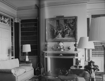
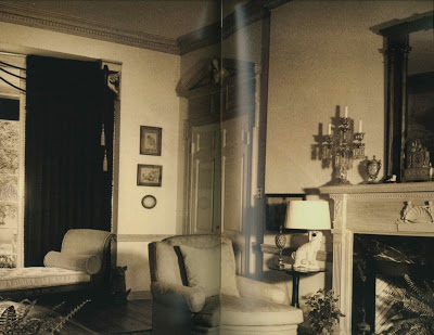
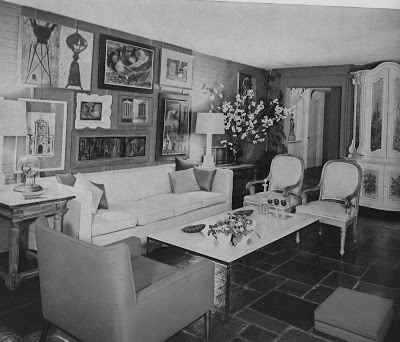
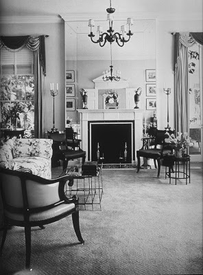
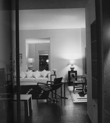
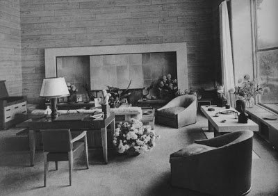
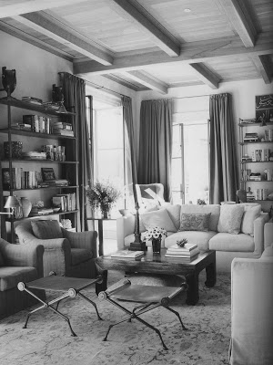
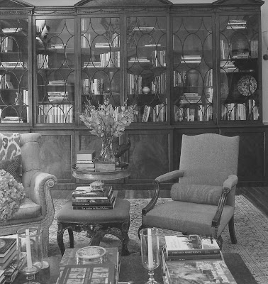
My thoughts on this get all philosophical…in fact, was just discussing dreams, color vs. b/w, and historical context with my young philosophy class…
…instead of getting into that, am going to ogle the chair in the 3rd to last picture some more.
(Blast, woman! I nearly purchased chairs from the shop you recommend…am still pondering, and this economy stinks! I really must stick with my perfume indulgences, and not poke around in these home styling issues!)
the beauty of black and white. I wonder how these rooms that appear so timeless would change with color? Thanks for posting, these are gorgeous!
I am a great fan of black and white photography – especially for interior shots. The subtle textures and tones that play between black and white somehow create a timeless effect.
Beautiful images and wonderful post.
Black and white never ages one.
I adore black and white photos.
Timeless, ageless rooms.
Brilliant post. The black and white could be like a diagnostic test to see if the scale is working, if the forms are striking on their own and so forth.
Smith’s rooms definitely pass the test but I instantly miss his complex layers of color. For me, textiles and ceramics are a huge part of his genius. It’s fascinating though to contemplate his work without color.
You've got me thinking about what my bedroom would look like in B & W.
Sorry, last comment. However Pittel and Smith collaborated, his voice, imagination and humor really came through in this second edition.
love the black and white for it does show the timeliness of design. I also love looking at old design magazines for most of the pics are in black and white.
Martha
Great post as usual Mrs B! I haven’t commented in ages but I do read you on my bloglines whenever you post! Thanks for your 2 lovely comments on my blog over the last few days! It was so lovely seeing a note from you!
xx
Anna
scentself – historical context of color v black and white sounds intriguing. Might be a good time to negotiate on the chairs!
milly – Stay tuned – color tomorrow so you can compare.
Vicki – I am a fan of b&w photography, too. For interiors, I must say, I love to see them in color, but this was an interesting perspective.
Courtney – I agree about the color. I’m a fabric junky and a lover of “things” so it’s important to me to see it. The structure of your bed and the details of the side table seem like they would photograph great in black and white – it’s just the flip of a switch!
And, yes, Smith’s book was such a good read; she captured his vision and voice perfectly.
Anna – I, too, am a stalker. I’ll say “hi” more often to let you know I’m there!
As in art.if you do work from a black and white photo or even a sketch it can help you get your color values on the right track.
A very interesting perspective, indeed, Mrs. B!! I cannot believe the "sereness" these black and whites bring to the soul. I just love them! Great post today, Mrs.B!
Think I will translate the pics I have of the interiors of my home to B&W and post them on my blog. Thanks for the idea! Lovely!
Oh my, a campaign bed! J’adore.
You pose an interesting question – black and white as a litmus test for timelessness. Makes me want to pull up images of my home and make them black and white; see what I find.
Excellent post today! Never thought of how black and white can take the trend out of an interior shot and make it so timeless. It really does lend a whole new perspective. 🙂
You really are a fantastic writer!
Very timely post for me. I recently read Joni’s post (Cote de Texas) regarding all of the wonderful things that have come out of her blogging. I loved the post, but wondered to myself why the photo of my house was in black and white. I know she has access to color shots. Then, I got over it, (the post wasn’t about ME!) and took another look. I began to like the black and white photo, mainly because I tend to get so many things going on – too many, I know, as I love color and so many different forms of art and accessories. The black and white photo gives a different look to form,placement and balance. Thanks for another really thought provoking post!
Deep down I am a color addict, but black and white photos make me stop and look.
Once I stop I notice details that are lost in movement. Thank you for the photos. 5 points Mrs. Blandings
I’ve always enjoyed b/w photographs and think that some of the b/w wedding photographs that are becoming more common again have a sensuality and timelessness that wouldn’t be captured in color photos (plus the colors won’t go bad, as mine have done, and the “color of the year, which the bridesmaids are wearing won’t look so “yesterday”). It was fun to see the b/w rooms, while still wondering which colors were used.
Great post and really gets one thinking. A corollary to this idea seems (to me) to be all of the contemporary couples who have wedding photos taken in black and white. You can usually tell the era from the dress but not always. And I think that as we age, those photos have a timeless quality that color prints lack.
Hicks’ book on gardens has long been a favorite but think also of Atget’s gardens or Steichen’s flowers or Penn’s fashion photos …
the b&w allows you to not get stopped, move past and recognize shape and negative space.
that lofty pronouncement made, I think color works a little better for interiors. The light always feels stale and flat in b&w rooms. I think we associate 'timeless' to these images, because we're only familiar with them through vintage pieces.
looking forward to seeing these in color.
Mrs. B – This column is a perfect example of what I find so compelling about your design writing. You share your process with us…here starting with what sparked your interest (Style Court post on Smith) connecting the dots to Aesthete and Hicks and on to your own perspective. There’s much “there” there. Best of all is that it leaves the reader with food for thought and fertile ground for ideas and connections of one’s own.
In theory, a well-decorated room should look good either way, but often, rooms that are attractive enough in real life look bland & uninteresting in B&W, because their appeal relies completely on pretty colors instead of value contrasts. Kind of like a b&w snapshot of an Easter basket. Yawn.
On the other hand, crisp black-&-white photos can confer a sense of timeless glamour onto rooms that may not, in real life, be so hot. I once saw a snippet of an early Kodachrome home movie taken on the giant sound stage of a movie studio, with a big Art Deco nightclub set in the background, and the thing was painted something nasty like Wedgwood blue & dark brown.
That said, the same absence of color that makes b&w images so compelling for creative people–because it engages their own creativity–makes them lifelss & dull for people with more limited imaginations. That's why I would never go to a b&w movie with most of my pals: two minutes into the film, I've forgotten about the lack of color, while it's all they can think about.
Really interesting idea. Can’t wait to compare the color versions.
black and white leaves a lot for your imagination to play with—kind of like a coloring book.
Hill Country house: I loved the shot of your living room in black and white – it seemed so serene.
And Mrs. B – I kept waiting for your yellow living room to show up in black and white?????
Sounds like a good plan Mrs B! I’ll say hi more often over here too!!
xx
Anna