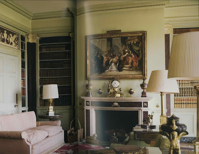
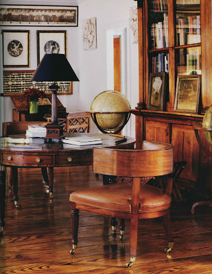
 OK, so here we go. The room, above, is from Regency Redux, but would you be surprised if I told you it was from World of Interiors last month? I don’t think so. Even in color this room holds its own.
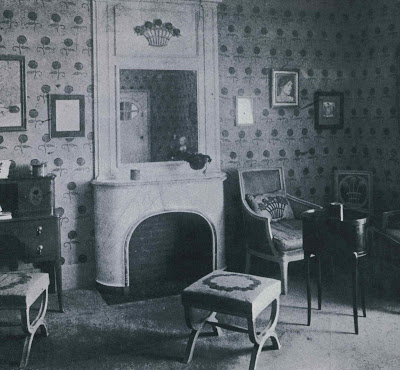 This room by antiques dealer Andre Groult appears to have one of Michael Smith’s favorite fabrics applied to the walls. The X benches, of course, are an element that appear and re-appear. One of the things I had to edit around a bit in putting together the first post was art and flowers; they are dead give aways for dating a room.
The room above, poorly scanned, encompasses all the elements of the 1940’s Connecticut farm house that is my particular back story. Formal and cozy at the same time it is all the things I’d love for my home to be.
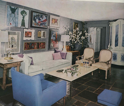
This jumpy little number could be straight out of domino when you erase the color. Circa 1960, as you might guess, many of these pieces would fit right into today’s scheme. Boxy, Hicksian sofa. Chrome and marble coffee table. Drum shade on ceramic lamps. Gallery wall, painted armoire and mix of old and new.
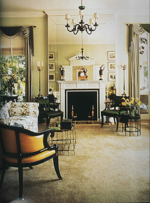
I’ve adored this room by legendary designer Ruby Ross Wood since
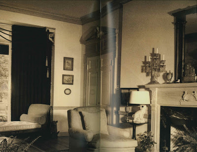
Jennifer posted it originally in her endorsement of Regency Redux. Besides the mirror surrounding the fireplace it still reads beautifully; coincidentally, the color palette does not date it. Remove the swags on the curtains and it could be published today.
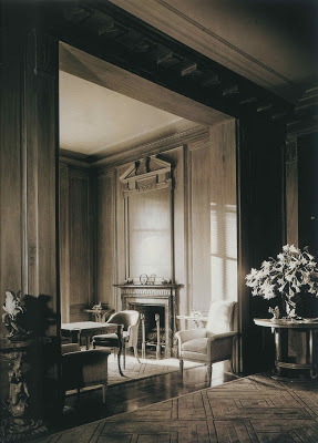
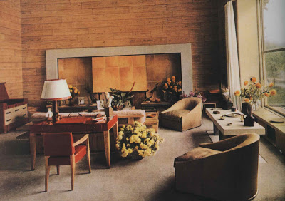
Gorgeous. T. H. Robsjohn-Gibbings, 1937. Even the flowers are right in this one.
This room was a surprise to me. I like it better after seeing it in black and white. There must be overhead lighting (even beyond the chandelier) and I am missing lamps. I’d replace the glass on the cocktail table with some sort of stone, but otherwise, I really, really like this room.
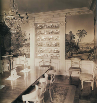
Fantastic in every way, Billy Haines’s own dining room. Heaven.
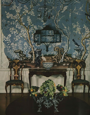
If it weren’t for the grapes would you know this was vintage?
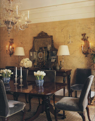
Smith.
Smith, again, but look back at yesterday’s post. They could be vintage images.
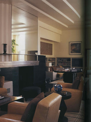
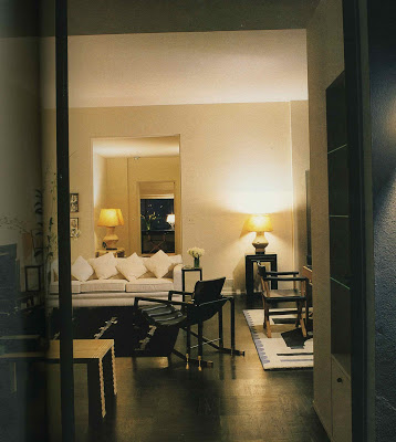
Andree Putman, 1987. Even though this room is not traditional, it is classic in design. A sofa, a pair of chairs, the lovely enfilade. So chic.
Paul Dupre-Lafon, 1938.
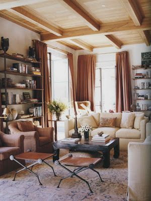
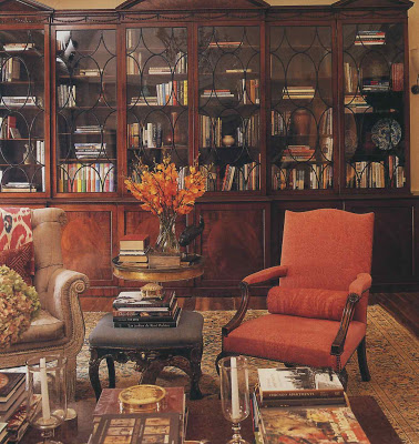
Again, Smith.
And, again.
But this, you might recognize, is Chessy Rayner for Bill Blass.
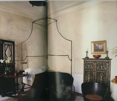
While there are elements of Smith here, plaster walls, iron bed, exotic pieces, there is not enough color and layers of fabric to be a telltale Smith room; this is Jacques Grange circa 1987.
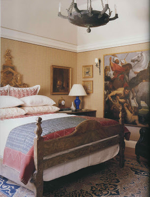
So, are they all more appealing in color? What are your favorites? Old or new?
Photo credits as follows: Ralph Dutton, RR; Andre Groult, RR: Hugh Chisholm, RR; Henri Jova, HG Complete Guide to Interior Decoration, 1960; Ruby Ross Wood, RR; T.H. Robsjohn-Gibbings, furniture & interiors of the 1940’s; HG Guide 1960; Billy Haines, RR; Govenor’s Palace, Williamsburg, HG, 1960; Smith, Houses; Smith, Houses, Andre Putman, HG Best in Decoration, 1987; Paul Dupre-Lafon, f&i of the 40’s; Smith, Houses; Smith, Houses; Chassy Rayner, RR; Jacque Grange, HG, Decoration 1987; Smith, Houses.


 OK, so here we go. The room, above, is from Regency Redux, but would you be surprised if I told you it was from World of Interiors last month? I don’t think so. Even in color this room holds its own.
 This room by antiques dealer Andre Groult appears to have one of Michael Smith’s favorite fabrics applied to the walls. The X benches, of course, are an element that appear and re-appear. One of the things I had to edit around a bit in putting together the first post was art and flowers; they are dead give aways for dating a room.





the grape picture cracked me up- my mom used to have plastic grapes in her “summer” arrangement on our coffee table- in the incredibly natural and lifelike grape colors of turquoise and chartreuse, no less. sounds a bit icky now, doesn’t it? but i thought it was rather chic as a child.
Fabulous! The images of Paul Dupre-Lafon and Robsjohn-Gibbings are priceless. Are they from the book by Anne Bony? I’ve had that on my wishlist forever!
Suddenly old looks new again in color.
love the Paul Dupre-Lafon and the Putnam best.
fascinating! just fascinating!! there are some older ones that to me are really dated – particularly the one you really like. but there are some that really shocked me – Haines dining room – looks like today — soooo beautiful. The Robsjohn-Gibbings is stunningly gorgeous. love this post. funny how every one is talking about the Smith book – that is the strength of it. You know = I wondered about his coauthor too. the difference between the two books is staggering, I think – do you agree?
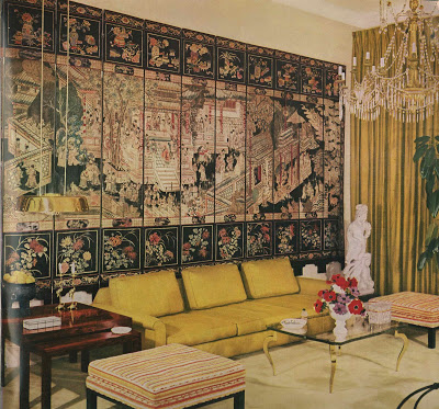
For me they are more appealing in color. The yellow/gold sofa juxtaposed with the lacquer screen is stunning. Billy Haines’ dining room is always a favorite too. And the Smith rooms are just more joyous and warm in color.
Darling M – just wondering what my boys will think is icky someday; sounds like your mother was quite in step with her time.
Suzy – they are and it’s a wonderful book if the 40’s appeal to you.
Patricia – I had not studied the Putnam room before and now I adore it. So clean.
Joni – I noticed last night in the acknowledgments that Smith thanked Pittel for capturing his voice; I agree that she did an excellent job of making Smith seem very real. It make the entire book sing.
Courtney – me, too. But I have to say, I don’t miss the color in the Robsjohn-Gibbings room – it’s almost irrelevant. I think Smith is as much a fabric junky – which I respect – and it’s so much fun to see what he brings to play with each time.
The Chessy Rayner for Blass , and Dupre-Lafon get my votes. I remember my Mother having the plastic/rubbber fruit in bowls as well!!
I didn’t know you were serious about adding color!!! My favorite is that 1960’s room, I linked to this post fmo my blog! Thank you!
May I comment from the gardener’s point of view? I think if you have a very formal, traditional room with an epergne, then (real) grapes are the way to go. Today, they’d be more lush and full with perhaps a dahlia tucked in for contrast. I don’t see that image so much as dated as the ideal, classic solution. (And for a very contemporary setting, turquoise and chartreuse grapes would be a kick)!
I love the mass of lilies in the Robsjohn -Gibbings but you would barely be able to breathe for the overwhelming scent. I think the scent would throw off the balance of the space if you were actually standing in it. The lilies in the Jacques Grange room and the calla lilies in Bill Blass’ apt. are perfect for then and now — at least for my taste.
Wow. This is so mind-blowin, so inspirational and such an example of what my design insides aspire to be on the outside! I live in Fairway, KS in a tiny cottage-home… 832 sq ft total. My living room is miniature, too, and I have a glass topped coffee table to add the illusion of more floor space. It has brass legs too, like the photo with the large Asian screen. What bothers me is the brass, not necessarily the glass. Is glass more dated than brass? (bonus because it rhymes)
I think that the only ones that I really like better in colour are those rooms with a limited palette. Which kind of makes them black and white anyway.
Great topic, and one so seldom discussed.
The black and white films of the 30s, 40s and early 50s have never struck me as devoid of colour, any more than an etching or engraving requires colour to get its message across. Yet it can be instructive to see interior design both ways. My first exposure to Nancy Lancaster’s famed yellow drawing room was in a book that showed the room in black and white. It was thrilling, but had nothing like the impact of seeing it in Derry Moore’s colour photographs a few years later.
And when I finally got to visit that room” in the flesh,” the many tones of subtle yellow were more apparent than ever they were in photographs. The Jansen book illustrates Boudin’s work in archival black and white. They are lovely rooms, but you learn far more from the occasional image in colour.
The first picture obviously has a Napoleonic theme – from the David picture of his coronation, to the “N”s on either side of the chimneypiece. There are other Empire style elements too. It’s interesting, but not my favourite from your selection. That would have to Andree Putnam’s.
Wonderful blog!
I think the name of the designer referred to as Putnam is actually Andree Putman:
http://www.andreeputman.com/
Marianne – thank you so much – I've corrected it.