Uncertain economic times can make one anxious. Fortunately, good design does not depend on your pocketbook.
In this vintage layout from House Beautiful, the editors highlighted several designers who rose to the challenge of the Royal Oak Foundation (the American arm of the National Trust of England) “to prove that good design can work within budgetary restraints.”
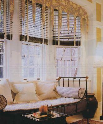
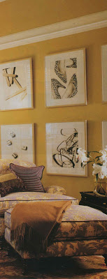
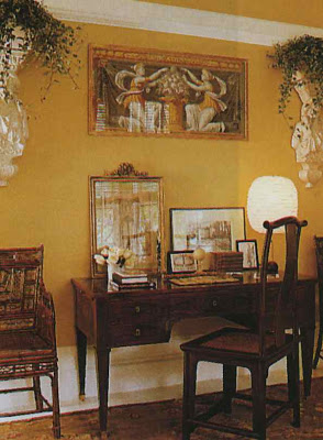 The three images, above, are Katie Ridder and Peter Pennoyer. Ridder was committed to lavender toile and after a good, long hunt settled on this Manuel Canovas. Hmmm… Canovas is not usually so easy on the pocket book, but the designers chose inexpensive upholstery and reproductions to stay within the guidelines.
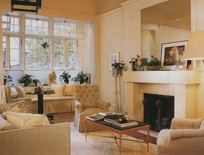
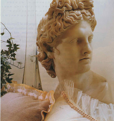
Mariette Himes Gomez designed the space above and below.
The article mentions her preference for things “strong and gentle, plain and fancy.” It does not mention how she kept the design from overwhelming her budget, but the simple, textured fabrics could be had for a reasonable amount. In addition, the mirrored tiles over the fireplace make a big statement without breaking the bank.
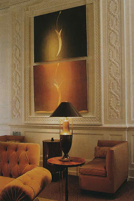
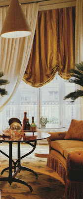 Stephen Sils and James Huniford focused their seating area on the center of the room for this parlor.
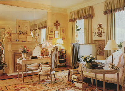
Today, curtains out of the box via chain retailers might take the sting out of this more elaborate window covering.
And, hello, Ms. Moss. Who knew Charlotte Moss could design on a dime?
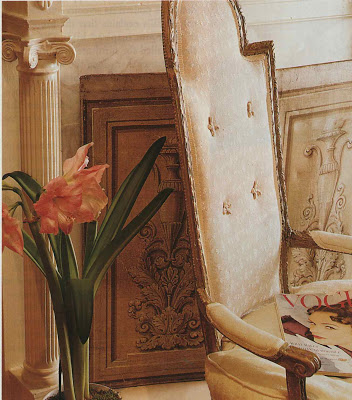
Yet, she did, using inexpensive green corduroy for the curtains.
And last, but certainly not least, David Easton created this smashing space and did share his tricks. Easton used a favorite beige and white stripe, this one a from a discount fabric store, to hide the flaws of the room. He used masonite painted to look like patinated bronze to create the fireplace surround.
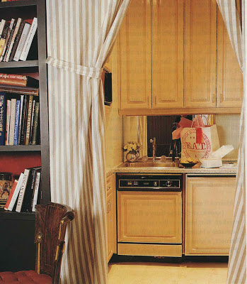 Cork tile for the floors proved inexpensive and sound absorbing. The kitchenette can be hidden by the curtains. Easton did use his own English antiques as a nod to the foundation. A wonderful idea if you can get your designer to go for it.
Photography by Antoine Bootz. Sadly, I have not retained the entire article and did not note the date. Darn.

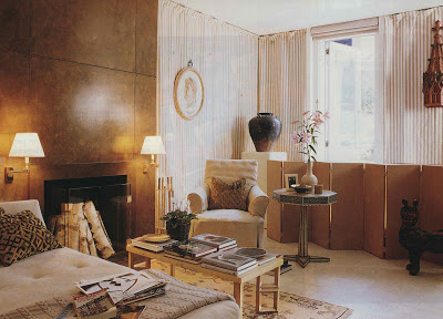
I love this classic kitchen you can hide behind this striped curtain – very chic for a bachelor pad… so much cozier than the usual stainless steel kind which has been ubiquituous in the last 15 years…
You ALWAYS inspire me, Mrs. B!!!
Well, if Katie Ridder was involved, it couldn’t be but so old, right? I mean not several decades?
The yellow and lavender seem to forecast her penchant for vibrating color combinations. And even that valance is like the beginning of her interest in bed treatments, seen more recently in Elle Decor.
I adore the chairs in the Sills/Huniford room.
I think when one is challenged with a budget, or with limitations, they merely present us with discovering that one can add style and grace to life in an ordered and restrained fashion. Some of the best of times are those with limits.
We can all give it a good old college try, right!
I visited that particular showhouse (circa 1993) and was struck by the lack of finish in many of the rooms. Your examples were notable exceptions. The Charlotte Moss room had real character, the Sills/Huniford salon made Tobacco fashionable as a colour, but the Easton room (the work of a gifted assistant whose name eludes me) was easily the most forward thinking of all the spaces and the best illustration of Style on a Dime.
hansaxel – especially as the walls are draped as well – a particularly cozy retreat.
mimilee – thanks!
Courtney – see Toby’s later comment – likely early ’90
s. I’m such a sucker for a metal day bed.
pt&e – the room is very chic.
Patricia – sometimes it’s even better, isn’t it?
Toby, darling, what don’t you know? Of course you were there! Naturally. I agree, the Easton room really resonates. I’d love to acquire a pied-a-terre just like this in NYC. I admit, I edited even the HB selections; a few seemed a bit sparse as you noted. Thanks, too, for letting us know it was an assistant; I hope he/she got the pat on the much deserving back.
I love the idea of corduroy curtains, and Easton’s trick with the masonite is genius!!
Jennifer – I agree – it’s very rich looking.
I’d be happy with their budget for sewing!
Somehow I still can’t imagine these rooms really fitting my own measely budget. They are really beautiful!
Excellent post, Mrs. B. . And it serves to prove that if you can develop your eye, almost anything is possible within your means. I’m still working on the eye part, though. Posts like this one help tremendously.