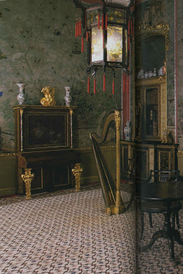
Ah-ha! This was it. The elusive image that was supposed to be yesterday’s post was not in a vintage design book as I supposed, but a historic room in a new design book.
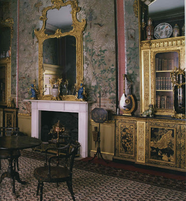
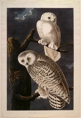
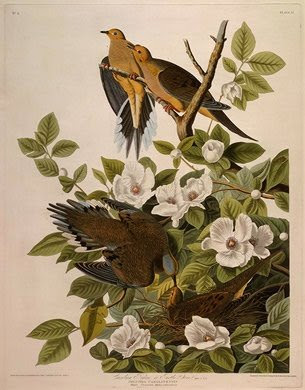
Just as I was pondering the repurposing of existing pieces for the Dream House I came upon this stunning room from Regency Redux by Emily Evans Eerdmans. Eerdmans notes, “The Prince Regent’s mistress Lady Hertford further embellished this hand-painted Chinese wallpaper with birds cut our from John James Audubon’s Birds of America, in the Chinese Drawing Room at Temple Newsam.”
Now, you might not think that Chinese paper needed further embellishing, but Lady Hertford clearly did and I applaud her efforts. This is a handy little do-it-yourself project requiring only Kindergarten skills. Cut and paste. Everyone can cut and paste.
You could even paint a little vine. Vines are easy. A swirly line and some leaves. Cut out a few birds while you’re watching TV. Easy.
Later editions of Audubon’s Birds are currently available on line for under twenty dollars. Lady Hertford applied her shears directly to the pages and you could, too, if you have the heart to cut up an actual book. I’m not sure that I do. I would march my book down to a local copy center, but I’m not going to suggest that here as it may stir up all kinds of copyright debate which would be tedious.
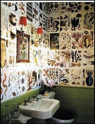
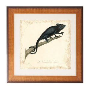 The images from the boxed sets of Natural Curiosities would also make a great impact.
 Or you could skip the cutting and use the whole page as Stephen Gambrel did here.
 The images from the boxed sets of Natural Curiosities would also make a great impact.
  Or you could skip the cutting and use the whole page as Stephen Gambrel did here.
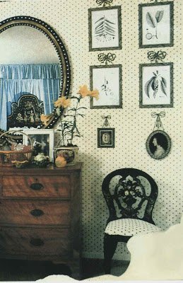
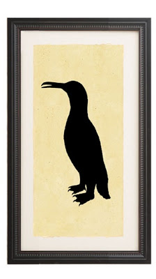
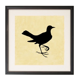
Their silhouette prints would create a jazzy little print wall like the one by Parish-Hadley in this vintage photograph of a New York apartment.
Wrapping paper is another source of inexpensive images.
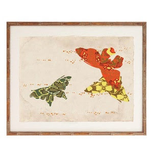
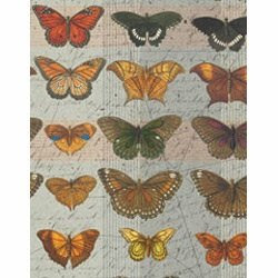
These butterflies from Paper Source would be happy to stand in for this Schumacher paper.
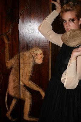
And if you don’t believe me, do check Hollister Hovey’s fabulous Walton Ford screen project here. Those Hovey girls are talented (this is Porter wearing feather eyelashes for Halloween) but even they make is sound easy.
I think I have everything covered here, but just in case, two images, top, Regency Redux, Emily Evans Eerdmans, next three birds, Audubon, Gambrel image via Style Court, Parish-Hadley room from Albert Hadley: The Story of America’s Preeminent Interior Designer by Adam Lewis, Schumacher paper, Porter and screen via Hollister Hovey, the remaining images from Natural Curiosities. And, yes, the Irish Georgian mirror is mocking me.



Good lord, Mrs. B.! Another amazing post.
There are a thousand things to commend, but mostly: I am getting out my shears (not really), adoring Porter’s eyelashes (really), and trying to remember if I saw the Gambrel wall on a glossy page, previously, or in a fitful dream. It is splendid.
Magnificent job, as ever.
so this simple skill you speak of? that any kindergarten child could do? not as easy as you make it sound – at least for moi!
i had this fabulous idea to decoupage pearl river tea paper as wallpaper (idea from meg’s blog) with butterflies cut from paper that i found at a craft store. spent an evening making sample boards to show to a client the next day at our meeting but never even got that far- because they looked as if they were indeed made by a 5 year old. an extremely poorly coordinated 5 year old at that.
there must be technique i am missing- i mean john derian can made a career of it, and i can’t even make a board with some butterflies pasted on it, look halfway decent?
got any tips for me, mrs b? 😉
(and sorry for the rant- i hate when i try something and it doesn’t work- the 5 year inside me positively throws a tantrum!)
Saw your room pic in House Beautiful ~ Simply wonderful! Had to come check out your blog (esp as a fellow blogger!) the moment I read the site name; got the ref immediately! Enjoyed your site very much and will be back… Great day to you Mrs. Blandings
“Print rooms” were very common in English homes and a few American homes during the 1860-1880s or so. I wish I could remember where I gleaned this little nugget of info but I cannot recall it right now (I think its called menopause!) I’ll let you know more about it if I can find it in my design books. Anyway, I love it, too.
And I just love your blog – read it everyday!
SuSu
this reminds me of the botanical wallpaper Linnaeus made famous in Sweden. Apparently his original prints were used by the wife to paper the house to keep the house warm. Now the house is a national treasure – and she was just trying to save money.
I am having a deja-vu of when my mother and I made decoupage handbags and used tiny scissors to meticulously cut out images for these box like bags, some were house shapes and others looked like the shape of a metal construction lunch-box with bamboo handles and the insides were equally as elaborate. Oh where did those things go? Some yard sale? You always remind me of my childhood days with these sort of crafty DIY’s. Love this!
Haskell Harris just did a post on how she covered walls with map-printed wallpaper and Elmer’s glue 🙂
The Newsam drawing room is one of my favorite parts of Emily’s book.
I’ve always loved this room; I’m going to look for the Ferdmans book!
I also am planning to make a screen with copy center enlargements – the outsized ones that architects use. I’m also imagining a dictionary illustration blown up to,say six feet high by whatever it takes. Or a room papered in blown up line illustrations of elaborately carved panelling. I love Kinkos!
In case you are interested:
http://gardenandgun.com/blog/diy-map-wallpaper
I love the powder-room. For years my husband and I have saved all of the quirky New Yorker covers. We thought we might use them in the powder room in our first home. We never did it- but still a fun idea!
this post is so fabulous.
i think i could spend more than a month in the first room.
they are sooo ‘period’.
and the paper, how clever she is to improve on what i consider perfection.
chinoiserie !!!
Victoria – This image is from Gambrel’s previous home in Sag Harbor (his current Hamptons abode is in the December issue of World of Interiors) which was originally published in Elle Decor, June/July of 04. It was a stunner.
I am so thrilled you picked out this picture from RR – it was the only one I commissioned for the book. Temple Newsam recently did a more authentic furniture plan, and insisted I use a new photo.
The idea of Lady Hertford cutting up this wildly expensive book seemed to me to capture the spirit of excess and over-the-topness of the Regency period.
Great post – makes me want to sharpen my scissors!
EEE
Darling M – I’m puzzled. I don’t know why this wouldn’t have worked out as it sounds wonderful. I just read Haskell Harris’s post and for her map wall she thought it worked better because the paper was thicker, which I can see. I wonder if your paper was too thick which created a heavier edge? The size of the scissor should not matter too much, so using larger scissors that are more comfortable in your hand should be fine. Durwin Rice “taught” me to decoupage through is book and he has a good reminder that if you need to cut into the image to get that tight edge it won’t matter as you are gluing it down anyway. Also, the seal does help blend it together. It had to have been something technical as your eye is unerring, so I know it wasn’t placement. Darn. I hate projects that don’t go the way I want them to.
Aria’z Ink – so glad you stopped by!
Susu – thanks so much. The little I know about print rooms could be held in a teaspoon.
Joni – A girl after my own heart!
Patricia – now I want one of those bags. Your mother is the best.
Courtney – I was there yesterday before the post, I swear! Now I feel like a copy cat. Didn’t that hallway turn out terrific?
Debra – I think Megan of beachbungalow8 parents actually did their basement powder room with New Yorker covers – fab.
Renee – you have to love a girl who would look at that paper and thing, “It just needs a little something…”
Emily – my only regret is that my scanner isn’t bigger as I would have loved to show the room as it is in the book. And while I could have used the “right” side of the page to show the paper, I couldn’t give up the tassels on the lantern.
Mrs B, this sounds like the time I practiced doing your silver leaf vine technique, what a mess I made of it! (not on the wall). However, two of my favorite botanical prints came from a calendar, I had them matted and framed, and voila! Love Gambrel’s Powder Room! I have a friend who does amazing decoupage, I mean astounding. Some people have it ……..you of course are one who does!
Looking again at the Parish-Hadley print-room type wall jogged my memory;
years ago, The World of Interiors had an article on a print room (or print rooms( and had an address for the frames and bows and all the accessories for a classic print-room.
It may have been the Victoria and Albert Museum but for sure, it was in The World of Interiors – a long time ago..
I tried decoupage, too. It all depends on how sharp the edges of your image are, how good your eyesight is and how steady your hands are. The rest is easy!
Patricia, I would never have the time to do a project like this b/c I’m so tied up ironing my linen napkins!
you are so right, i would say something like; “if only it had another bird here and one right over there”.
who says we can’t improve upon perfection, even if it is only in our very own minds eye.
you are the best !
I forgot to say the post is wildly creative! So comprehensive and very original.
I was caught up in the collective design unconscious thing 🙂
I have a bartender friend, ex-art school boy, who needed some extra cash so he got a part time gig pasting stuff for John Derian. Woah did he laugh at me when I’d fork over $80 for a plate to hold my keys (or nothing). “I used to make those things for $10 an hour.” Paperweights I understand being simple, but the domes? That’s really gotta take skill. Or be at least worth $15-$20 an hour.
I am sooo coveting the chinoiserie lantern…just beautiful….great post!
This is great inspiration! I’m working on a wall display and am constantly looking for new ideas. Thank you for a great post!