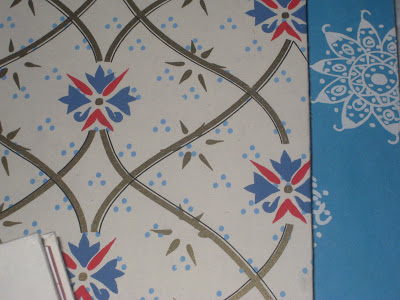
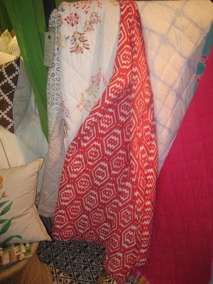
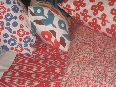
 John Robshaw is dreamy. If you want to think I’m referring to his bedding and rugs and furniture and journals, you may.
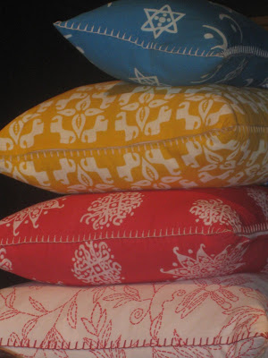
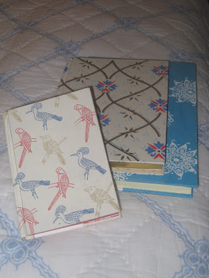 The journals are a fun addition to the line. This way you can carry around a little bit of hand blocked heaven every where you go. Blue Stars, the turquoise with white, is a personal favorite.
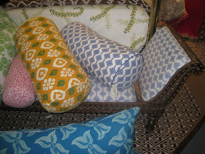 Regardless of the prediction that this is the year of yellow, I did not see a preponderance of offerings in this color. Robshaw’s Fern pattern offers a great way to work yellow into your color scheme with a white background and bright green leaves with yellow flowers. The Maharani bolster, above, is a similar scheme.
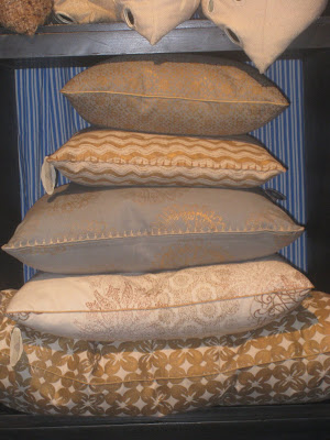
But if you don’t care to live your life in a riot of hues, these metallics certainly offer a way to enjoy Robshaw’s designs with a neutral sensibility.

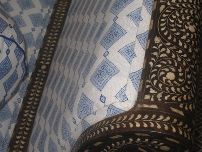
I LOVE these, love love love. Block print, boho-yum.
You and I are swooning in exactly the same places.
Lucky you! It sounds as though you had a ton of fun in NYC!
My all time favorite!! Love everything he does, and yes he looks quite dreamy, too. I think I am drawn to his designs because try as I may, I just cannot do neutrals(although if forced, I would choose his) – I am just a color girl. Thank you for sharing his latest and greatest!
pattern on top of pattern,on top of pattern, on top of pattern.
when done right, there is NOTHING better!
Great to see photos of the store. I’ve been wanting to go next time I can get to NY. The blue and white and inlay sofa is amazing, but red and white gets me every time.
Glad to see you guys like the new stuff, too. It was quite a thrill to meet him in person.
You know I’m smiling.
I’m coveting that bench at the foot of the bed and all the new designs. You are so right — the journals are a great way to grab some very affordable Robshaw!
somehow these rekindle my inner hipster.
coveting a collection of those journals.
ideas for each one.
oh some of all my time favorite fabrics. Glad yellow is getting some extra praise this year, but I am loving the blues and reds! I miss all my old spots in nyc and love seeing them all through your trip- thanks! You can’t go wrong with anything from JR!
Love John Robshaw, and those patterns do work so well with combining as many as you like!
I am so sorry that I did not get the chance to meet you! I was exhibiting on Pier 94 with three booths! I have only missed a couple of shows on the Piers since 1995. It was a fabulous show, I have not had such a great one since the economy started it is down turn. It has left me feeling so positive about the economy – despite what the pundits and press say! I have added over 100 colors to my palette and I think that has helped with its rejuvenating effects.
Love. Love. Love it.
I was surprised with the “yellow” thing that all the design/marketing agencies were spouting about for this year since yellow was everywhere last year…odd.
john robshaw is just plain old dreamy. And I can only say this on your blog as Nick gets into a fit of jealousy whenever I mention how hot some design guy is. (laughter)
I never tire of his prints. They’re beautiful and for a beach house, perfection.
oh, swoon is right. i love how easy he makes it to pick up a few pieces from one collection to create an easy eclectic mix of patterns. those metallics are divine!