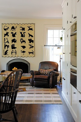
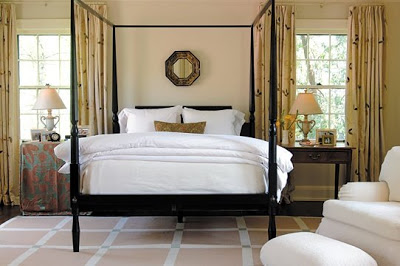
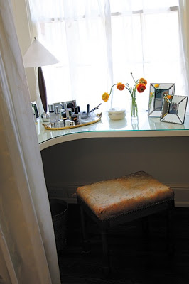
When I posted Dee Dee Arnold’s apartment recently a few folks asked if I could get my mitts on any more images of George Terbovich’s work. Unlikely, I thought, until my editor from Spaces reminded me that they had run another of George’s projects in their June/July 2006 issue.
A little surreal, isn’t it? I know, I’ve been off for a few days and you are thinking that I am a bit confused, but no. Same George.
And the thing is, neither of these homes typifies his look. I’ve seen three others besides these two that Spaces has published and they are completely distinct.
There are some similarities. An intense focus on detail. A commitment to wait for the right piece. Truly, perfect pitch. Each time.
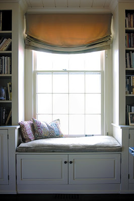
There is the unobtrusive mix of old and new.
A dedication to revealing the voice of the owner, not the decorator.
I see these images and wonder what George would think of my jumble of color and hand-me-downs and nonsense.
I do know he wouldn’t come in and wave his arm and say, “White! It needs to be all white!” Because that isn’t me and he isn’t interested in inflicting his taste on anyone.
All photos courtesy of Spaces; photography by Landon Collis.

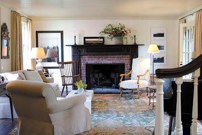
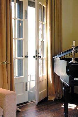
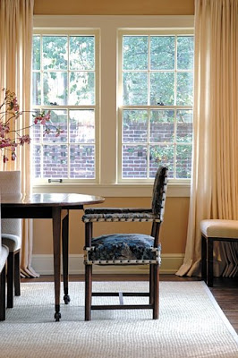
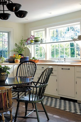
I feel your burden, so why not lighten your load and inflict me. Editing is an art.
Simply lovely! Thank you for digging these images up for all of us. What a treat.
-GSG
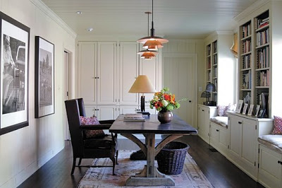
Oh a dream~ that work table/desk in the library…. Our own style makes a house into a home. I’m sure yours is one of warmth and comfort with your own special style.
That should be the job description for decorators. If they want to be stars they should become actors.
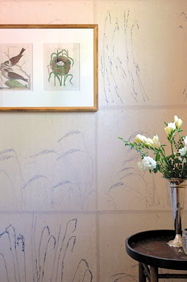
Two things – ….”revealing the voice of the owner, not the decorator” – so well said, I love it! and the wall behind the bird and bird nest prints, is it wallpaper? It is wonderful! Oh, and one more thing – the part about your jumble of color and hand-me-downs and nonsense…. that is my constant challenge. Oh, to be able to edit…Thanks for a beautiful post.
So interesting that George truly is a super star in the design world.It is his art form to be able to put it all together as you say, “revealing the voice of the owner”
I believe that is a lisa grossman painting on the mantel. she creates the most amazing plein air landscapes of the Flint Hills in Kansas. if you are ever in KC check her out at the Dolphin Gallery!
Patricia – because if I had you here I’d much rather sit on the sofa, drink wine and talk!
GSG – honestly, my editor did the digging. I’m just as grateful.
Debra – I love the table as well – but it’s the combinations with the lights above it that make it fantastic.
HoBaC – Indeed.
HCHG – the wall is hand painted. Truly lovely.
Karena – I completely agree.
PJS – I need to get down to the Dolphin – I’ll try to make it next week to see what is up for First Fridays and report back.
Oh my heavens that vanity table is faboo. I think it would actually inspire me to do things like buy a curling iron just so I had an excuse to sit at it.
So very fresh, clean and lovely. Why oh why can’t I be more tidy?
I am certain I would get so much work accomplished if I had an office like that. I would be motivated to clean and buy myself fresh flowers and somehow I would become smarter and more refined. I’m just crazy for it.
Beautiful, I enjoyed your blog it’s very inspiring!