Every day I stop into the House of Beauty and Culture for both his sense of design and his sense of humor. HOBAC has a very sophisticated aesthetic. And a jaded point of view. He defines himself in his profile as being, “In search of the unusual in a world that is becoming increasingly and frighteningly homogenised.” Searching. Becoming, but not done. That seems optimistic to me.
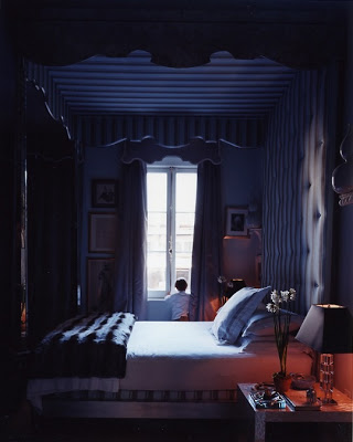
“Unless there is a cataclysmic shift in the collective consciousness, I don’t think that legendary rooms are any longer possible.
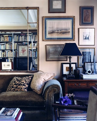
People now are too transitory and conformist, and readily influenced by the culture of the mass market.
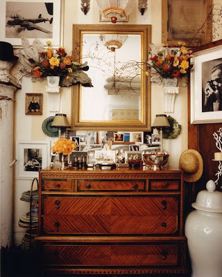
However, if one had to choose a legendary decorator I would choose Miles Redd. Given the right clients, he will be his generation’s equivalent of Parish Hadley.”
This response made me go back to Redd’s portfolio and look again. And again.
Pop back in this afternoon for thoughts from Magnaverde.
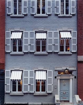
All images courtesy of Miles Redd. Facade of Redd’s townhouse, top, designed in conjunction with Gil Schafer.

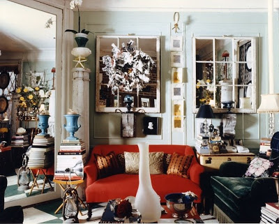
Couldn't agree more.
All of these images were on my mind too. The facade of the townhouse — I think he collaborated with Gil Schafer? Just amazing!
great post.
i went to the site, and am going back .
just wanted to come back and thank you !
xx
ok , i am back………miles redd is amazing.
love love love his work!
He's so brilliantly PERFECT! Oh, what I wouldn't do to be Mrs. Redd!!!
I was lucky enough to spend a day with House in London last fall. He's just one of the best people I've ever met!
I'm loving all the over-the top interiors you've been featuring…or are they? The feeling is rich because of all the color and meaningful objects to the owners and isn't that what personal space is all about? We should please ourselves and not slavishly copy the latest catalog cover!
I'm right there with anon 8:29. Miles Redd had me at the mirrored kitchen something I've been planning to do for years. And let me just add this: I think part of what is missing in today's interiors in the lack of spirit. Personal spirit and sacred spirit and by sacred I mean honoring what we hold dearest.
That's the great thing about looking at a person's work over a long period of time. Instead of having to start from scratch everytime a new client calls, he or she gets to build on what's already there, and expand & develop a vision, rather than create one out of whole cloth. Of course, that's a skill, too–Renzo Mongiardino comes to mind, who, for a price, could conjure an 18th Century Venetian palazzo out of thin air for a Bear Stearns gazillionaire (ah, the good old days!) just as easily as he could for a titled prince–but in the wrong hands, and used for evil instead of good, that kind of skill can sometimes can end up creating the decorating equivalent of a masquerade party, where no one is who he seems to be.
I remember a glossy magazine spread of a lusciously colored Beverly Hills villa, with shrimp pink walls, elaborate silk draperies, gilt bouillotte lamps & beautiful artwork in handsome period frames. The place was lovely, and it would have made a perfect setting for, say, a re-animated Elsie de Wolfe, but the real owner was–can you guess?–Mr. Jim Belushi, who was pictured barefoot, enjoying the sumptuous, silky splendor in sweatshirt & baggy shorts, playing with a big shaggy dog. But whether the place was a perfect expression of Jim's natural taste and the spread was just revealing a more refined aspect of his personality that most people don't see, or whether the Frenchified decor was a bit of intentional decorating camouflage for a good-ol'-boy who wnated to remake his image, or whether it was a heartless Emperor's-New-Clothes style trick on the part of his decorator, or whether it was just a particularly freaky instance of someone misreading the client's wishes, I can't say. I don't know the guy. Life's full of mysteries.
Anyway, that's the great thing about decorating for yourself, rather than for a client: you never have to interrogate the client to determine how he really lives (versus how he says he lives), and you don't have to rifle through his closets to find out what colors he likes, because you do that every morning, anyway. No, you already know all that stuff, which means there are never any unpleasant surprises, and no not-to-your-own-taste artworks to have to incorporate into the whole shceme of things. You can skip right over all that and get on to the fun stuff.
Clearly, Miles Redd has a lot of fun, and his various rooms show (and have always shown) a natural, confident use of scale and a consistency of style, starting with his very first published place–a crowded, Prazian apartment with not much room & even less light–to his super-elegant current digs where he's mixed up a spiffy David Adleresque floor treatement with items he's been hauling around for years, the only difference being that these days, the guy's got a more money to spend. But his distinctive look was there right from the start. But no wonder, since Redd's style starts with the eye & the mind, not the checkbook. Obviously, he developed his eye a long time ago. It might be interestsing to find out what his first real find was, and to see if he's still got it. My money says he does.
Scott – I just visited with him by phone and he is delightful and gracious as well. I'd start looking for a pumpkin coach if I were you – Prints Charming, indeed.
Magna – I agree on every point. I have the image of Belushi as it is the back of a terrific piece on Chahan Minassian – December 1992 House and Garden. I can remember the story giving me pause, though I did not keep it. Do you remember the designer?
Michael Smith.
I've enjoyed the 'Enduring Style' series no end.
Thank you, Mrs. Blandings and everyone! This has been wonderful.
Regarding the Jim Belushi house and what it might or might not say about his taste ~
I'll venture to guess that the Belushi house doesn't say anything about Jim's aesthetic.
It seems to me that the most likely scenario is that the Belushi house decor was a collaboration between Jim Belushi's wife Jennifer and the decorator.
KO – that does happen, doesn't it?
Great post and also very interesting blog The House of Beauty and culture. Miles Redd is in my top 5 innovators that I posted last week. Come and take a look I think you would like it.