If you blog on design and you are very lucky, you might receive a comment from Magnaverde. He should be blogging himself (are you listening Magna?) With a wealth of knowledge and an exacting eye, I couldn’t help but include him in my focus group.
“I don’t know whether, objectively speaking, there are really more talented designers working in the field than ever before, or whether that’s just an illusion fostered by our 24/7 media. These days, all it takes is one memorable room in a charity showhouse to become the darling of half the design blogs out there, and if the creator also happens to be hot, he or she will land a spot on TV for sure.
But being good-looking & charismatic on camera doesn’t mean you’re a good designer (or even that you’re a designer at all) and just being an incredibly gifted designer doesn’t mean you’ll even make it past the first cut on any of the popular “design” shows. I can see the casting director’s audition notes now:
‘M. Hampton–too patrician. B. Baldwin–too fey. deWolfe–ugly & old. J. Fowler–wound too tight (also, English). Robsjohn-Gibbings–talking head. Rose Cumming–cuckoo for Coco Puffs. Next group!’
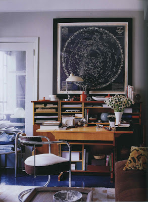
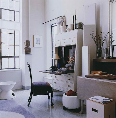
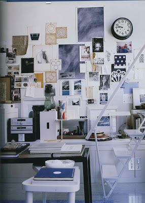
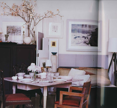
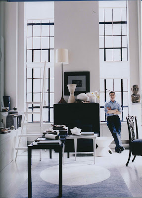
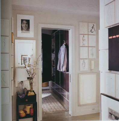
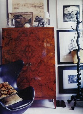
Anyway, I don’t know whose entire body of work will come to define the taste of our our times, but I can already think of a room that comes close and it’s one that–just like the chastely elegant salon that Jean-Michel Frank did seventy years ago for the Vicomte de Noailles–has already evolved from the elegant & pristine purity that it had when I first saw it 15 years ago (was it on the cover of HB? Met Home? I can’t remember) into a richer & much more fascinating look, one that now reflects less the discipline of the designer’s original concept than it does the inhabitant’s personality, broad interests & well-lived life, even though, in this case, the designer & inhabitant happen to be the same person:
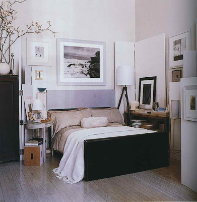
Ralph Waldo Emerson said “A foolish consistency is the hobgoblin of little minds” and O’Brien didn’t let the apartment’s original clean-lined look–handsome as it was–call the shots, but, instead, used its crisp white geometries to ground a casual-looking (and, apparently, ever-growing) assemblage of artworks in various media & furniture in various styles.
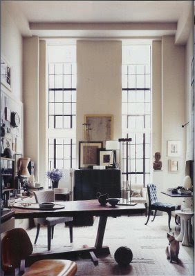
But he’s no slave to change, either. In fact, like the Noailles’ place in Paris, this is a home designed for the long haul. In fact, O’Brien long ago announced that he’ll never move again, which, in an industry based on the assumption (and desirability) of constant change, is not only rare, it’s almost revolutionary.
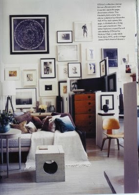
And if he’s as serious as he sounds about staying in one place, this apartment may end up acting as a sort of aesthetic weather-glass, forecasting changes in public tastes long before they become apparent to the rest of us.”
Images, top seven, Elle Decor, July/August 2006, bottom three, House & Garden, November 2007.

As usual, Maganverde never fails to surprise and delight…excellent and interesting selection.
And how haunting is that Emerson quote?
Oh, how I wish he would blog. Instead, I google him periodically to catch any of his comments that I might have missed during my usual blog reading. As usual, this was a treat to read.
He really should blog; such a wonderful brain and turn of phrase. And good choice re O'Brien too. But even better is his take on design greats who wouldn't have made it past the audition phase of any reality-television program.
Mrs. B: Agreed re TO'B (also love a long-ago spread on his country house, in tatters from frequent viewing)and MAGNA. And, agreed re: your selection of bloggers—loyal reader of all you've featured and daily visitor to the Dreamhouse. Also follow Elizgonz (above) in practice of googling Magna for his occasional comment. Am always rewarded with some tidbit…remain grateful for the daily reward of your blog. Have you ever seen the article, "When in Doubt, Act Like Myrna Loy"? (Although why do I feel it would be redundant for you—see you brilliantly, breezily, Blandingsly going through life—thanks for sharing in your blog, which continues to reward.)Any Mitfordania in the pipeline?
So… my design qualifications are limited to apparel which is to say, I am unqualified, entirely to wade into this discussion. I know only what I like to gaze upon and expect only that it also be functional. But in the end, that is the some total of what we all do, I suppose. I enjoyed Magnaverde's thoughts because they pull something more from my consideration regarding all the images I am inundated with… Typically, O'Brien is not a favorite of mine for just the reason M points out, firstly: Overexposure at a mass market level to stuff that makes me shrug. Secondly, his rooms always made my OCD crawl from what I preceived as unmitigated clutter. Lastly, for me, color is hope and I found his things too restrained that way.
Stopping to reconsider now, though.
Ah, anyway, who cares about the rooms? I am just glad to allowed into that thought pattern for moment in time…
I have been enjoying Magnaverde's comments across blogland and, too, wish he had a place of his own. Thank you for inviting him to yours.
This is an inspired pick- I have no doubt it will be one of "THOSE" rooms that is studied, envied, emulated but never duplicated- and that must be Its sense of place- the real X factor. LA
Years ago, in my pre-blogging days, I remember reading comments by Magnaverde on gardenweb.com's decorating forums.
This is indeed refreshing — and highly entertaining — commentary. I always appreciate Magnaverde's insights. This post should be required blog reading!
I love the pictorial on Thomas O Brien. His look is so cool & classic at the same time. I am a big fan of the look that he is so great at creating!
Leslie
Did you see that Heather at Habitually Chic was just in visiting Hickory Chair where they make that wonderful secretary in his living room! Yucky Heather to see his visions being created in person for us to all enjoy at our homes across the world.
I think that Thomas O'Brien was honestly my first designer "crush"…
Fabulous! I love O'Brien, great pick by Magnaverde, who I agree needs his own blog for sure!
Nell – I have seen that article and feel like the author is on the tip of my tongue. As a huge fan of the Thin Man movies I loved Nora's deft way of dealing with naughty Nick.
The Mitford obsession led to the Churchill biography, which I gobbled up. Sadly, the first few weeks of summer may only leave time for magazines.
"even better is his take on design greats who wouldn't have made it past the audition phase of any reality-television program."
Except that it's not true. Have you seen the competitors who make it onto, say, "Project Runway"? They out-eccentric, out-fey all the decorators in Magnaverde's list.
It's the conventionally behaved, conventionally appearing designers that are going extinct on reality shows.
I am loving these posts.
I never, ever, ever tire of seeing Thomas O'B's place… I could look at it 10 times a day and still discover something new every time I look.
It would seem obvious to all but Magnaverde that he simply must have his own blog. The comments are always entertaining, expressive and on the money.
Long, long paragraphs which, at this point in time, could be bound into book form. There's a thought…
But oh, Magnaverde, anyone who's ever heard Billy Baldwin speak wouldn't describe him, even for a moment, as "fey". The voice and manner were quite brusque.
Patricia, the choices are exquisite and Magnaverde blogging would be phenomenal.
Toby Worthington said…
"It would seem obvious to all but Magnaverde that he simply must have his own blog…"
Look who's talking. But I will if you will.
And about BB & his brusque manner: I had no idea. Than again, your firsthand knowledge of people & places beats mine any day.
———————————–
Thanks for your nice words, everyone.
I adore nearly every choice. Good, concrete and seamless selection.
Thomas continues to develop classic modern pieces that complement a wide range of interiors. His passion for design is contagious.