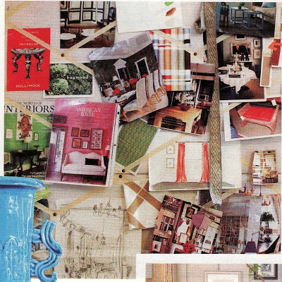
Just a few thoughts as I wrap things up here. Courtney Barnes at Style Court sent me these images that she had saved (and cropped) from Ruthie Sommers’s inspiration board that appeared in the first issue of domino, 2005.
I need to find a spot to put a board like this as I usually end up with piles of stuff on my desk for weeks on end. But I thought the board was interesting because you can see that Sommers was inspired by other designers’ work. Miles Redd noted this as well and many readers commented on the fact that he was inspired by the work of his contemporaries.
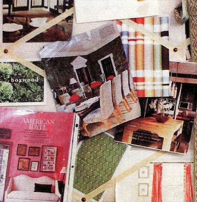
It’s likely that each of us has different elements that jump out at us among Sommers’s creative jumble – the Smith dining room, the most excellent green on the cover of World of Interiors, the graphic punch of the stack of stripes.
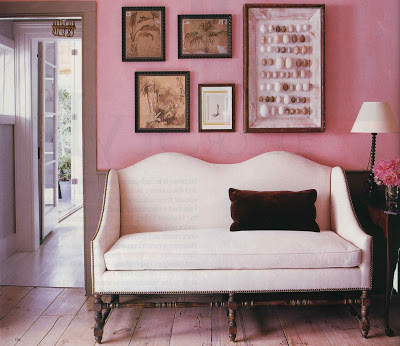
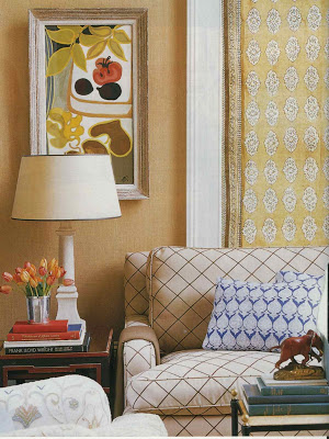
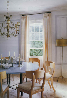
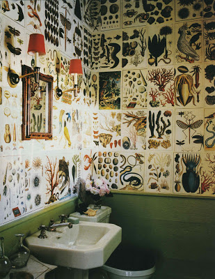
But I continue to feel the tug of Steven Gambrel’s second Sag Harbor house that appeared in Elle Decor, July/August 2004.
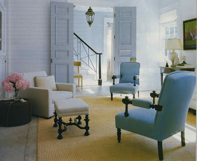
I can still recall opening that issue and the mental gasp when I saw these images for the first time.
Aesthete’s Lament also noted, “Gambrel’s first Sag Harbor house was genius… pure genius.” The Aesthete went on to say that Gambrel’s color sense is exemplary. I must agree.
The gift of that color magic, with the unerring eye and, most importantly in this case I think, some budget constrictions resulted in something particularly special.
This house, I think, will come around again and again as one of the examples of an enduring aesthetic of our day.
Designers’ own homes often seem the mad scientists’ laboratories and how I do love to see what they are cooking up.
Images, top, via Style Court; photography for the Gambrel images by William Waldron.

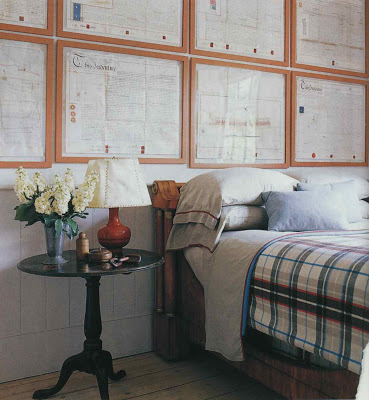
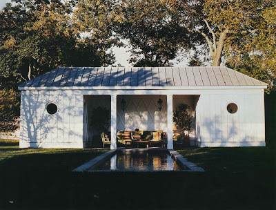
LOVE Steven Gambrel's work and I, too, gasp with anticipation sometimes when I first see a room that I love. I want to be in that last photo – right now, with a good book and glass of wine….right now…….okay, maybe with a few close friends, too.What a perfect spot.
I remember the first time I saw that sea life bathroom, I threw myself back into my chair & lost my breath.
Its definitely the unexpected that always grabs my soul.
I suspect that your board wuld need to be the size of a large wall.
I came to visit after hearing you Skirted Roundtable. I've found inspiration on my first visit, so I'm sure I'll be back often. Thanks. laurie
I live right near Sag Harbor–each year there is an exhibition house taken over by designer's and you can view for a fee-stunning!
Steven Gambrel is the best- love his work.
These are all "money" rooms in my book, too! I had great difficulty narrowing the field when Patricia asked me to participate in this terrific series.
Truth be told, I could've easily mentioned 25 – 30 most memorable contemporary rooms. I've heard from an acquaintance who writes for a shelter mag that Gambrel's city house is even more spectacular in person.
Gambrel is such a talent. It's not hard to see why you're drawn to his work!
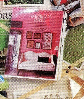
Yes yes yes! That gambrel house is a shining star in my memory too! That first shot of the pink hallway with the camelback sofa and framed eggs is an all time favourite, and the bathroom 'wallpapered' with old specimen prints is such an inspiration. Gorgeous and thoughtful post!
That image from Steven Gambrel's home really inspires me.. I would love to go pink. I don't have a room at the moment it would works in!
I remember that series. I wanted to throw out everything I own and start over.
I think some of my friends would agree with that "mad scientist" comparison.
do understand the "mad scientist" laboratory all too well! Constantly trying to surround ourselves with inspiration. Thanks for inspiring me.
I saved that image for those blue chairs. I could be a lab rat for Gambrel.