Faux painting took a bad turn somewhere in the 80’s (90’s?) and the baby got pitched with the swirl of marbleized bath water.
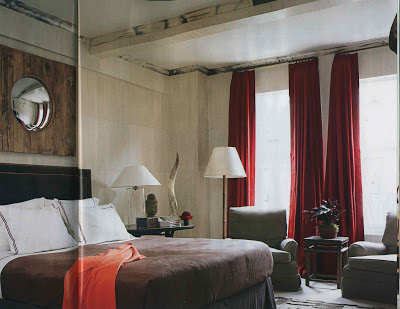
 But the Miles Redd designed faux ivory and horn bedroom, above, is a striking reminder that in good hands faux can be fabulous.
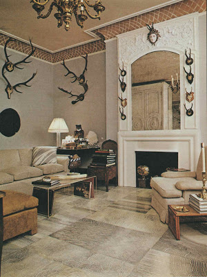
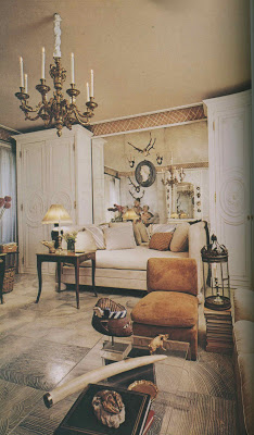
 There are wonderful examples from back in the day of course. The Manhattan apartment of Kansas City native and decorative painter Richard Neas featured a floor of “large squares simulating the striation of cut agate.” Neas painted the treillage at the ceiling as well.

Horn and ivory would take a pretty practiced artisan, but the finish on the floor would be an easy project for any do-it-yourselfer. For a closer look click the images.
Redd images from House Beautiful, July 2009; photographs by Thomas Loof. Neas’s apartment appeared in the New York Times Book of Interior Design and Decoration, 1976 by Norma Skurka; photography by Norman McGrath.


The Neas apartment is one of my all time favorites. The color scheme, faux finishes, and exquisite choice of assessories are wonderful! Thanks for a great post!
Marion
Mrs. B. – this further confirms his staying power. True decorating is about being able to reference techniques and make them relevant to one's time.
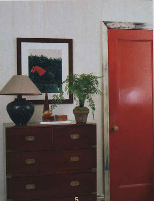
Such a great point Patricia. I never tire of Miles' bold doors.
Mrs B. It is true, Not just any old hand can go faux- I had a brilliant decorative painter and mentor who did it perfectly- I jumped over the blog moon as a tribute to him when he died in Dec 2008.
long live the good faux.
wonderful post as always and love the photographs that withstand the test of time. la
Now THAT just might reinstate faux painting in my "DO" column!
Well-done faux will always be welcome in my home!
Faux design painting is a true art form, taking a trained and discriminating eye. The treillage is beautiful, I can feel the neck strain, doing all of that detailed work!
This post just confirms my desire to have a Portuguese chest of drawers faux painted. It is so beautiful when done properly. Thanks!
I have had great faux lamps that were done in the 1930's. When something is done well it will last forever.
Mrs B;
Beautiful examples!
For some of the best examples of faux, look to subtle designers like John Dickinson, Andree Putman, Jean-Michel Frank who bring a little wit into the picture. They'll do faux architecture (a la Frank at the Guerlain headquarters on the Champs-Elysees, with Bebe Berard embroidered walls), or Andree did faux ivory or the palest soft wall effects. John Dickinson loved the effect of faux ivory or faux pine-wood on a table. I have a table he painted by hand in faux black and white gingham. Pretty great.
Perhaps I need to look further into this. I can't decide whether faux exists for it's own sake or is a subtle play on the trompe l'oeil.
Remember when faux was plain ole fake?????
Thanks for piles of Miles. He's such a treasure.
Just blog hopping and enjoyed reading yours….I love making new blog friends and love looking at all the different blog designs.
Mrs. B,
I like some soft faux's but where I am in Ga, there are many homes that are way overdone and it is not lovely. The neutral tones and soft marbeling is nice though.
Blessings…
Completely agree that when it is done well it's terrific, but when done badly (Renae) it's horrid.
Marion – I do wish I had more than just those two views.
Courtney – a great use of color that never looks like it was inspired by a bag of Skittles.
Diane – I want to see those tables!
I called MOTH over to have a look at this post Mrs. B. As part of his 'Dowry' when we plighted our troth 15 years ago, along with all his smelly old diving gear came the most wonderful old Campaign Chest almost identical to the one in the 2nd pic next to that scrumptious red door. I bet he'll be strutting around telling anyone who'll listen that he's got something in common with such a prestigious blog such as Mrs. Blandings! I'm not sure whether to thank you or curse you dear for this post!
Millie ^_^
As a decorative painter for over 20years, I appreciate your statement that all faux finishes aren't bad. Many of us have weathered the years of overdone, poorly executed, faux anything that doesn't move phase and emerged busy with tasteful, understated, and elegant work. Great examples of how it SHOULD be done. Thanks!
What a beautiful space! Thanks for sharing. And I almost fell off my chair when I first saw the faux bone finishes in the Redd designed apartment. Pure genius.
I love seeing faux painting in such an elegant setting. Transforming just about anything with a little paint. Very tasteful and inspirational!