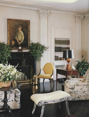
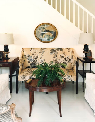
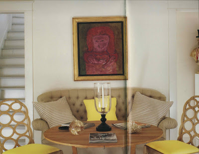
I’ve always enjoyed the lightness of this Albert Hadley room despite its serious setting. The bare floors, the faded chintz, a touch of yellow.
And those fantastic benches with their perfectly ragged finish.
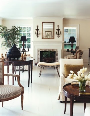
House Beautiful featured the homeowner’s new residence in their latest issue. Beautifully relaxed you can see elements that have made the move.
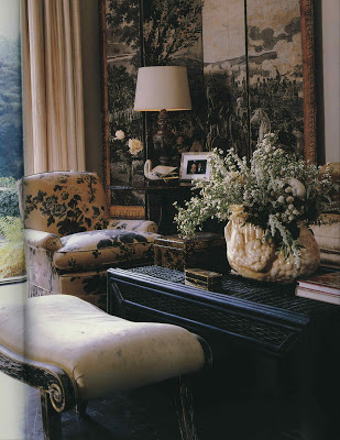
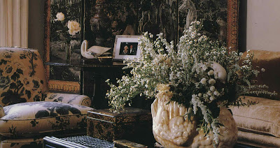
Not just the benches and the upholstery, still in its delightful chintz, but the pillows from the sofa, above as well.
The new home seems more reflective of what I think of as Hadley’s personal style.
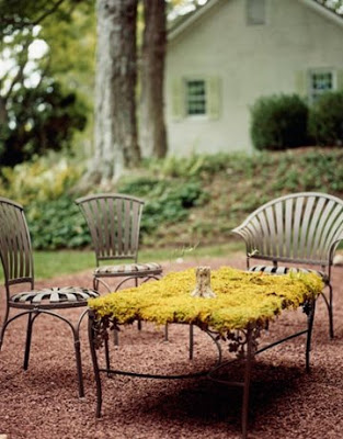
A delight to find the homeowner has the spring chairs of my current obsession as well.
You can find the full story here.
Images of the new home via House Beautiful, photography by Simon Watson. The previous residence appears in Influential Interiors by Suzanne Trocme; some images appear at House Beautiful as well. Image second from the bottom of Hadley’s Naples, Florida home from Albert Hadley: The Story of America’s Preeminent Interior Designer by Adam Lewis.

that overworked new phrase- "now that's what I'm talkin about" comes to mind. my mind might be drivel but -when it sees a good thing- it instinctivly knows. I love seeing this sort of things always- thanks for putting it together. la
What great style. I love peeking into other people's homes. Lovely.
Wow, and I do mean wow. That living room with the black shiny floor and that yellow chair. I'm going to go right out and get me some: black paint and yellow chair and I'll find an antique store and get an ancestor painting for over the fireplace. Did that decorator ever just go to grade school with the rest of us or was he located early and kept in an attic until adulthood and then turned loose in a room with a black shiny floor and a yellow chair and the rest is history. Thank you so much for making my day. Ann
I too was mulling it over~ regarding the timeless chic
of the older room and the simpler, equally satisfying chic of the more modestly sized newer room~and I believe that it all boils down to consistency of mood.
And, more to the point, a limited palette.No doubt the earlier room was worked around the grisailles of the wallpapered screen. Interesting to see the how the glamour quotient is modified when a dark floor is replaced one that is painted and relatively pale.
I do love the use of a limited palette in design and art! I lessons confusion and is more soothing in soft tone; in the brights it highlights pieces beautifully!
I'm still focused on the benches. As a dealer, I tend to want to make things "perfect", but these are perfectly, wonderfully scuffy. Thanks– and have a great 4th of July.
This was by far one of my favorite House Beautiful issues!! I love how they created a "center hall table" for the homeowner and were able to use the scale of furniture that they did without making it feel cramped…total eye candy surrounds one in those spaces!!!
The lacquer green kitchen that Miles Redd did is also fabulous in that issue!
Thanks for finding the previous home pictures to contrast with the new home. I was wondering about that when I read the magazine.
The best news from the magazine is that they are going to reproduce that chintz since seeing it in this home after many years!
Good stuff does last.
Nice style and elegance stamped everywhere… Oh and those spring chairs are really lust-worthy.
I love the title of this post, we can have new rooms just RE-thinking…(Recycling must always be the last option)
I love the homeowner's new New Jersey farmhouse — beautifully done, except — I can't love their painting the old wide-board floors white. Everything else, OK — but that? It looks good, but it breaks my heart.
Love HB, love Hadley, don't love antique floors of that age being painted.
Cass
Love the moss covered table top! I might try that and have a living top with some grass seed… whatta ya think? Might work… if not… scrape it off.. right? I love seeing your posts! BTW… my comments were blocked on my posts so if you happen to stop by… they are now back in working order! Enjoy your week!
Yes indeed. I cut out the photos when originally published in (I believe) House & Garden years ago of the first installation in the original house (I believe it was in Far Hills, NJ one of the most beautiful towns in the mid-Atlantic) for an idea scrap book I had, and consider it to be one of the iconic rooms, at least for me. Perfection. I am always pleased to come across pictures of the room from time to time. While saddened that it is no more was quite pleased (and interested) to see the furniture and furnishings reused in the new house. Brings to mind Deborah Devonshire moving into the more modestly-scaled (albeit marvelous) Dower House at Chatsworth…
Reggie – a terrific comparison!