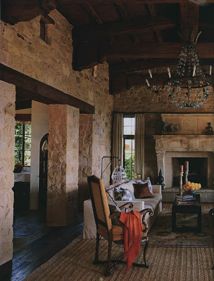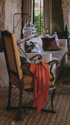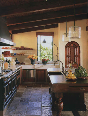
Alison Berger’s floor lamp caught my eye in the Michael Smith designed home in the October issue of House Beautiful.
The industrial metal and sparkle of the glass are a nice contrast to the texture in the rest of the room.
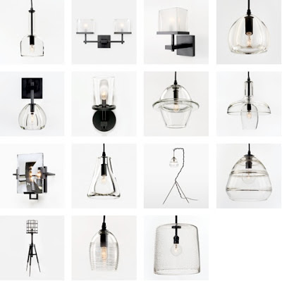
House Beautiful images by Thomas Loof; last image via Holly Hunt.


Found for the Home in Houston is making similar looking lamps – with jars – they are so cool. I love that last image – the hanging fixture. some people are so creative!
Yum. Clearly delicious.
Gorgeous lamps!
Greet
A friend of mine used these lights in her newly renovated kitchen, and they really are lovely – clearly, great designs.
pve
It caught my eye too! A little industrial…a whole lotta chic!
* Ohhhhh, those stone walls & fab floors!!!! DELICIOUS!!!
Linda in AZ *
I love these and I do need new kitchen lights. Time to replace the horrid florescent with pendants!
You're right the juxtaposition is great. That's a great resource. I'm sure in no time restoration will be knocking these off too.
These are fantastic…so is the whole room! Good find!
what a beautiful home and the lamps are lovely!
Loved this home in House Beautiful this month. The pendant lights were my favorite, so I'm glad you posted some further information on them!
I've noticed a lot of these industrial looking lights popping up. Some even harken back to the first lightbulb designs it seems to me. They're very cool, but I wonder if those bare, clear bulbs wouldn't get annoying? They'd have to be very low wattage for me to take, and that seems to fly in the face of task lighting (which I sort of need in the kitchen at my advanced age. The joke is that you could operate at my prep area.)
Just thinking out loud.
Love this! Thanks for the great find. The editorial staff at Mountain Living magazine always looks forward to your posts. We just shared this one with our readers: http://post.ly/6i0z
Patricia, thank you so much for turning me on to Alison Berger! Her style is just what I was looking for and didn't someone was out there doing it. Wow!!! I'm blown away! Thank you.
Alexis
Christine – that is incredibly flattering. Thank you so much and thank you for the link!