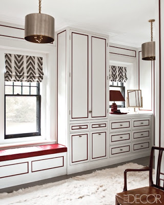
 Custom cabinetry aside, this handy little paint trick has me falling right in line.
“Why not?” said Henry B. Swap. “Why not?” said Mrs. McGillicuddy.
“Why not?” said all the people.
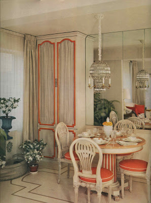
Why not, indeed, snappy designers have been doing it for ages.
Marian McEvoy lined them up with Sharpie.
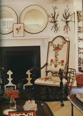
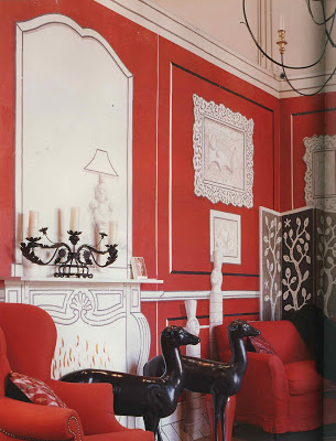
Suzanne Rheinstein colored outside the lines with this eye-catching display.
And don’t feel confined to handwriting on the wall, you can easily outline your objectives on the furniture, too.
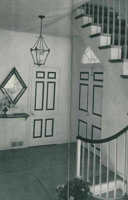
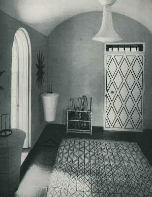
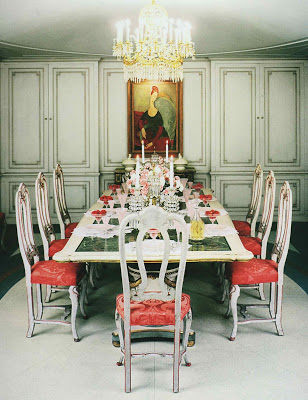
Image, top, designed by Steven Gambrel in Elle Decor, January/February 2010, photography by Eric Piasecki; the lines on this doorway are blue, as is the railing atop those very jazzy lucite balustrades (ala current style setters Alexis and Trevor Traina), design by Baldwin & Martin. Hmm…Baldwin & Martin again with the diamond mine, and a twist of orange by Mallory-Tillis all from HG’s Complete Guide to Interior Decoration, 1960. Marion McEvoy from Rooms to Inspire, photography by Tim Street-Porter as is Rheinstein’s black and white and red all-over by painter Paulin Paris. And, once you are finished admiring the lovely Modigliani, do click the image, bottom, to admire the refreshing red sorbet popping against the pink carnations and fizzy cocktail from Mr. and Mrs. Frederick Mann’s Philadelphia apartment featured in House & Garden in 1953 from The Well Lived Life by Dominique Browning. Pieces of the text refer to Mike Mulligan and His Steam Shovel.

And why not! Looks great… If you can and do indeed colour inside the lines!
Loved the post! And why not… because it was from such a diverting angle!
!
Off to get to work with my Sharpie! The red outlines of Gambrel's bathroom reminds me of the Duke of Windsor's bathroom.
Wonderful post! I recently saw this article on an amazing basement decorated entirely with a Sharpie: http://www.kentucky.com/147/story/532854.html
Happy Christmas!
Jennifer – now I will have to go look it up!
And, Optimist – THAT is amazing. Thanks for the heads up.
In reference to your last post, maybe the Blanding's boys should find lots and lots of Sharpie's in their stockings!
And about decorating baseboards thought you would love this. JCB reported on her blog that Lynn Fontanne and Alfred Hunt were enthralled with that new-found invention of cellophane tape and used it to "gild" their baseboards at their Ten Chimneys Estate.
Some Sharpies. Some tape. Who knows what could happen!
Not to mention the fabulous sculptures by DuBuffet…this is what this design treatment makes me think of.
Janell
I was just looking at this room last night! I was wondering how it would look in person: it definitely photographs well but would it feel contrived in person?
I totally "dig" it–just like Mike Mulligan and Mary Anne! Fun post, and I just happen to have a basement playroom that needs a makeover.
Patricia,
Great images for the files. Thanks for the post. We do this a lot in our design projects.
Gwen
Ragland Hill Social
that's so pretty! What a beautiful post!
i love piping of any kind, including with paint. when i was at domino, i worked on a piping story that this reminds me of. what can i say, great minds think alike!
xo katherine aka. urban flea 🙂
http://www.urbanfleadesign.net
Patricia, I can picture you with sharpie in hand, and where it might take you!
I knew you would love the bathroom!
The red sorbet room!!!!!! I love the color. On my screen it shows up as a coral-red and combined with the Venetian furniture, it is amazing.
Love it! Miss you two!
Jaithan + Eddie
So much food for thought. I want to get to work right away!