Ever see grand rooms like this and admire them, but think they have nothing to do with you and your dream house?
Think again.
So many classic design concepts can be applied to a variety of contemporary interior styles.
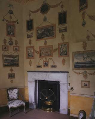
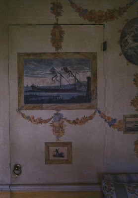
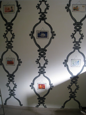
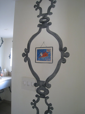
Here, George Terbovich has used a very similar concept as the print room in Yester House, above. Instead of etchings and swags he has applied images from the book, “Letters to Giorgio” by the late Jean-Michel Folon. Click the images and you will see charming illustrations from Falon to his friend. They are decidedly personal as the recipient of the letter and the shop owner share the same name.
Images, top, from In House by Mitchell Owens, photography by Derry Moore.


LOVE THIS! Creative, charming, inspired, delightful!
Thank you Robin
These are so wonderful Patricia. The designs do look contemporary with the whimsical art images! George is a genius!
I believe I mentioned to a certain Mrs. B after the butterfly closet that a print room closet might not be far behind! If this idea hints of what to do with buyer's remorse (how does one get this off this wall?) I think a print inspired folding screen could be fantastic. I do hope you are thinking about writing a book on Mr. Terbovich!
Huumm,
This gets my brain thinking! Thanks for the inspiration!
HH;
Leslie
HBD – I would if he'd let me! I'd love the excuse to following him around for a year or four.
Very Griffin & Sabine. And very doable. I'd love to do this in my daughter's room.
What an interesting idea. I love that he repeated the design on more than one wall.
I like George's best…
and Home Before Dark is right. A book about George. You are the perfect author for that project.
So, so pretty! I love this idea:)