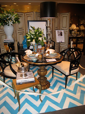
I’m going to give you a taste of the tables from the DIFFA event last night. Click on them to see the details of the table settings. David Jimenez hit it out of the park with his graphic and gorgeous style.
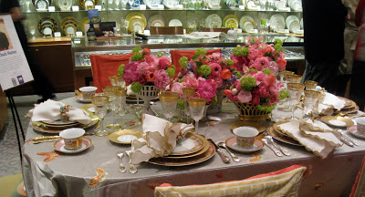
Local florist Chuck Matney was pretty in pink.
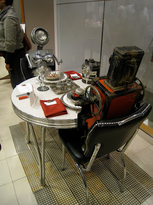
The Nerdbots were busy eating so we tried not to interrupt.
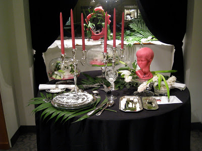
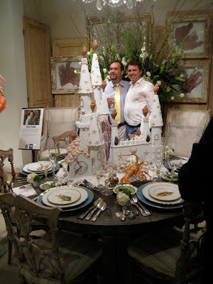
Peregrine Honig’s table sparked lots of interest; click to see what she is serving up on those silver trays.
Don Fields created a sea side fantasy on the plaines. (Check out those terrific chairs.)
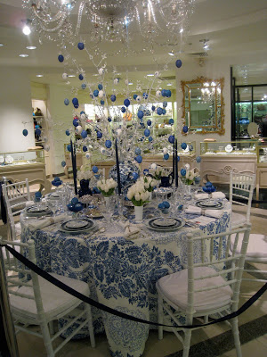
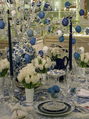
And for you blueaholics Eddie Ross and Jaithan Kochar executed an extravagant Easter tableau using a combination of the best that Hall’s has to offer and thrift store finds. (I used restraint and did not say “eggstravagant.”)
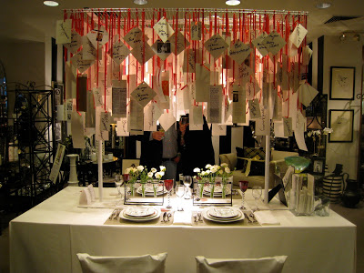
John Rufnacht kept the message clear that AIDS awareness is the mission; the creativity creates attention for the cause.

wow. i am floored. awesome photos of an awesome event!
have a great weekend.
xo
David's table looks great. Did he borrow those screens from Joanna Votilla's shop? Love them.
Ashlina – you too!
David – I do think that is right – I'd admired them there before.
David & Dons…zowie!!! You weren't kidding about those chairs. To absolutely die for!!!
Lovely weekend wishes to you!!!
It's fun to see so many ways to decorate a table at the same time. I especially liked the blues – my favorite color. Thanks for sharing.
Whew! I am so glad you didn't say eggstravagant.
David Jimenez table is amazing with those black lacquer chairs and painted floor boards, but the big linen bergeres in Don's space are to die for. Thanks for sharing. Hope to see you next week. Mary
I was looking forward to seeing photos from this event. Thanks for sharing. So much creativity and style. Love it.
Fabulous!! I love every single Tablescape. A very talented group of designers!!
Karena
Art by Karena
David Jimenezs table was amazing and I couldn't agree more with the other comments. Everything from the screens, the lamp, the chairs, everthing was impeccable!
The screen in David Jimenez' BEAUTIFUL scene is the perfect inspiration for a small, simple, but plain, screen I own. It's not quite quality enough to sell to a client. Yet I've hung on to it. (I honestly can't tell you where I ever got it). I've had a million ever changing ideas for it: paint, mirror, wallpaper. The gilded moulding is perfect. I think I might even add a pagoda shape at the top. I'll post all about it. And you're so right: outta the park!
That turquoise & white chevron rug is making me squeal!