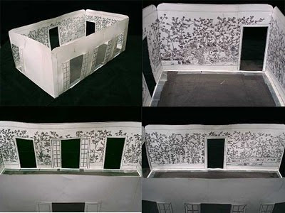
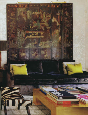
There is a lovely picture (which I’ve cropped badly) of a Windsor Smith project in the January issue of Architectural Digest. The minute I saw the room I remembered it from a post on Corbu’s Cave, painter Scott Waterman’s blog.
 That subtle, luminous chinoiserie shimmering on the wall is not paper, rather painting. But the really remarkable thing about it is the process. You can read how the project was conceived and executed here.
Image, top, Architectural Digest, January 2011, design by Windsor Smith, photography Erhard Pfeiffer; next via Corbu’s Cave.


So fascinating – the different textures and the layered walls make that room absolutely luscious.
Okay. That does it. I have to get a copy of the January issue today!! Joni posted a teaser yesterday and now you! I can't stand it.
Dear Patricia,
My statistics go through the roof when my name appears on your blog! Thank you so much.
That silver leaf project seems to be a crowd pleaser. To accommodate I have four links associated with that project.
http://corbuscave.blogspot.com/2010/02/beyond-silver-screen.html
http://corbuscave.blogspot.com/2010/08/orlando.html
http://www.scottwatermanartist.com/01_aerie.html
http://www.scottwatermanartist.com/images/south_accents_dec2008.pdf
I'm just as taken by Scott's work as I am by those models. Those are art in themselves!
That was my favorite image from the new issue, for several reasons.
What did you think of the rest of the issue? I'm usually not a huge fan of international-themed issues, but thought several projects were great. Margaret Russell's editorial letter was very gracious, too. And may we never have another celebrity cover again.
One of my many passions–Chinese (and Japanese) lacquer screens–I wish that the Windsor Smith screen (absolutely gorgeous) were two panels larger. It is so reminiscent of Coco's Paris living room; but with a 21st c. twist. The silver leaf chinoiserie room is to die for–much more unique than paper. Thanks, Mary
Oh that sofa is to die for…don't usually read AD but I'm def going to pick this one up….Thanks for posting!
Scott – good! I hope they never miss another post. Thanks, also for the additional links.
Megan – completely agree
Topaz – The magazine seems fresher to me already, though I wonder if some of the projects had been shot pre-Russell. I like the bolder font and the layout seems cleaner. I could open a bottle of champagne to toast the demise of the real estate section, but it's bad to speak ill of the dead.
Celebrity projects don't bother me, necessarily, as, let's face it, celebrities have money to complete great homes. I'd just rather see the good ones. AD has traditionally done great Hollywood coverage going way back and we owe a lot of terrific pictures to that tradition.
And, yes, the editor's letter was incredibly gracious. Can't wait to see what comes next.
Sofa and Coromandel Screen. A long time decorating staple, since at least Syrie Maugham, and one of the best…love them all.
I do love the Cave! I remember this, I would love to have him to NC for a down tobacco road project. thanks for the great memory-Yours! pgt
Where is my issue? I need to go out and buy it, as I will not be able to stand not having it by the time it arrives!