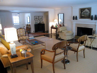
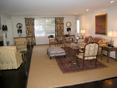
Slightly tweaked. The sisal rug is going. The old rug that is currently atop will shift over to live under the yellow chairs, which will hopefully not be yellow. An as-yet-undiscovered rug will live under the other group leaving more of the floor to show. Also, I picked up a pair of Paul McCobb tables that replaced the one that I made. (He is not abandoned, but residing in Mr. B’s study.)
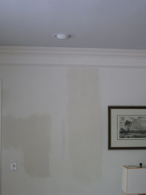
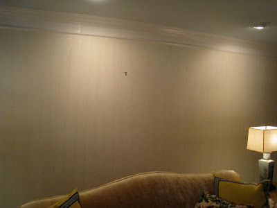
The plan was Farrow & Ball Borrowed Light on the ceiling and a strie of Slipper Satin on the walls. Borrowed Light is a home run in every way. I adore it. I could write poems about it. I dream of it in my sleep and spring from my bed in the morning so I can see it. The strie was tricky. (The swatch image is accurate; these are not.) I couldn’t figure out why I couldn’t figure it out.
I tried varying combinations of paint and glaze, hunted for different glazes and brushes, all with little success. It was time-consuming and annoying. One evening my middle son, who is not overly interested in aesthetic endeavors but has a good eye and a strong opinion, cruised through the room. I paused, brush in hand and asked, “Whaddya think?” He glanced and offered, “I like the color.”



I know you Patricia and it has to be "right" or you will not be able to rest until it is redone to your expectations!
PS That is a good thing!
xoxo
Karena
Art by Karena
Its a great room and such a nice size. Theres a lot of furniture and it still feels spacious.
I'm glad you're trading the sisal for something smaller, the dark floor is gorgeous, we should see more of it. I'm glad you're painting too, it needs just a little color.
Ah, Mastercraft. Those were a step up from my first apartment in the student ghetto.
Yes, definitely love the color. I'm looking at the yellow chairs and seeing the rose/red from the drapes. It is definitely lookin' good! Mary
Can't wait to see the new paint color. Should warm the room right up. And seriously love your Joni comment! She is the master of long posts! But I also love watching the process as it happens. I am more of a milker myself.
Looking good! I love Borrowed Light as well as Pale Powder, which I have in a couple of rooms in my house. Looking forward to seeing your revisions. What helpful son!
I have been confused by two things in your house project. Why do you insist on doing your own work, and why do you not hire a decorator. Also, did I actually see blinds on the living room window?
Anon – I can't afford a good decorator and they are shutters. They will likely come down, but I haven't gotten there yet.
Mrs. B,
I always admire that you put it "out there" for all to see and judge. I enjoy having a peek and hearing about a homeowners thought process! I recall seeing the color Borrowed Light in a room David Mitchel designed and it was gorgeous. Good luck with the painting!
"Why do you insist on doing your own work, and why do you not hire a decorator."
Not sure but I don't think this commenter understands that Mrs. B is on intimate terms with the country's very best in the design field, all you have to do is read this blog to understand she is lunching and dining and emailing and lecturing alongside these folks, probably stands to reason they've chatted a bit about her new house over the fruit salad; moreover, if I might, this commenter has no idea the joy and pride that comes from doing one's own work. Again, if one follows this blog, one can see that Mrs. B consults her family each step along the way, revisit her husband's study for a primer on that note. And, Mrs. B, I love that you checked out your son's impression right in the middle of the strie process, he helped you get centered, hired talent isn't going tolerate something like that. [I also love seeing your peg-leg-resolution table standing proud against the wall, nothing like a stroke of the primitive mixed with the refined.]
Shutters are actually very practical for privacy and also beautiful. With large windows they also look good with curtains. They are very popular where I live. Please don't use bamboo shades which are cheap looking, ugly and never compliment what you pair with them. You have a great size living room and having two conversation areas will be particularly nice when entertaining. What are your ceiling heights?
Anon – Mrs. B is diplomatic; she does not need a decorator and the shutters might come in handy to block out the sun which will, given time, fade anything in its path. Look what it does to our skin!
Mrs. B – F&B stried wall paper is gorgeous…and in any of their fabulous paint colors. But you knew that.
Thank you, really, but it isn't necessary to jump to my defense. It is in process, but I like the room regardless of this and future anons.
Flo, I do follow this blog and know that Mrs. B is well connected to the design community in Kansas and elsewhere. That my dear was my point in asking the question. It is always gratifying when family members like your design choices and my question was not to discredit Mrs. B's young son. The question about hiring a decorator was asked because it was "so obvious".
Ohhh can't wait to see version 1.1!!!!! I'm so loving your evolution of Dream House II!!
-linda,ny
p.s shutters are practical and pretty, imho.
I love to look back and watch how my spaces evolve. Your husbands comment is about what I'd get from mine!
Looking forward to 2.0!
~ Elizabeth
pps I REALLY can't wait to see what you do in your dining room!
-linda
Mastercraft! You're killing me. 'cold water flats'. Lived there for a summer.
And I believe 'lay' is correct here. "lay requires a direct object and lie does not." right? unless you're speaking of something in the past?
"Thank you, really, but it isn't necessary to jump to my defense."
🙂
Send that hemp to Joni, she is in charge of papering Houston with it or grasscloth.
What I want to know, and inquiring minds what to know, is, what about the ceiling fans. Did they move or did they stay?
I like your living room. Ann
The ease of misunderstanding wit when typed. Oh well. Mrs. B, you're a terrible tease. I do remember that white look, although didn't know it was called Mastercraft(St. Louis in 80's). Your son, of course, has impeccable taste, and when he opens for business in NYC, I may by then be able to afford him.
Thank you for bringing us along on the process, not just showing us the before and after. I like knowing about the deisions to be made and even those that need to be remade.
As for doing it yourself, it's been very clear that you put yourself into your home projects. You are more likely to realize something is "off", where a contractor just follows orders. You may not have a "degree", but you have an excellent eye and will continue to tweek until you get it right.
The ceiling fans are going one by one. I've convinced the oldest to give his up by buying a vintage Sputnik fixture. Also, truly, I'm not hob nabbing all that much and my little projects rarely come up.
Hi! (waving from Australia) So, just to confuse non-visual me, you take the two living room pictures facing from different directions??? Arrrrrgh!!
I have absolutely no idea what Mastercraft white is 🙂
LOVE that warm paint colour you're using on the walls, but I'm not sure how you're getting that texture? Technique? Brush?
Looking forward to seeing the developments!
Indeed send the seagrass to Joni. Only in Houston could such impractical and boring floor covering be appreciated. Mrs. B. your projects are really not little considering the size of the rooms you are painting. Do you plan to keep the zebra rug in the living room and what if anything have you changed about the dining room (hopefully the chairs and wall color)? If you insist on no design help, be prepared for a few missteps, but at least the house will be "yours".
Lee, when good "contractors" are employed, they know when something is off. Often they communicate with the designer before talking to the homeowner. It all depends on the financial arrangement. I have had this happen several times and frankly have been miffed that the contractor didn't speak to me first, but came to realize that the designer is ultimately responsible for dye lot discrepancies, (wallpaper) and the finished product. It is in their best interest to talk about problems before involving their time and energy into the project. Often these issues are worked out early and in time to complete the project with everyone involved satisfied. While I would love to have the talent to paint a room, I would rather employ either directly or through my decorator someone to help make that part of the project go more smoothly.
I love to hear about your jones on Borrowed Light! I too dream about certain paint colors. Glad to know I'm not the only one. I'm sure that Slipper Satin and Borrowed Light will look lovely together. They're both a bit ethereal.
It's coming along beautifully! Thanks so much for sharing a sneak peak of the new dreamhouse. Love it all – especially the rug, the painting over the sofa and the zebra ottoman.
It is late and I am perhaps befuddled. Ther is no zebra rug, natural grass flooring hardly seems confined to Houston and I am not sure when contractors entered the picture. The dining room is different, it is a different house altogether, so the wall situation is, um, different. And, yes, I am quite prepared for both missteps and the house being mine. Thanks so much for the warning.
Oops, I meant to say "oriental" instead of zebra. After rereading the post I realized that you mentioned moving the rug across the room. The zebra ottoman is certainly a "keeper". Can't wait to see how you use the Biedermeier chairs. They are one of my favorite elements in the room.
Loved this post. Yet, I did expect you to pull a Joni and give us the big kahuna. Looking forward to reading the sequel!
Mastershaft apartments as we called it. What a hilarious image!
Fun to see your process! What what it's worth, I was very pleased using Benjamin Moore's Hepplewhite Ivory to achieve a "candlelight" color and look. For those who aren't ready for the F&B paint prices yet.
hi! thanks for the shoutout. very funny.
your living room is looking so pretty. the floors are gorgeous and i am green with envy at the deep dark color. i go from wanted to restain mine that dark color or just paint them light gray?…
i am wondering – i know you have tried this but how do the yellow chairs look next to the sofa? it seems like maybe the scale would be better…and then maybe get some taller chairs for next to the fireplace – to create so variety of height in the room. just a thought. then flank the two matching wood chairs in front of the window. heres a link to 2 taller chairs for next to the fireplace:
you can tell me to shut up and mind my own business too.
http://www.leeindustries.com/productdetail.asp?Group=Upholstery&Category=Chairs&id=065206041247085231240054026112191070063083173003204231226246126142119066122157133183003142005138100129188015230121068052026214062074251221173176069201155168020094212160123215046191123201116088065174144170096085098204210031121005074229025161003250195057170090062221015172181228199086004114148071070006085041228028239072178140012179214013079240147152154106255199158116182032089085122129052170079057202246045242214096204031222008070065066235213084071076021248181156