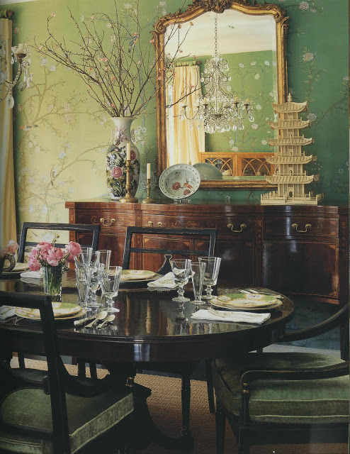
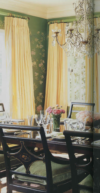
I hadn’t realized that I was unconsciously mining this image for inspiration until last week’s episode of Million Dollar Decorators. When Mary McDonald walked through (by? I can’t remember) this dining room, my conscious mind went, “Oh, yes, of course. That has been it all along.”
I wish this little nugget had slid into the conscious side of my brain a little sooner. I’d been holding off on ordering the stencil for my dining room project as something about it seemed not quite right. It wasn’t working with the rest of the house and I couldn’t put my finger on why.
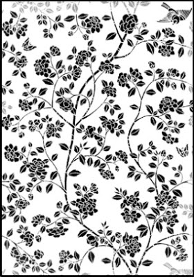
When I saw the dining room (again, fully conscious) I realized that the stencil, above, was too bold for my space. Too heavy. Too much.
So, I’m ordering this all-over pattern instead and am going to use it in pieces to create an airier silhouette similar to the wall above. It wasn’t my first foray into analysis, but it was most certainly the most fun.
Top two images, Mary McDonald Interiors, Rizzoli, photography by Melanie Acevedo. Remaining images via Stencil Library.


I think the boldness has everything to do with the palette. Every oil painting class that I have ever taken, I never truly see what the teacher meant until I walked away. Sometimes subtlety is an art in itself.
pve
Good choice (the second) at least it wasn't a custom piece of furniture! It will be gorgeous.
xoxo
Karena
Art by Karena
I have a New, very fashionable Giveaway on my site! Come and see!
Yes, very beautiful. It is a cliche, but less is more.
Add some butterflies!
God is in the details!
I think the softer green would be much easier to live with too, so calm and restful and yet the pattern is so uplifting and engaging!
Thanks for sharing your creative process with us!
Awareness is such a process and God is definitely in the details. Needless to say, I am so impressed with the concept of your doing it — the good thing about a stencil is that it is paint and not antique chinese wall paper. Go for it. Mary
I have been thinking about those stencils so I am looking forward to seeing what you do.
Kare – yes, there is an additional sheet that has extra birds, butterflies and flowers – I am ordering that as well.
Sooo smart+the effect will be stunning. Pictures please. xxpeggybraswelldesign.com
This post reminded me of this bedroom…
http://cotedetexas.blogspot.com/2011/05/my-new-bedroom.html
I'm thrilled that this is the look you're after, as this is the very image that popped into my mind when you announced that your dining room would be green. Would you give us a peek at your room before you add the stencil, just to show the color? (I have no patience!)
DAM – I should be so lucky. And Peggy and Lee – a small image of the wall color tomorrow. Promise.
Can't wait to see!
Waiting on pin cushions to see the results!!!!
Speaking of Mary MacDonald, did you catch the cast iron bookends of the two dogs standing on their hind legs at Mecox?!
Have a SUPER week.
Isn't it funny how creativity sneaks up on you…smiles.