Cole & Son Georgian Trellis may be the paper for the front hall. The color looks remarkably not like this at all, but is a creamy background with a bronze design.
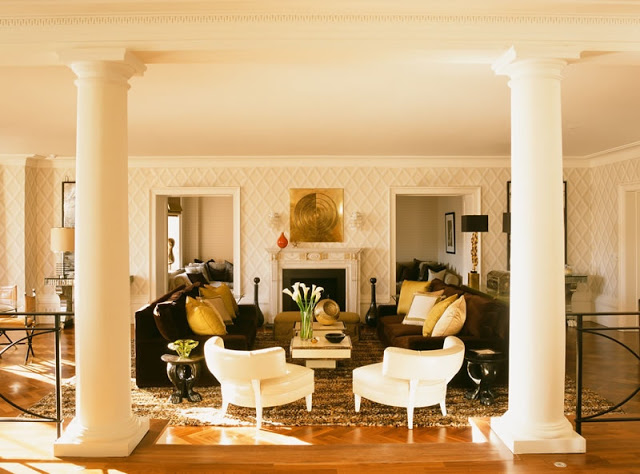
I’ve had Rooms to Inspire in the City open to Tamara Mellon’s London apartment, designed by Martyn Lawrence-Bullard, for about a week. This paper is Cole & Son as well, Pompeian in Beige and White, I am pretty sure. It’s such a striking room, but what caught my eye was the lovely shade on the ceiling. Nowhere near “ceiling white” and making a humongous difference to the room. Which is leading to more ceiling paint here at The House with No Name.
Image from Martyn Lawrence-Bullard’s site, used without permission – please, please forgive me.


I love that you get your ideas the same way we all do… searching through images until something jumps out. It's what blogging is all about! Getting inspired!
Love the trellis, like, a lot.
Pretty post, Cole & Son is a wonderful company
Love your blog
Regards
Jamie Herzlinger
Beautiful paper. And you have me thinking about the ceiling color. Is it different than that of the pillars, or just a different finish than the trim?
FT – The reason is, I'm not a bit different from you. Just an enthusiast with a lot of books and magazine subscriptions.
Daniel – the coloration on the site looks a bit different than it does in the book (I think there is always a difference from page to screen.) The pillars seem to be the same color as the trim, while the ceiling color is different – sort of the medium color from the paper. It's a little yellower here – in the book it is incredibly lovely shades of ivory.
Love the Georgian Trellis – I've used before (in a blue/green with gold) – hope it was one of the ones I mentioned when you asked. Also love the Pompeian – obviously a bolder and more 3 dimensional choice.
I love this paper! I have used both actually-Pure classic the 1st-and Rose Cumming makes virtually the same pattern. The TM apt paper is the same I featured in the bath in the green colorway-Classic with panache, I think. pgt
Dear Mrs. Blandings-
I was struck by the familiarity of the trellis wallpaper pictured here. I used a very similar design in a kids' shared hall bath in a former home on the east coast. I had just completed that bath when we had to relocate to the Midwest. sigh. I didn't want to use paper in the room so I had a tromp leil artist paint the look. It had the same lines and proportions as your design, but the connecting points were buttons. And the tromp leil gave it the illusion of an actual raised trellis on the walls. I used a green similar to folly combined with shades of tan and off white. Wish I had a photo handy.
Why not go for the Cole and Sons paper for your foyer? A bit more dramitic, yet more subtle in coloration. Just a thought….
Oops…I meant to suggest the Pompeian design for your foyer.
Patricia,
I adore that paper!! Really interesting/ elegant yet subtle. I have been noticing painted ceilings a lot more lately!
By the way great article in KC SPACES!
xoxo
Karena
Art by Karena
I like them both. Correct me if I am wrong…but I think you could, should you chose to use the simplier Georgian paper for your hall, stencil the design. Maybe doing the dining room is enough work!
I could paint the trellis. If we get to Fall and I finished the dining room and I haven't ordered the paper, it might happen. As one of my friends said the other day, "It's a long winter." Still, I do think it's nice to have the change of texture. TOO much painted effect looks like bad designer show house.
Oh! And Pompeian. I think it is such a terrific paper. Mellon's living room is so large that it absorbs the pattern and in small spaces it is quite terrific. I fear in this narrow hall it might look like a fun house. Though aesthetically, on its own, I agree that Pompeian is a more striking design.
I particularly love the fine trellis as pictured at the top. It is so elegant and timeless. I have had Rooms to Inspire in the City opened all week too!! How funny!!
I have been admiring the Iriving blue and white room…it is one of my favourites. I just wish I could get this really lived-in, unpolished look going in our house. I feel like I always go too bold! I need to tone things down a bit…
xx
Anna
Look at the June 29th edition of the Wall Street Journal, Personal Journal section, regarding wallpaper. Great advice and where to buy.
You're on target about the ceiling. Standard white ceiling paint screams, "look at me" and is distracting. It also appears cold and gray around the edges. I love to see people being more imaginative with ceiling color, like your ethereal Borrowed Light. It feels natural to look up and see the color of the sky.
Funny…I've had Domino's book open to the page with the framed de Gournay wallpaper in the dining room convinced that I can find some way to substitute but I realize there isn't a way really.