Mine is nearly always a ring around the rosie (otherwise known as the coffee table) with the sofa against the wall like it’s getting a mug shot.
Somewhere, sometime (it’s been nearly four years for heaven’s sake) another blogger mentioned “the ladies who love dead decorators” (or something like that.) I can’t assume that I was referenced, but I recognized myself in the description.
I do like looking back to see what still strikes a note; it helps me pull out my own aesthetic.
These rooms were created before I was born. My mother could have rested this copy of House Beautiful on her bulging belly. Perhaps that is why I recognize this tailored treat and that wonderful, wonderful view.
All images House Beautiful, March 1965, the home of Mr. and Mrs. Edward J. Mathews. The post title is the same as the title of the article which implies that the decorating was done by Mr. Mathews who was with the architecture and engineering firm Skidmore, Owings and Merrill. Photography by Ezra Stoller Associates – and isn’t the lighting amazing? By the way, there is wear on the third image, not a pattern on the carpet which appears to be a solid, short pile.

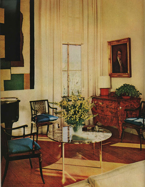
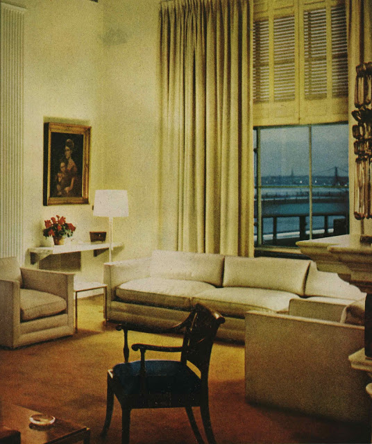
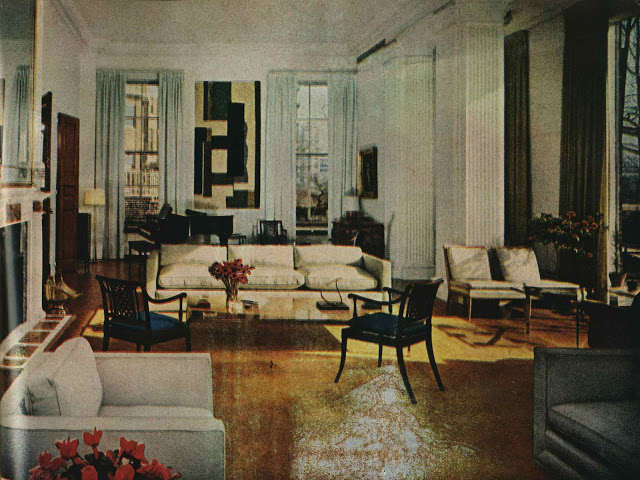
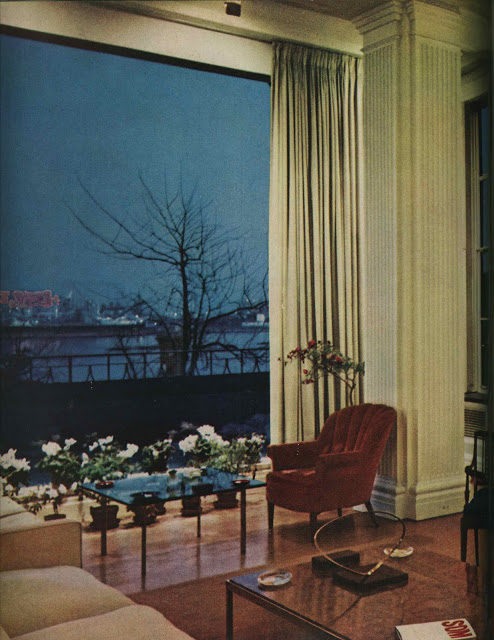
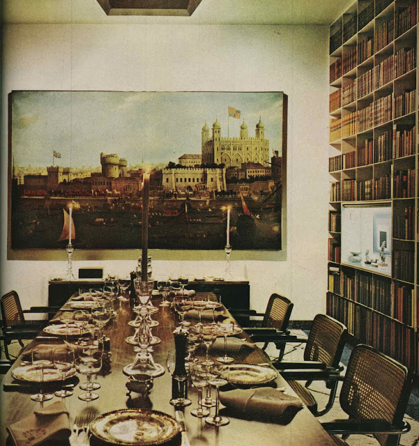
Supremely elegant, and a very successful mix of modern and the antique. Surprising in that it was owned and decorated by a partner at SOM, which I would have thought would have meant a more severe and rigorous modernism at the time these rooms were done.
Yes and what a wonderful view!! I have finally been able to arrange some of my furnishings in an interesting/ unique way!
xoxo
Karena
Art by Karena
Agreed on the sofa against a wall. I have an odd shaped room in which I have to do this, but I have another in which I "float" the sofa. So much more charming. And I love the old rooms also. I grew up in Mississippi and live in Tennessee… we love old things! And really… isn't the freshest thing now to go back to something from the old days? I love my shelter mags, but they all look the same, right? Mrs. Mathews dining table looks amazingly fresh and hip to me (but again… maybe I just have your "sickness"!) Love the books, sideboard with that huge artwork… great post!!
I am obsessed with this apartment and am dying to know where it is! Do I spy Long Island City's Pepsi-Cola sign outside one of those gorgeous windows? My guess is Sutton Place. What I wouldn't give for 14-ft ceilings and wafer-thin book shelves …
I like the decorators – dead or alive – when they know their stuff!
If we don't study the past, how can we appreciate where we are today? I haven't been blogging long enough to be one of the "ladies who love dead decorators" but I certainly resemble that remark!
I agree with Mr Darling – supremely elegant and a successful mix. It is from interiors such as this that one can learn so much about scale and proportion and, perhaps more important, how such rooms relate to and enhance the lives lived in the. A very beautiful set of rooms,
I've been writing a series about "dead decorators" – men who died too young and whose names are mostly forgotten.
Lovely post.
This feature in HB just reaffirms my belief that good design is almost always timeless!
Karen
Another great issue!! I always love looking back for inspiration and agree – furniture placement is an art!! And that last shot looks so amazingly contemporary!! I had that same chair in my office for years!!
Oh Mrs. B., I'm completely hopeless in all aspects of home decor. This is an inspiration. To me, it seems timeless.
Looking back, it just occurred to me that this was in the era before most people came home to plop down in front of the TV. These rooms were made to facilitate conversation and interaction, with the odd restful space for reading thrown in. Not that I could guarantee that analysis, of course. The rooms just seem put together that way to me.
Magnificent windows which an ordinary house will not have. Not contrived but long and narrow giving the rooms drama. These are wonderful finds but hard to replicate in most cases. Oh for a window with a view like these.
It's good to know I'm not the only one who studies old design books and magazines! I see such lovely (and, honestly, practical) ideas in them.
Easy and Elegant life makes an excellent point about rooms being set up for conversation vs. TV viewing. Perhaps that is what makes the rooms so appealing–they revolve around human interaction, not technology.
Something that throws me off a little in the first two rooms is what appears to be wooden shutters at the *top* of the windows. Not necessarily a bad idea, just one that's new to me.