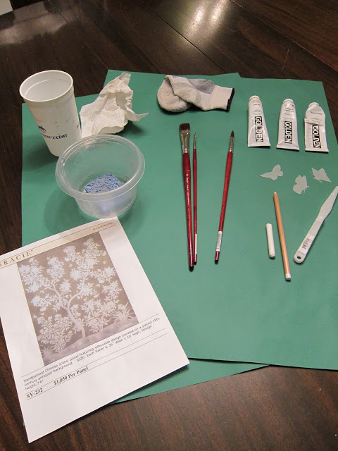
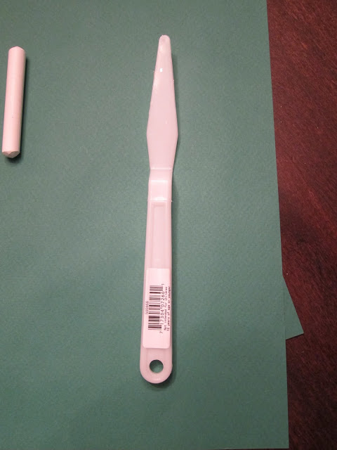
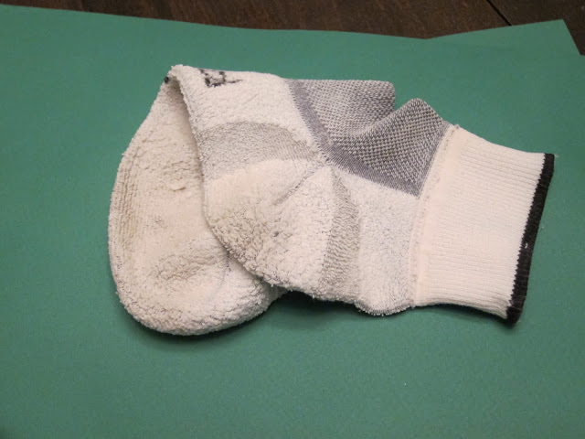
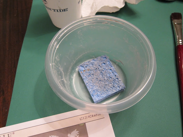
To complete the project you will need: (clockwise from top left) A plastic cup resembling a party favor, a crumpled paper towel, a clean sock, paint, tracing paper, a palette knife, a white graphite pencil, a piece of chalk, brushes, a Gladware bowl that is missing its top, a used kitchen sponge and inspiration.
I had ordered stencils from Stencil Library and they are lovely. I gave them a go a few weeks ago and they were not for me. It sort of turned the project from something creative into a job. That said, they are very nice and if you are not confident enough in your drawing skills, they are a fine way to go.
Instead, I regressed to an old favorite past time of drawing on the wall.
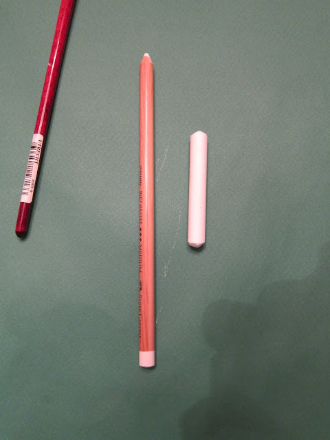
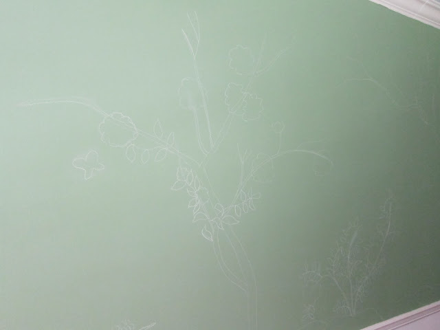
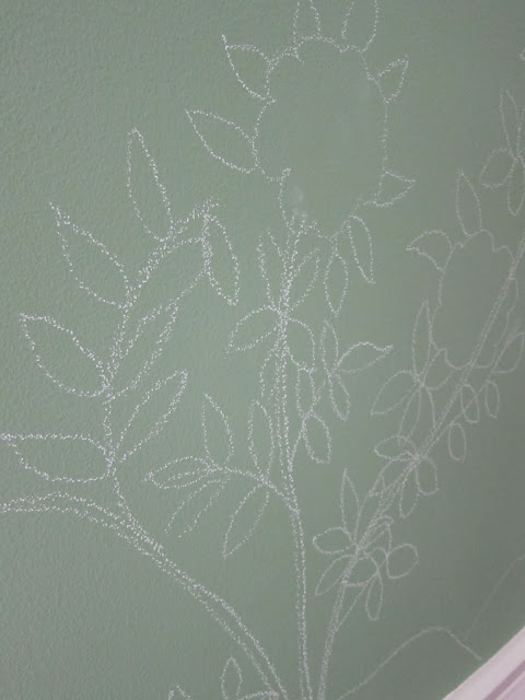
As the walls are green, I used chalk to outline the design. It wiped away very easily and did not leave a mark when corrections were needed.
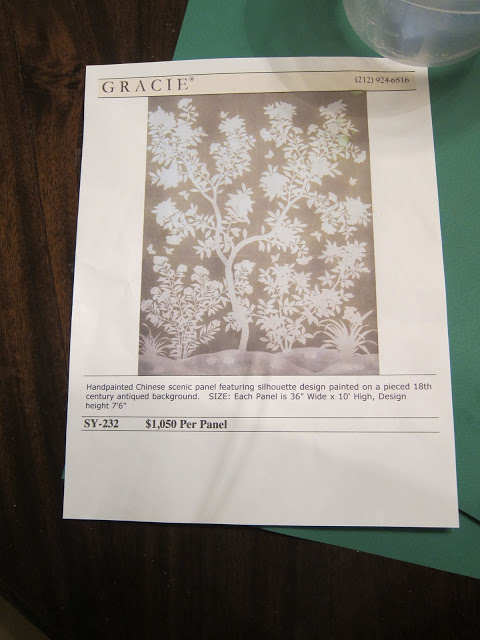
I alternated between holding images from Michael Smith, Mary McDonald and Gracie to create the design. The Smith room had a paper very similar to this Gracie panel, though it was a little denser than what I wanted for the room. The McDonald walls had the right feel, but different flowers.
I drew the entire project before I started painting. (This is unlike me, as painting is the fun part.) Sketching in the design easily took twice as long as painting. Prep is always longer and a little less fun.
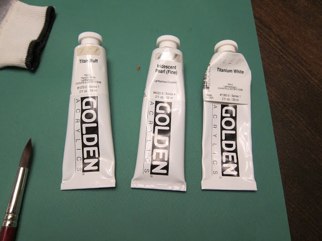
But then I got to go to the art supply store, which is almost as good as jewelry shopping. I explained to the lovely woman working at Utrecht that I was trying to avoid having to go over the design twice. She suggested Golden paint in a dense opacity. We chose Titanium White and then she suggested Titan Buff to take the edge off; Iridescent Pearl (Fine) (and it was) was added for a little luminosity.
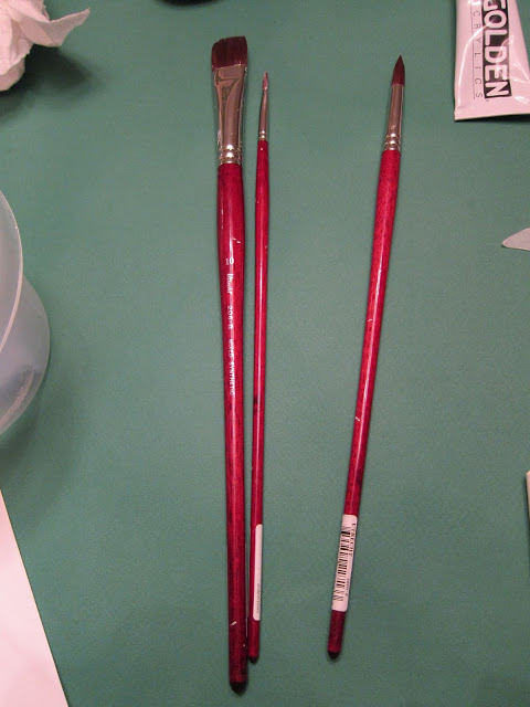
I chose the brushes myself and developed a deep and lasting love for both the large #10 and the smaller #2. #6 and I took an immediate dislike to one another and will never be friends. Beyond that, we cannot see what anyone would see in the other, though we stopped short of become enemies. We will smile and nod, but will be unable to move beyond social pleasantries.
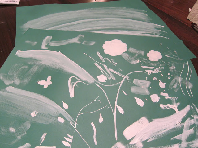
I did pick up a couple of pieces of green poster board to test color and consistency. And, yes, I agree, based on the testing it appears that I made a rather large leap of faith.
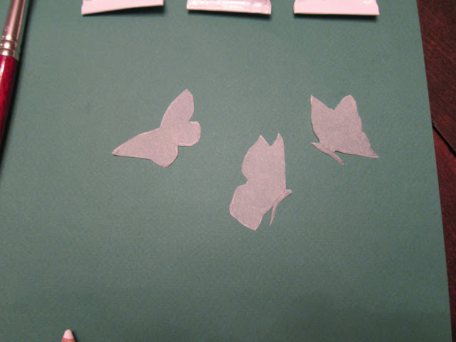
I could not manage to draw a good butterfly. Eventually, I created a template from the stencil and traced around these with the graphite pencil (chalk would have been too thick.) The butterflies were the best part.
Once the paint was dry I rubbed off the chalk with a clean and coincidentally-inside-out sock that was sitting in the laundry basket that I had just brought up from the basement. I imagine a clean, soft cloth would do.
Somewhere along the way I’ve heard the last shall be first and the first shall be last and I don’t think it was related to puberty, though it worked out that way in my experience. Also with the mural. I should have painted the “ground” first and then the trees and bushes, but I didn’t quite know how to go about the ground so I skipped to the good stuff. As it turned out, it was pretty easy. I used the same paint combination, but thinned it until it was very watery. I then looked for my sponge brushes for twenty minutes, gave up, and used half of a sponge from under my kitchen sink instead; it worked fine.
Onward and upward. Or downward as I think a rug may be next.

Holy smokes! You are just amazing! I am beyond impressed. Fabulous job, Mrs. B!
xo
Rock star is all I can say.
love it. thanks for the details.
Bravo!It is very nice. I don't know why I assumed a stencil was used. Good paint is everything, I see you agree.
Holy C'moly, you should be pleased as punch! I am a few days late and missed the early reveal, but I have to say it is simply gorgeous in the final version!!!
wow -an impressive effort but worth all of it -it looks so fantastic!
You may have topped yourself-Rest on your beautiful laurels for a moment. pgt
Your hard work paid off — a very lovely outcome!
Your painting is beautiful – both design and execution. What fun it must be to sit in your dining room with your own original art on the walls.
Good morning Mrs. B.
I can't really tell but it looks like the flowers and trees have depth. How did you achieve that look? You did a wonderful job!
"To complete the project you will need: (clockwise from top left) A plastic cup resembling a party favor, a crumpled paper towel, a clean sock, paint, tracing paper, a palette knife, a white graphite pencil, a piece of chalk, brushes, a Gladware bowl that is missing its top, a used kitchen sponge and inspiration."
God I love you, Blandings.
This is the work of a genius — inside-out sock and all.
Your directives are half the fun of the whole process.
Next thing you know, Michaels Smith will be forgoing the painted papers and call begging you to create an oeuvre in his dining room.
Cheers, Alcira
nerochronicles.com
Patricia, as you can imagine, I adore it!! It looks much easier than your silver leafing, which I made a huge mess of!!
So glad that you love art stores as much as I do!!
xoxo
Karena
Art by Karena
Love. this.
You are a brave (and inspiring) woman, indeed.
Delightful!
The beauty of chinoiserie is that one can not only
improvise, but go on adding to the design when
the spirit moves you.
There are precedents for this at Temple Newsam
where Lady Hertford cut out bird images from Audubon (imagine!) and stuck them on to her chinese wallpaper.
In Mark and Duane Hampton's New York bedroom,
the grey branches of the Gracie wallpaper have been
embellished with additional colorful birds and butterflies, which takes the edge off the icy coolness and adds interest.
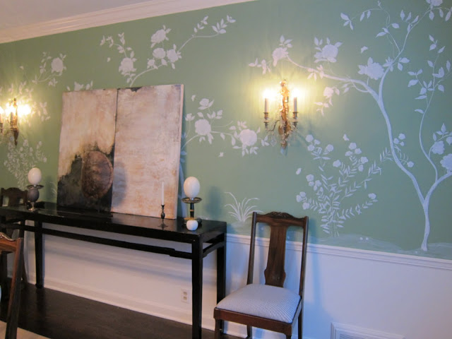
Thanks, really – you are all very nice. Anon – there is some dimension which is mostly due to the combination of the paint and the wall. You might be able to see that on the poster board you don't see the same kind of detailing. The walls have a slight (and slightly annoying) texture; in addition, the paint has a very low sheen – it is Estate Emulsion – so not entirely flat. With the paint thinned just a bit I was able to have almost complete coverage (no need to go back with a second coat, which I knew would be a messy disaster) and still show some brush work. It was, without a doubt, a happy accident.
Quite, quite glorious. A triangulation of my grandmother's dining room, a palace in Europe, and my children's easel paintings from nursery school. In a good way. Why do I assume it smelled good going up?
I am so impressed, as usual! Thank you so much for taking the time to spell out how you got there. Very generous of you. Outstanding job.
FREEHANNNNNNND!
My jaw is dropped in utter respect.
-Flo
I am gobsmacked.
Beautiful room! Upon reading your suggested equipment list, I was thinking one might add: Big Glass of Wine.
Meant to comment last Friday…it looks stunning!!! I'm still in shock that you drew out the sketch by hand. Boy are you good!
God you are amazing. AND this is giving me the kick in the pants I need to try it out myself. I've been thinking about this for a while…
And now I'm really jealous. I can't draw. Patricia this room is GORGEOUS! Mary
Your dining room walls are lovely! Congratulations on a successful project. Reggie
Patricia —
Now I say amazing to the fourth power. Just amazing.
That is really nice work. Kudos.
"The beauty of chinoiserie is that one can not only improvise, but go on adding to the design when the spirit moves you….cut out bird images from Audubon and stuck them on to her chinese wallpaper…..embellished with additional colorful birds and butterflies."
Toby Worthington, pardon me for chopping up your comment, but you have thrilled me no end with this observation/information of yours. There's an outdoor entry courtyard here that one must pass through to get to our front door, the main feature of which is a lonnnnng dull high blank stucco wall. So, why not get started? I will put 'chalk' on my errands list for next week.
Wow! Just gives such a luxurious feel to the room! Congratulations!
Stunning, would love to see close up of the roses!
http://www.sirenlondon.com
Wow, I am stunned that you have this kind of talent and patience. Absolutely beautiful–and it really does look professional. You should hire yourself out!
I am in awe — at first glance, I assumed that this WAS a Gracie wallcovering. I cannot believe that you painted it yourself. I mean, of course I BELIEVE you — no accusations of passing off a pro's work as your own… But I'm feeling very inspired by your project. After all, I suppose that no matter how hard I botch the painting, I could always paint over it all and start again, right?
So, question for you, Goddess of the Graceful Branches: Did you make any mistakes when you were painting on the walls, and if so, were you able to wipe off the oopses some how so you could fix them before the paint dried?
BTW, my father LOVES the film Mr. Blandings Builds His Dream House. Whenever he hears my mom and I discussing wall or fabric colors, he chirps in about the scene when Mrs. Blandings is going over paint colors with her contractors: http://www.youtube.com/watch?v=7ZwOGVWqHAw
I'm so happy to have found this wonderful site. Just yesterday I interviewed an artist to paint my dining room and nearly fell off my chair when she told me it would cost $10,000 and "that was a steal." When she left I eyed my walls and thought maybe I should give it a go myself. But having only elementary painting skills I was hesitant. I've been searching round on the the web and found this very inspirational piece. I'm going to go for it. Thank you so much for the inspiration!