 |
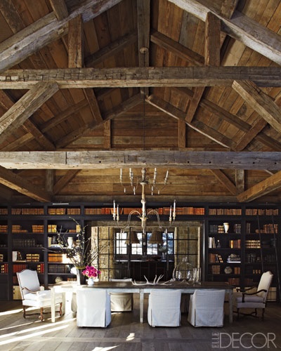
| Elle Decor, December 2010/January 2011, Rusty and Mary Lynn Turner’s Idaho home of her design, photography Miguel Flores-Vianna |
I have done year end lists now and again, though last year I did not. (Did not stitch ornaments, did not send out holiday cards, did not, did not, did not.)
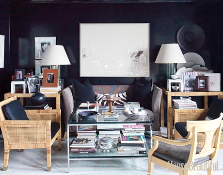 |
| House Beautiful, May 2011, Atlanta designer, Stan Topol’s office, photography Thomas Loof |
I don’t mean to imply that these are better or worse than any other, but they meant something to me.
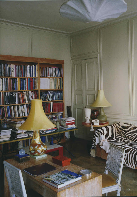 |
| World of Interiors, May 2011, Eileen Gray’s apartment, photography Roland Beaufre |
It was a very structured and orderly process, if you consider sitting amidst a pile of magazines with a pad of sticky notes structured and orderly.
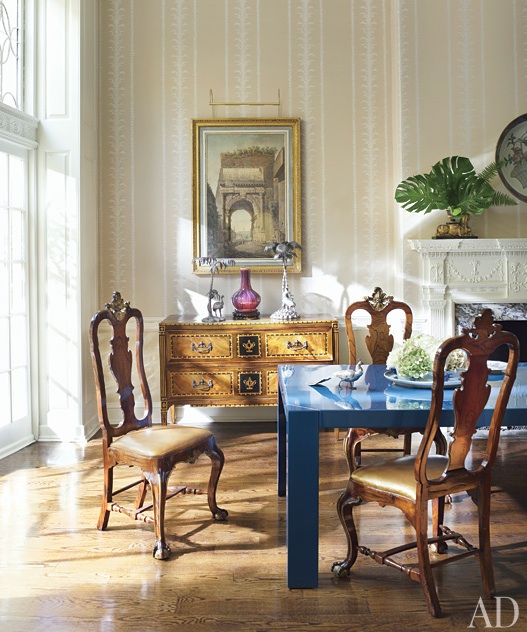 |
| Architectural Digest, July 2011, Philadelphia townhouse design by Thomas Jayne, photography Pieter Estersohn |
Don’t look too hard for a common theme.
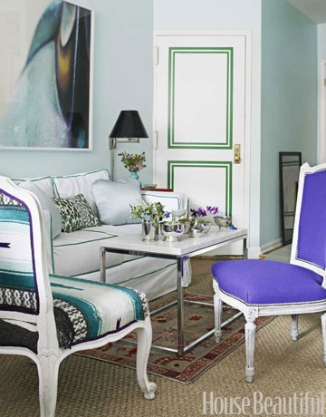 |
| House Beautiful, July/August 2011, Rebecca Phillips’s Brooklyn apartment, design by Nick Olsen photography Bjorn Wallander |
They meant something to me.
Coincidentally there were ten rooms. I’ve drawn specific inspiration from all of them, but they appeal in the big picture as well. Six through ten tomorrow.

Blue table, brown chairs, classical print, green on the mantel and that light oh my yes…
All beautiful. Happy New Year!
Interesting to see the green paint on the door in the last image. Doors are getting so much more interesting these days!
_Valerie
We love that Brooklyn apartment by Nick Olsen. Also on our list of most memorable of 2011!
I am going through the same process, going through my European magazines, design books…I really need to be merciless as my bookshelves are totally overcrowded.
Loved the Eileen Gray space!
Happy new year!
Favorites= Eileen Gray's apartment and that gorgeous dining room mixing baroque chairs with the sapphire lacquered table and the outstanding Italian Neoclassical commode thrown in. Can't wait for the next bunch. Mary
Gorgeous Patricia. The last two, by Thomas Jayne, and Nick Olsen are my favorite!!
Xoxo
Karena
Art by Karena
All beautiful but I was also particularly fond of the first. I know if our ski shack looked like that I would somehow be better on the slopes!!
All wonderful; I adore the rattan chairs and side tables in Stan Topol's office and Thomas Jayne's townhouse was SO memorable. And wow, the kelly-green trim in Rebecca Phillips's apartment – just so fresh!
It's hard not to fall in love with a black room. House Beautiful's May 2011 photo wins hands down
all so very beautiful dahhhling!
"Did not, did not, did not . . ." What is the difference between last year and this year for you?
Love your top ten list. Ann