 |
| “Why do a house in just one style? Being narrow-minded is not the message you want to pass on to your children.” |
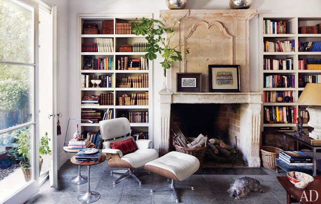
I owe a lot to the esteemed Aesthete (Mr. Lament to some) not the least of which was an introduction to Isabel Lopez-Quesada. At the time he mentioned her to me I could hardly find an image of her work on-line. Fortunately for blogland, her site has been up for a while and is a treasure trove of beautiful work. Her home in Madrid appears in Architectural Digest this month. You can find it on-line here. She does this really great thing, this combination of old and new and neutral and color and symmetry and not, and it leaves me, well, as the blogger himself would say, “gobsmacked.” I hope this is just the beginning of what we see on our pages stateside.
Do pick up the issue if you haven’t as it focuses on designers’ own homes which tend to be my favorites. Suzanne Kasler in Atlanta. David Easton, a long-time favorite, in Tulsa, my hometown. The issue would only have been better had it come wrapped in a red bow.
Image, Architectural Digest, April 2012, produced by Howard Christian; photography Simon Watson.
By the way, AD pays me for what I do there, but not for what I do here. What I do here is of my own accord. In case you were wondering.

Isabel really has the golden touch; very excited to read this issue of AD
Xoxo
Karena
Art by Karena
love the blue shutters and the pink cushions!
is the author An Aesthete's Lament a man? I had no idea….had a vision of a refined woman in my head for some reason ha
Congratulations! What a great room.
Karen
Well, what can I say, entirely well put,(unput) together…..
That fine line where planned comfort and lived in looks effortless and a schematic accidental tourist!
Bravo, and I must return to take note, sit up and delve right into those rooms one at a time…
Lovely,
L.
many things I love here….the chair, Eames?….the bookshelves and the mantel…..thank you for sharing….smiles
David – I am publishing your comment in full with the exception of your phone number, which I was not sure you would want on the internet. Thank you so much for your feedback – we are heading out of town, but I will be in touch when we get back.
Patricia,
I will try to keep this "in a nutshell", as I'm sure you will appreciate that. Having read your article, "The New Old" in KC Spaces this past week, I tried not to comment on some of your statements, such as, "…Kansas Citians have always embraced the new…" and Rod Parks comment, "..it could be the best house in Kansas City." Quite honestly, the photos of the homes you showed were, in my opinion, quite boring. Architecturally, structurally, aesthetically, functionally…they do not get near to measuring up to what most KC architects and engineers would consider the "best" house in KC.
How do I know this?
I am the youngest son of Bob D. Campbell, recently deceased structural engineer of KC/entrepreneur/business owner/O.P. resident, etc. I would not have written this post in years past, leaving it up to my father to respond if he wanted (he NEVER would, being the reserved gentleman that he was). Dad never pursued any limelight, though hundreds in KC attended his funeral in March of 2011 to listen to eulogy after eulogy from KC professionals in awe of his talents.
Why do I tell you this? I grew up in a home that Dad created and built in 1966 near downtown O.P., and these homes you showed would be considered "bland" to what is still lived in by my aging mother.
If you want to see or learn more about true KC "modern" home design that was WAY before its time and outshines your listed homes to mere mediocrity, you may call me.
FYI: I do not want to boast…my father would be embarrassed. I just could not let the truth not be heard, for my father.
Respectfully,
Christopher Campbell
That was a great issue of AD over all.
Love her work…and I did see your small write up…congrats to you!
The plant in a wicker basket just outside the door spells, PROBLEM WITH THE LANDSCAPE DESIGN.
Love the room.
It's Vanishing Threshold, alas, doesn't exist yet.
Garden & Be Well, XO Tara
The night I discovered Isabel Lopez-Quesada, I spent hours studying every photo on her website. She has a remarkable talent for unstudied casual elegance.
This issue was really great! I love to see inside the homes of designers and dealers. I would really like to see inside the homes of the dealers in KC. That would make a great coffee table book!
Oh lordy, as usual, I have nothing much to say when I visit here. Other than to let you know that I still do from time to time.
But now I gots a little sumpin to posit….do you HAVE to have the "type in the word" thing for comments? Has your spam situation gotten that bad? Tisk tisk. 'cause it's aggravating. But please, don't go changing it for me. Me, and my every six months comment.
I hope that all is well with you and that house full of Shackelmen.
Beautiful, and so lovely to see books taking centre stage so magnificently!
saw this room on another blog yesterday…it's really beautiful in so many ways… good one to "study" and learn from..
Thanks for sharing!
Ivy..