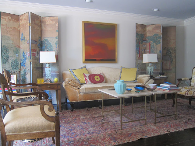
A few people posted and emailed to ask for a larger image of the screens, which, frankly is lovely. But see what happens when I post “more?” Sort of loses something, though it does look quite nice in person. It’s the light, maybe, or as someone pointed out recently, the photographer.
It’s one eight-panel screen hand-painted over silver leaf, likely 1920’s.
With some wear. Like its mistress.
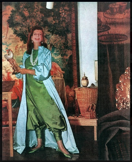
There’s a plan for some reupholstery as well. While this charming image of Pauline de Rothschild turned up on pinterest yesterday did not inspire it, it certainly could have.
Thank you, to those who asked, for your interest.


LURV what you are doing. xo xo
Chic screens – Im so jealous! Your living room is very pretty. But, possbily a more saturated wall color would greatly enhance them, or go very pale everywhere in a Frank Babb way.
Loses nothing for me. Thank you!
They are beautiful. What a focal point for the room! So glad you shared.
Gorgeous! Your Living Room is perfection!
Sarah
Gorgeous. Absolutely, heart warmingly gorgeous.
I missed yesterday's post, and when I opened up this email I thought we were delving into a published interior. Your living room is awesome. Really. Like a skinny person showing up at weight watchers–I'm sure you could be skinnier, but spare us fatties. And it reminded me that we've gotten so few glimpses of the new dreamhouse….surely you haven't given up crowd sourcing your decorating decisions? Weighing in on your dining room was the first time I had ever left a comment. On any blog, ever Not that you should follow us voyeurs–there is nothing like hear "B" to make you realize that "A" is clearly the superior choice.
The screens are really special! No, they lose nothing being shown in full. I immediately thought of the "Pauline" connection when I see the first post.
Thank you for sharing this.
Thank you for showing all of that gorgeous screen. It is a treasure. Just look at Pauline with those harem(?) pants–what style.
Mary
Absolutely lovely and elegant. Just pinned your room!
I think the photographer did just fine. Beautiful screens. My only suggestion would be to put them on an angle to fill the corners of the room, rather than have them against the wall, which leaves the corners of the room exposed. In this way you would form a "bagua", which in feng shui terms could make the room even more pleasing. Nice job!
Hmmm. Have you seen that Dove video going viral, where the women describing themselves paint such a different picture than other people describing them?
This reminds me of that. The picture of the whole room is stunning, such an amazing example of detail, balance and proportion. Yet your own description of the photo is so disparaging! I think people who follow your blog, myself included, do so because of both your eye for detail and fabulousness, and because of your exquisite documentation of the *process* of how you get there. If you only took photos and posted them when everything is done/recovered/reshaded/the light is right/the legos are away…then we would have nothing to follow, nothing to inspire.
It's great the way it is, it will be great the way it will be. Keep posting.
I think it's coming along nicely and looks wonderful! LOVE your rug -the screens are fab…..it's a great start and it's already wonderful.
Anon – I have seen the Dove commercial and was struck by how at least one woman said, "My mother always said I had a wide chin." Some of that self-deprecation that we carry was handed to us and while we have the choice to lug it around or leave it, it can be hard to forget.
Every time I post an image of my home I receive several, sometimes well-meaning, criticisms and suggestions. So, it takes a little fortitude to put it out there. The good stuff, the kind words, those stick, too and I do appreciate those who leave those with me as well.
I always love seeing photos of your home and this is simply gorgeous!!! Thanks for sharing!
Still as gorgeous…where did you find them. I have a four panel screen that I feel is too dark and so it isn't being used.
xoxo
Karena
Lovely room with pretty soft colors. I hate to say this, but your cocktail tables appear to be almost end table height. They are so nice, but I think could be even better if you shortened them just a bit. They are holding your lovely sofa captive! Certaily not a deal breaker, just a suggestion.
Lovely…both the screens and your living room! Good job!
Patricia, the screens are stunning! I think they look great even close-up.
It could be simply that the colors don't translate well via my computer screen, but I see no reference for the yellow pillows on the pinky beige sofa. The screens would definitely look better in the corners and a softer, more compatible painting above the sofa. Your colors are soft and the jarring color in the painting takes center stage. I'm not sure that's what you were looking for.
really stunning, mrs. b. the earlier glimpse was as well. the little yellow touches are just the best. thanks a million for sharing your own space. I know how hard that is to do…donna
Patricia,
I am wildly in love with those screens! I don't know how you get anything done. I would just sit there and stare at them all day long. And a pair! You really hit the jackpot on these. Those colors are incredible, and the scenes are, too.
There is something so wonderful about Chinese art. We have a Chinese four-panel screen in our formal dining room, and I placed it so that when I work in here on my computer I can see it. I bought it for the living room but moved it in here as inspiration. We also have a Chinese painting on what I believe to be silk that was mounted to board and framed. It hangs over our sideboard flanked by two large turquoise (copper that has weathered to this color) garden urns with finials on their lids that make my heart flutter.
For twenty years, I have never tired of looking at the painting or the urns, and I know you will enjoy those fabulous screens for years and years to come. They are, indeed, a forever purchase, a once in a lifetime find, a visual feast and perfect in your home. So glad you shared them with us. I'm sure I will be back to ogle them again.
XO,
Sheila
That's a fricking brilliant room. Elevated beyond interior design alone. I can almost feel it stroking my furrowed brow.