I did keep it simple (which is a good idea considering my proficiency in the kitchen) and was happy that I am finally feeling that my house is starting to look like me.
It did from the start, I suppose, though now it is fuller. More nuanced. It’s good to be at the point where I can worry about the music and whether or not I have enough tonic and not how to accommodate an evening with company when there’s a big dark hole in the corner that has no lamp.
Does anyone but me notice when something isn’t right? Probably not. But the energy is different and I can feel its shift.
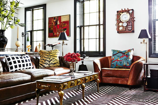
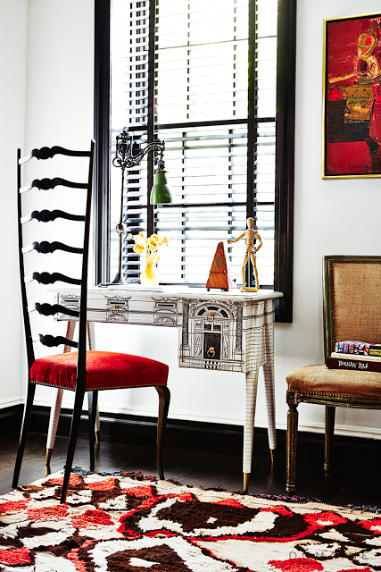
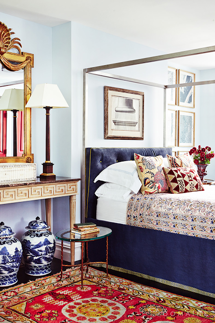
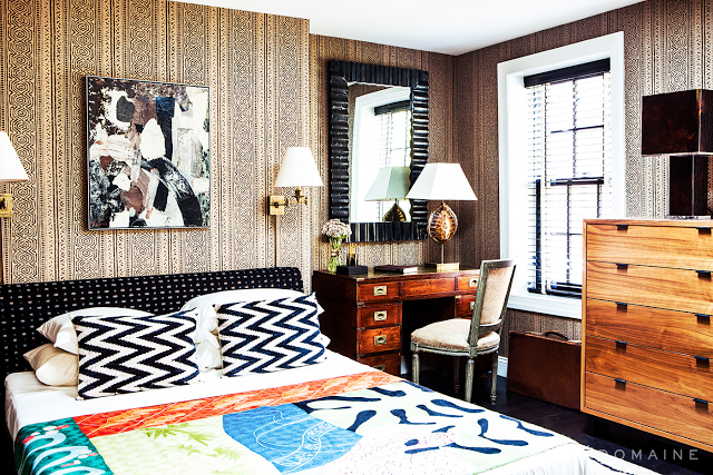
Speaking of nuanced, these rooms designed by Nick Olsen are some of my favorites. His site looks great and you’re sure to find plenty of inspiration there by clicking here.
Images, My Domaine, photography by Reid Rolls. You can find the story here.


Yes I always notice, not in others homes, in mine though! When do we get to see more of your home even though I adore Nick's designs!
xoxo
Karena
The Arts by Karena
Ceramic Artist Leah Bowring
love the rooms….
Really love you writing – inspirational for someone who's just started blogging! Thanks for sharing.
http://www.magpiehomes.wordpress.com
Thank you, my darling! So much credit goes to the great Reid Rolls who took these photos. And to the clients who let me go to town (and back).
Soon the Dream House 3.0 will be as warm and nuanced as you are … which is very!
X