Farrow and Ball, darling, you were just reading my mind.
My bedroom, the one out of which I may be moving? I was just thinking it should have this subtle but not so neutral palette.
And then you send me this. A little wallpaper Valentine telling me that, yes, the stars have aligned and all is just as it should be.
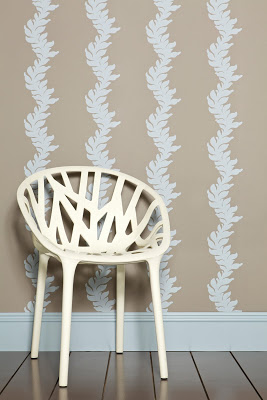
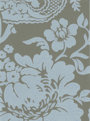
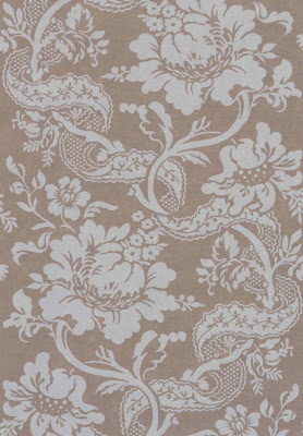
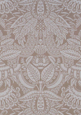
The new Baroque Collection which is available this month in this particularly appealing and never before seen combination of Charleston Gray (ground) and Parma Gray (pattern) and sixty-two others. Yes, that’s right, sixty-three color-way combinations. No wonder they are calling it “sumptuous.”
All images courtesy of Farrow and Ball; the second is a scan of the paper and is most representative of the color. Or colour.


I keep seeing this word. It reminds me of a time gone by. Love the designs.
pve
Love their colors and papers. Thanks for the heads up on the new collection.
Love, love, love the wallpaper. And the chair in the first photo, can you provide more information? It is fabulous.
Go for it!
Love Farrow & Ball, especially in the neutral color ways. So sophisticated but still charming. Hope you are well.
Always loved Farrow and Ball and now have even more reason to. Agree with Gwen – love the neutrals. I've been looking for something for a powder room – this may be it – thank you!
Absolutely lovely! Can't wait to view the entire collection! xoxo Beth
oh I LOVE that – not stodgy at all!
Farrow and Ball has the most beautiful wall coverings. Love this collection.
Teresa
Mrs. Blandings,
Great paper and the chair in the first photo, can you provide more information? It is fabulous.
Am dashing this morning – will be back this afternoon with a link for the chair. Promise.
This line is phenomenal. My favorite is the last (paisley?) pattern. When does this momentous move take place?
So gorgeous!
I LOVE the Farrow and Ball papers but beware- they are a nightmare to hang. My husband is great at hanging paper and he refused to use this paper again so I had to hire someone else. The paper itself is a bit fragile but if you rub it too much, eg to get the bubbles out, the color comes right off. I just had my nursery done with the Silvergate design in Teresa's Green (which has turned into the loveliest 'glass' color on the walls) and originally thought that I would have two rolls too many. THEN overnight, the paper dried thoroughly and shrunk, leaving gaps between certain panels and I had to have it re-done. Finally, I ended up with just enough.
I still think its pretty enough to be worth the bother 🙂
Oh, PS I think that the chair is available through the Conran Shop. Its from Ronan and Erwan Bouroullec. In french its called the chaise vegetal