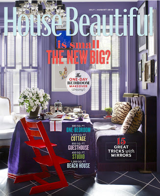
 The recent round of editor musical chairs made the magazine junkies excited, but maybe a little jumpy and twitchy. No one likes anyone messing with one of her favorites. Such a relief, though not a surprise, to find Newell Turner’s first issue of House Beautiful such a delight.
Not a surprise as Turner has been Style Director at House Beautiful for quite a while; the magazine has felt his influence already. “I worked so closely with Stephen Drucker over the last four years here that I feel like it’s already my House Beautiful. But, great magazines are alive and dynamic – meaning there’s always some evolution in progress. Especially today, no one wants exactly the same thing over and over again,” says Turner.
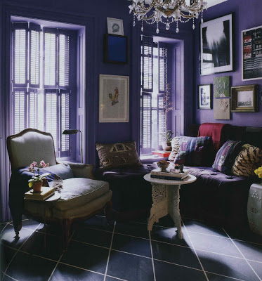
I wondered if he had a moment of giddy pleasure being able to feature David Kaihoi’s distinctly beautiful apartment in his debut issue. “I did! This may sound a little crazy, but that purple color spoke to me.” No, no that doesn’t sound crazy at all. That sounds normal. That’s normal, right?

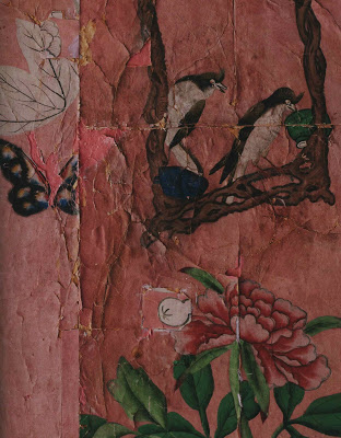
Turner was quick to give credit to his team, “Of course, I have one of the best design directors, Scot Schy , in publishing. I loved what David did with the salvaged wallpaper in the bedroom. And, when Scot showed me the layouts for the story including a full page detail of the wallpaper…how much more evocative does it get? Every time I look at that spread in the magazine I want to reach out and touch the wallpaper. I hope it does the same thing to our readers!”
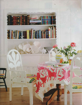
If you haven’t had a chance to pick up the July/August issue you should make it a point. That sunny beach house, top, can put a spring in any one’s step. And Kaihoi’s apartment? Tear Sheet Hall of Fame.
All images House Beautiful, July/August 2010. Photography, second from top, Victoria Pearson; design, Krista Ewart; remain photos by Ngoc Minh Ngo.


I got my copy today and loved it. The tiny Kaihoy apartment is a showstopper. I will miss Stephen Drucker but feel confident that Newell Turner will keep up the good work with my favourite shelter magazine.
I got my copy today and loved it. The tiny Kaihoy apartment is a showstopper. I will miss Stephen Drucker but feel confident that Newell Turner will keep up the good work with my favourite shelter magazine.
This is possibly the best HB in years. What appeals to me most is grand style in a small space–which is why I enjoyed SOUTHERN LIVING Magazine's effort to enshrine that ethic with their COTTAGE LIVING Magazine, which folded two years ago.And why APARTMENT THERAPY is my favorite website.
And Newell is one of the best in the business! The magazine looks just great, IMHO 🙂
I was a little nervous, too. Too many of my favorites have gone to magazine heaven–and the thought of messing with those that remained…..But I love the purple–and the wallpaper made me feel right at home as I have a large salvaged c.1790 French wallpaper screen in my living room that is in only slightly better condition that the Chinese paper. I love the evolve feeling of the magazine.
jlonit – Fortunately, we can still visit with Drucker via Town & Country; I hope you saw the Miles Redd project in this last issue. Wowza.
Amy – I totally agree that it is a terrific issue.
Mary – your screen sounds amazing. I bet Kaihoi's bedroom will make a lot of folks look twice at less than perfect pieces.
Jennifer – I don't know all that much about the business, but I think he is an incredibly nice guy.
Sad to say, I have to disagree. Kaihoi's apartment made me so sad, because aside from the Stokke chair, there was little to no evidence of his child in the house. No toys aside from a small shelf? No art? No room to run? 2 adults and a preschooler in 300 SF?
I fully believe that living in small spaces can be done — I'm raising 2 boys in 1000 SF — and that no one needs a McMansion. But that apartment focuses completely on the parents and their design wishes. I hope for the child's sake that she's in preschool or daycare all day, and that they go to the country house on weekends, or something similar. I really hope they don't spend a lot of time there, other than sleeping.
That feature just left me depressed.
Anon – You know, this came up when I posted some images from here a week or so ago. I wouldn't assume that a home looks day-to-day the way it looks for a photo shoot, or a party for that matter. When people come to my house it is not littered with toys and plastered with children's drawings, either, though it normally is. You may be right, of course, it may be the stuff of childhood hell, but life is rarely how it looks in magazines.
I loved Newell's first issue as well. He is a wildly creative design editor—and a downright terrific guy—and I wish him great success and can't wait to see what he does at HB.
I, too, was worried when I heard of the departure of Drucker from my favorite magazine but agree that Newell has hit the mark with his first issue and I am so excited to see what's next!
xoxo Beth
PS And that purple…swoon!
Just finished reading my copy of House Beautiful – I loved it! Congratulations to Mr. Newell Turner. I feel he hit it out of the park with his first issue. I like the fact that the focus was put on how we can all live graciously in smaller spaces.
I too adored this issue and the purple palette was very exciting! I think Newell will make House Beautiful fresh and creative.
Karena
Art by Karena
I haven't read HB in years — but this post will send me to the newsstand — compelling images.
Yay Newell!
The magazine looks great and it looks like Newell Turner is off to a terrific start.
Loved the purple in Mr. Kaihoi's apartment, but dread to think how bad that'll look when Mrs. Jones tries that at the Jones residence with the help of her Home Depot style consultant — yikes!
There were so many pages of inspiration in this issue, that I think I may just have to keep the whole thing. Love the apartment featured on the cover. And, yes…I want to reach and touch that wallpaper!
Here's to Newell! Keep bringing it!!
Elizabeth
Really? I thought there were a few interesting spaces but on the whole I was underwhelmed. And the purple turned me off, even though I like purple. At least I still have the Barefoot Contessa for solace.
Mrs. B,
Please tell Anon Mrs. Jones painted her living room purple five years ago…her dining room too.
She got the idea from a 1992 Elle Decor.
Respectfully,
Mrs. J
Oh WOW!!!
Newell is the nicest guy ever!!! And is starting out with a BANG!!! He has exquisite taste and Southern charm; and the values he expressed in his first "editor's letter" are a welcome change from the "McMansion", and "Celebrity" proponents. Whew!!!
He and Scott Schy photographed our house a while ago; they are just so talented and imaginative!
They were taking very unusual pictures; which I cannot wait to see!
Our house going to be in next month in the "Color" issue; written by one of my very favorite writers!!
I am so happy for him! (And myself as the decorator!)
The funniest thing that happened when he called; we spoke at some length. He called back and asked:
"are those vines deciduous?" Brilliant. Wait till you see!!!
(the answer was yes…..the crew arrived sooner; not later!)
When he was made Editor; he received a beautiful bouquet from some bloggers ,and he included a photo and credited the florist !!! Lovely!!!
BRAVO!!!
I hadn't picked up an issue in a long while, but after seeing a friend's copy, I had to pick it up. Gorgeous. And that purple? Is now in my spare room.