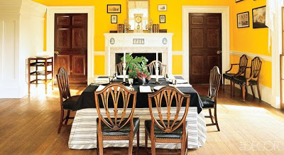
 In the spirit of the holiday make sure to read about the process for updating the paint color in Thomas Jefferson’s dining room at Monticello in this month’s Elle Decor. The change from Wedgwood-blue to chrome-yellow is startling. Equally enlightening is the magazine’s revamped site which has loads of original content. Accompanying this piece is Mitch Owen’s round up of striking paint colors in historic homes across the country. Doubly helpful are the suggestions of modern day colors straight from the can that are a close match.
Image via elledecor.com by Pieter Estersohn.

great, we all need a jolt now and again, I can not wait to go see it this fall. pgt
I will head over to read the article, that chrome yellow is electric…how intriguing…thanks for the tip!
sunnyside up! 🙂
Thanks for the link, love Jolly Green. A little more bold than the other historical colors which pepped me up at the start of the week. Hope it was a great 4th.
Happy 4th of July , Mrs B!
Saw your beautiful pic in this months Elle decor! Yay!
I've taken my daughter to Monticello, two years ago- and that glorious dining room was so dreary in that Wedgewood blue. ..now it positively glows!a
Jefferson's home, Monticello,is a great place to visit if you are in Virginia. There are now many specialized tours unlike the standard walk through with a guide when I was a child.
Good! People weren't afraid of color back then — or maybe it had to do with the lack of electricity?
I'm tired of seeing beige and sage green everywhere. Maybe it's soothing but sometimes it's fun to live beyond playing it safe. Wonder if this will get past the decorating pages and into the national psyche, though.
Just finished this fascinating article about the new (actually old) paint color of Monticello's dining room this past weekend. I like the color.
The yellow dining room is so cheery. When I saw the picture but hadn't read the post, I thought you might have brought your ourside yellow into your dining room.
The details in the Monticello dining room are stunning. Such craftsmanship!
Yellow isn't a personal favorite, but comparing the before and after photos in the article, it's much better than the former blue.
I have always loved yellow!
I flipped for this too. So interesting also to see the table settings done up for the shoot in this historic setting. And I agree with Kerry, Monticello has really expanded the educational offerings.
It looks like a big improvement over the old scheme, but it's not what I think of as "chrome yellow."
(Perhaps this is some defect of my own.)
P.S. I'm on record somewhere as hating Monticello for two reasons: First, it's constructed in a way to disguise the essential role of slaves to make it work as a house, and second (and from a contemporary standpoint, more important) because it suffers from what I think of as The Palladian Disease — the compulsion to allow the exterior fenestration to dominate the interior allotment of space. (Monticello is a big house with little rooms. No wonder Jefferson felt compelled to flee so often to Poplar Forest — a small house with comparably small rooms, albeit no visitors.)
In rooms of generous scale and perfect proportions
those brilliant colors can have enormous appeal,
as the Monticello dining room shows us. Refreshing
to see bold color within the framework of classical
architecture, too. It's only when those brave hues get
applied to modest American houses, that I start
running for the hills.
In this room, I would need sunglasses at night.
Also, I believe extensive archaeological research related to slavery is currently taking place at Monticello. I think there is a stronger emphasis now on telling a more complete story, educating visitors about the many craftsmen who built the structure etc.
Absolutely loving the bold yellow shade – such a statement colour. I have inherited a deep green in the dining room of my Georgian house in England, and I was tempted to go straight to neutral – however, in keeping with the spirit of the time and on seeing this image – perhaps it's time for a rethink!
Of late, I have been consumed with yellow, in both the interiors and exteriors of houses, a color I once deplored. I do believe there is some truth to the idea of, what another reader called, "generous scale and perfect proportions" in bringing out its brilliance. It is especially pleasing when used in older homes, estates not withstanding.
Hi Patricia,
I was at Monticello this past Friday July 2. Previously I had visited there two weeks prior to 9/11 and was so enthralled with Mr Jefferson's inventions that his color scheme gave me no pause. The docent commented that this, the original color, was chosen to take advantage of natural light and it certainly does.
Best wishes,
Amy in Omaha
So sorry, the boys had me running today. I learn so much here in the comments section and am always delighted when there are such divergent views. Mrs. Sutton, while some are turning on or turning off yellow (or the lights) I am more and more drawn to green lately. I say keep it for a while longer.
Beautiful and bright love it. Yellow is so mellow.
Brooke
http://www.momentsofelegance.com