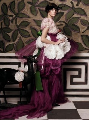
 I have gone back to look at this image a dozen times. And saved it. And, finally, printed it because I need paper inspiration files. That giant Greek key has me hunting for a yard stick and a paint brush. The flowers! That green! I can’t get enough.
This Steven Meisel image appeared in Vogue in May, 2007; the layout was produced by Grace Coddington, set design by Mary Howard and panels by Sarah Oliphant. My hat is off to all of them. You can see the slideshow here.
From the incomparable Little Augury and her award-winning (well, it should be) post here. The image is

AMAZING!!!!! xoxo
It is you, Patricia, and a great weekend project! Fabulous image from Little Augury.
Karena
Art by Karena
That boysenberry color!!!
Are you thinking of this for a room in your home? I can see it being fabulous! I love the graphic bold key juxtaposed against that green leaf ~
Her dress is stunning.
pve
The Greek key is always "in"- a Classic-since… Well- Greece.
& I humbly accept, pgt
It is an amazing image. And, Patricia, I don't know, but it needs to go somewhere.
I'd be happy if I could be taken seriously while wearing that get-up.
The floor butting up against the greek key–definitely amazing. Thanks, Mary
Just when I think I need to simplify and the image in my head is of whitewashed Greek villages…. along come this.
Great image. Thanks fro sharing!
well, if anyone can do it, you can. The whole image is pretty bananas. Those giant Camillas, the loosely painted floor and wal, the colors… LOVE it.
Totally bananas. Love it.
Luscious!!!! Now I think I need a splash of green in my black, white and wine bedroom.