View From Thornhill Farm

IMG_2268

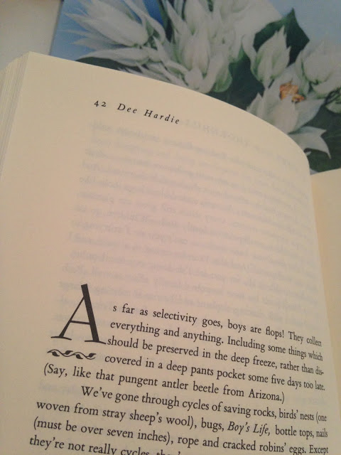
Before there were collages of product and collections of quotes, there were often words on the back pages of decorating magazines.  House Beautiful was the first shelter magazine that I began buying and reading when I was just out of college.  Part of the pleasure of reading House Beautiful was not only exposure to the creativity of design, but turning to the back page and reading Dee Hardie’s tales of her family’s life in an old farmhouse in Maryland. Her life was not extraordinary.  What she did was pay attention.  Well before it was a catch phrase, she was present in her life.  She appreciated the significance of what turned up in her children’s pants pockets, and by telling her stories she made me pay a little closer attention myself.

I enjoyed Dominique Browning’s editor’s column for HG for the same reasons. And I read with equal delight the entirely different narrative of Mayer Rus when he wrote The Testy Tastemaker for HG. He told me once that writing the column filled him with anxiety.  (There’s a local columnist who once said that writing a regular column is like being married to a nymphomaniac; it’s fun in the beginning.) But the thing that all of these writers brought to their trade, was a very personal view of home and design.  Michael Boodro’s editor’s letters for Elle Decor come the closest today, (though I always wish they were longer) but this sort of narrative is largely lost.

Dee Hardie died last week from heart failure; she was 89.  I so regret that I did not make the effort to try and meet her, or at the very least write to let her know what her stories of everyday life meant to me.  I owe her a lot.  I feel sure there would be no Mrs. Blandings without her.

Many thanks to Meg Fairfax Fielding of Pigtown Design for sending me Hardie’s book, Views from Thornhill courtesy of Book Thing a few years ago.

rssrss      FacebooktwitterpinterestlinkedinmailFacebooktwitterpinterestlinkedinmail

Rooms for Living Are the Best Kind

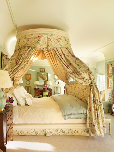
141509_Suzanne_Rheinstein_Bedroom_3

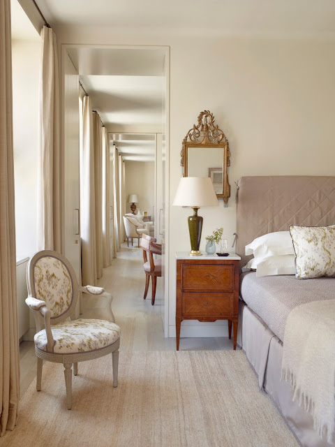
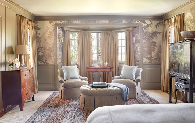
I had hoped to post on Suzanne Rheinstein’s new book, Rooms for Living: A Style for Today with Things from the Past, before Thanksgiving.  Each time I’ve visited with Suzanne she is so gracious. Her demeanor, while lively and engaged, is soothing.  It’s as if nothing bad could happen to you while you were talking to someone who is so lovely and at the same time completely unstuffy.  All of that is sort of how Thanksgiving feels to me and I thought they would be a good fit.  Suzanne and Thanksgiving, I mean.

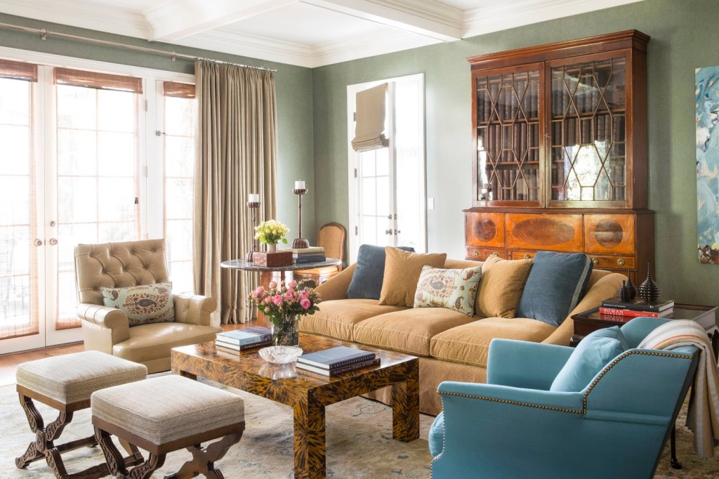
Rheinstein_Klein_MasterBedroom_3

But the oldest boy came home and life, as they say, got in the way. So, now we gear up for the joyous, hectic, giddy rush of December, the great escalation before we slide – either gratefully or reluctantly – into the new year.  Perhaps in the face of that we could use a little escape.

Roder_MasterBedroom_1

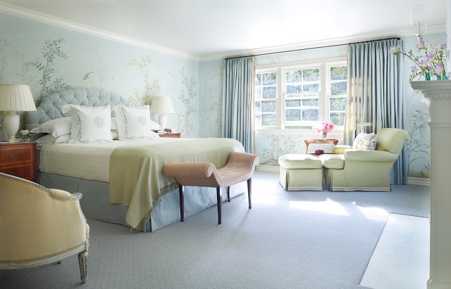
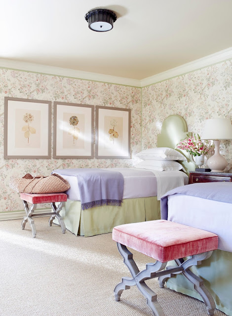
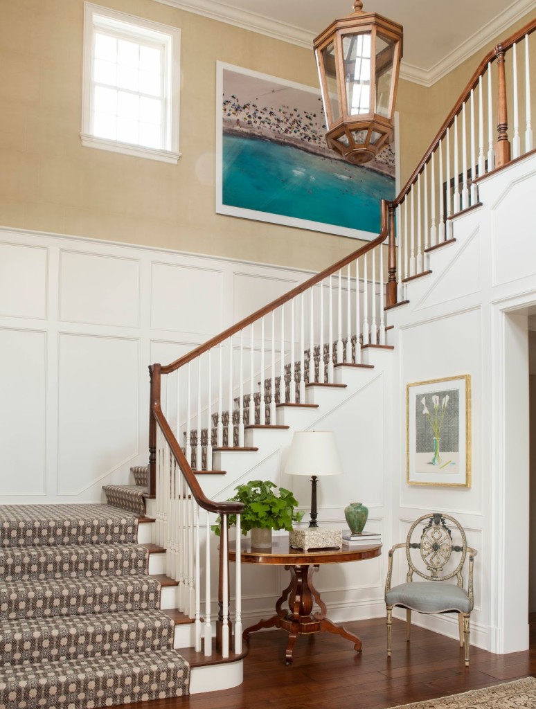
Rheinstein does undeniably beautiful work, and having a second collection of it gathered in one spot is a treat.  This book is structured by room, so it has a different feel from the last.

Roeder_UpstairsBedroom

As I’ve recently sorted (or re- and re-sorted) my living room and dining room, I’ve turned my attention to my bedroom, which is a jumble of cast-offs and orphans.  If you’re in the midst of a project like this, be it real or imaginary, the layout of Room for Living is particularly handy.

Wecker_Suzanne_NOVATO_CA_62181FINAL

There’s a deep crease in my copy at the beginning of the bedroom chapter and I’ve committed to painting my bed and upholstering the headboard thanks to Suzanne. (Might I paint a mirror in the style of Christian Berard as she’s done as well? I might.)

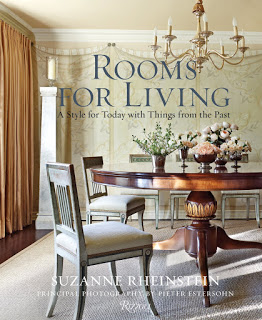
SuzanneRheinstein_cover

If you could use a quiet escape from the rush and hurry of the next few weeks, Rooms for Living is a good place to turn.

All images courtesy of Rizzoli New York; photography Pieter Estersohn.

rssrss      FacebooktwitterpinterestlinkedinmailFacebooktwitterpinterestlinkedinmail

Re-articulation

schulumbergertulip

It’s bracelets, really, that I cannot resist.  In fact, I recently took a pendant in to be put on a longer chain in the hope that I would wear it, but just last night as I was taking off my jewelry I thought, “Folly.  The only thing to be done is to make a bracelet.”

But then as I was in bed, down comforter tucked under my arms and spirit braced against the unrelenting rain, I flipped through Bazaar and came across this.  The Tiffany & Co. by Schlumberger Tulip necklace is articulated.  This twist of ribbon and blooms, bows and bugs would rest just over your collar bone, not stiff but fluid, the diamonds winking as you leaned in to hear his clever remark at the obligatory dinner. I can’t remember the last time I saw anything as lovely or graceful. This necklace alone would make me leave the bracelets in the drawer.

My apologies to Bazaar.  I’d love to link the remarkable image of this necklace on the lovely pale blue background with the stunning white French tulips and their rich, green leaves, but I cannot find it on your site.  

rssrss      FacebooktwitterpinterestlinkedinmailFacebooktwitterpinterestlinkedinmail

Fresh Take on Tradition

We put up our tree last weekend.  It’s a little earlier for me; I tend to wait another week.  But, the oldest was home from college and we wanted to decorate all together.  

We brought the boxes up from the basement and each boy pulled out his ornaments and hung them on the still-soft branches of the fir.  (Forgive me if I was wistful that they were not all gathered about the bottom, but evenly spaced all the way to the tip.)

There’s comfort in these rituals, just as there is comfort in reviewing the work of a favorite decorator.

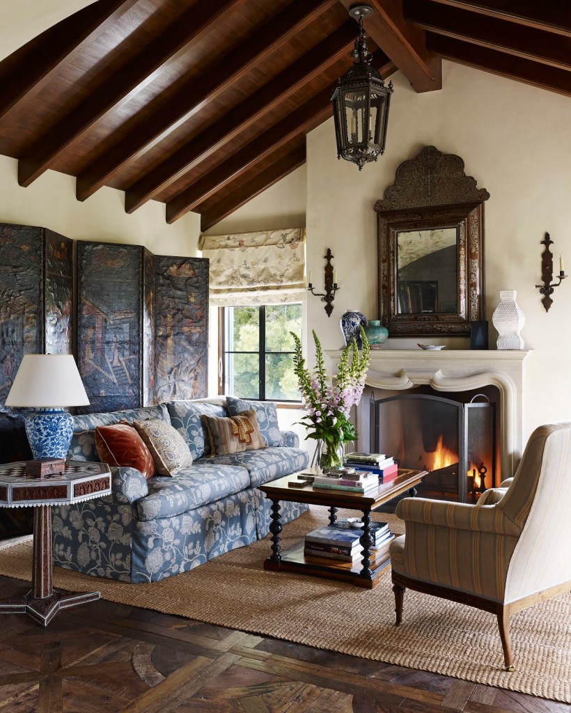
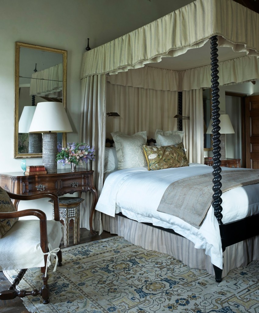
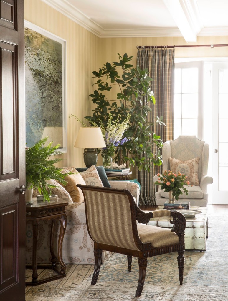
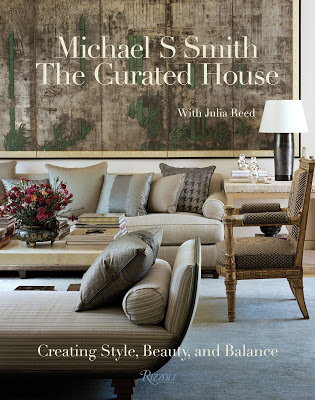
I’ve long admired Michael Smith, and his third book, The Curated House, which features four of his personal residences, does not disappoint.

I never fail to find inspiration in his color palettes, his combination of traditional and modern and – most helpful to me – the logic of his furniture arrangements.  As you’re filling out your Christmas list, this would be a good book to have upon it.  (Better yet, buy it for yourself.  I’m quite sure you deserve it.)

 All images Michael S. Smith; The Curated House; Rizzoli New York, 2015 used with permission from the publisher.

rssrss      FacebooktwitterpinterestlinkedinmailFacebooktwitterpinterestlinkedinmail

Artful Dodger

We’re having more noon gloom than June gloom here in Kansas City.  Yesterday a friend texted at 4:30 saying, “Does it seem like it’s getting dark already?” Still, there’s no reason to give in to it – better to seek a little sunshine.

I’ve gone back again and again to Los Angeles art dealer, Maggie Kayne’s, modern home for inspiration.  The Architectural Digest feature produced by Mayer Rus is the freshest thing I’ve seen on paper or screen for a long time.  Architectural pedigree? Sure. Iconic furniture design? Yes.  Bold and arresting art? Of course.  But there’s something fresh and remarkably un-decoratory about her home.  It seems so personal.  It reminds me of House & Garden.  Okay, when one starts to get nostalgic about magazines, it’s time to sign off.

You can see the entire feature here.

Image, Architectural Digest, December 2015.  Photography Douglas Friedman, produced by Mayer Rus, styled by Michael Reynolds.

rssrss      FacebooktwitterpinterestlinkedinmailFacebooktwitterpinterestlinkedinmail