 As all married people do, Mr. Blandings and I have a short hand. “Dude,” is one, but we have another that comes up fairly often. There are people, well-known people, with whom I become convinced that I would be friends if only our paths were to cross. The first time I described this I said, “If we sat next to each other on a plane I think we would be friends,” and that is the measure, now, to describe my connection to someone. Someone famous or at least famous-y.
I feel quite sure, and have for along time, that if Nora Ephron and I sat next to each other on a plane we would hit it off. Which was why I was quite excited at the prospect of the new Ephron movie,
Julie & Julia.
I have a sort of perverse connection to
You’ve Got Mail and one of the things I really enjoy about all Ephron films are the sets. I’m a girl who likes a good set. I had the pleasure of seeing Julie & Julia this week and was delighted once again.
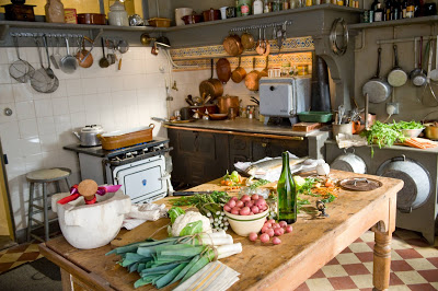
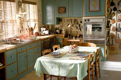
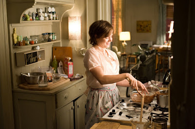
One of the things that intrigues me about movies is the process. I checked in with Mark Ricker, who was the Production Designer on Julie & Julia, and he explained how the sets evolved. “(The Production Designer) is one of the first people hired once a film gets the green light. Typically the relationship with the director grows out of conversation, research, shared ideas, art, references, etc. Nora is very involved. (She) is very good at knowing spacial relationships, camera angles in her head and other devices.”
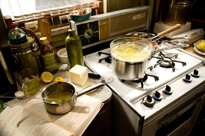
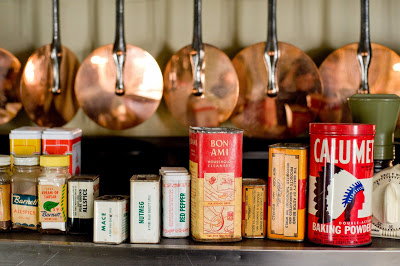
Julia and Paul Child’s apartment in Paris is delicious. “Julia’s apartment was pretty much an instant sell. Julie’s took more steps as Nora had been to the real apartment herself, and so was influenced by what she saw there, which ultimately wasn’t very camera friendly. We wanted to show the history built between she and her husband Eric. They read a lot. They love science fiction, so we had some posters and tons of paperbacks and travel books. Both are from Texas so we had a few Texas touches throughout. Basically, we just built a layer of accumulation in an apartment without a specific design style, but cozy nevertheless.”
I asked Mark if he ever develops a crush on something they have gathered for a set. Let’s face it, he’s a designer. “Production Design,” says Mark, “is a combination of the best of visual fields: Architecture, Interior Design & Decorative Arts, History, Film making, Storytelling, Photography, Landscape Design, Travel..” As for the crushes? “It always happens. Shopping for the set dressing on a film is a combination of buying with characters in mind, but through the filter of personal taste. It is inevitable that certain pieces become fodder for crushes, and I always end up with a trinket or two.”
Mark was extremely helpful; for the full interview, and details of what he stuffed in his duffel, click
here. The other critical piece of setting the stage is Set Decoration. Next Friday I’ll post an interview with the Set Decorator from Julie & Julia, Susan Bode, whom Mark deemed “a genius at coming up with the details.” The movie opens August 7th.
All images courtesy of Sony Pictures; photography by Jonathan Wenk.


 Not that I need any more turquoise and gold, but geez. And, in the six degrees thing, it is very similar to the ring Stanley Tucci wears as Paul Child, which you can see on Meg’s blog here.