Me and Mrs. Jones

With the recent demise of the esteemed blog House of Beauty and Culture I had to pause and consider why its author would cease to find joy in something that was offering so much of that elusive stuff to me.  

And like all kinds of loss it made me stop and wonder when the day would come when I would pull the plug.  Honestly, it’s hard to imagine blogging indefinitely.  Hmmm…”Well, I’ve been blogging for twenty-eight years and…”  No.  Unlikely.

And as a great over-thinker I had to wander the path of, “Why in the heck am I doing this anyway?”

For me the answer remains the same as the day I started almost two years ago.  The exchange.  The conversation.  The connection.

Often the connection takes place with another blogger, but it happens, too, to sometimes flourish with a reader.  You exchange a few emails, you get to know each other a little better.  You might even fill in some of the more personal details.

And then one day her house appears in a local magazine and you marvel at her mix and unbelievable color sense.  And you just want to email her the password and say, “Your turn.”
You can read the article from the May/June 2009 issue of Kansas City Home Design here.  Photography by Landon Collis.
rssrss      FacebooktwitterpinterestlinkedinmailFacebooktwitterpinterestlinkedinmail

In the Closet

Jennifer Boles of the Peak of Chic did a great post last week on the design equivalent of lipstick.  She’s layering her home with thoughtful touches that are both stylish and budget friendly.  She asked her readers what their “lipstick purchases” have been.

Mine have been paint.  When we bought the dream house we had a little bit of time between closings so we freshened up our new home with paint.  The painters did not think they would have enough time to finish before we moved in so I pleaded, “What if you didn’t do the closets?  Would that save enough time?”  Yes, agreed, no closets.  A happy compromise and, as I like to paint, I thought I’d do them myself.

Nearly nine years later I had completed one.  Five years ago I painted the big boys’ closet while they were skiing with Mr. Blandings.  But right before school let out I took on the front hall closet.  It was supposed to be papered with the same paper as the front hall, but had been forgotten.  Nine years ago.

I don’t usually like pink for myself but I was having a hankering.  The first shade was horrific, but the next, while vibrant, was just what I was after.  Then, just following an exchange with another blogger about the current wave of Draperesque design not holding up, both of us nodding our heads at our computer screens, I Dorothy-ed the ceiling.  I was inspired by a couple of pieces I’d seen in Joe Nye’s showroom in New York.


I’ve been thinking about these butterflies for a while.  Once completed I decided they were too dense, but I suppose my perspective was skewed as I was on a ladder in a very tiny space.  Also, I think a new globe is in order but I’ve been far too busy running my ridiculously-indulged children around to pick one up.  Which will also be the excuse I use for not painting the remaining four un-touched closets for at least three more months.

rssrss      FacebooktwitterpinterestlinkedinmailFacebooktwitterpinterestlinkedinmail

Enduring Style – Postscript

Just a few thoughts as I wrap things up here.  Courtney Barnes at Style Court sent me these images that she had saved (and cropped) from Ruthie Sommers’s inspiration board that appeared in the first issue of domino, 2005.

I need to find a spot to put a board like this as I usually end up with piles of stuff on my desk for weeks on end.  But I thought the board was interesting because you can see that Sommers was inspired by other designers’ work.  Miles Redd noted this as well and many readers commented on the fact that he was inspired by the work of his contemporaries.

It’s likely that each of us has different elements that jump out at us among Sommers’s creative jumble – the Smith dining room, the most excellent green on the cover of World of Interiors, the graphic punch of the stack of stripes.

But I continue to feel the tug of Steven Gambrel’s second Sag Harbor house that appeared in Elle Decor, July/August 2004.


I can still recall opening that issue and the mental gasp when I saw these images for the first time.  

Aesthete’s Lament also noted, “Gambrel’s first Sag Harbor house was genius… pure genius.”  The Aesthete went on to say that Gambrel’s color sense is exemplary.  I must agree.

The gift of that color magic, with the unerring eye and, most importantly in this case I think, some budget constrictions resulted in something particularly special.  

This house, I think, will come around again and again as one of the examples of an enduring aesthetic of our day.

Designers’ own homes often seem the mad scientists’ laboratories and how I do love to see what they are cooking up.

Images, top, via Style Court; photography for the Gambrel images by William Waldron.
rssrss      FacebooktwitterpinterestlinkedinmailFacebooktwitterpinterestlinkedinmail

Enduring Style – Suzanne Rheinstein

I checked in with Suzanne Rheinstein after Courtney’s selection of her living room as a space with enduring style.  I wondered what she thought made the room a classic.  She graciously replied as follows:

“The combination of furniture from different eras: Louis XVI, Regency and Italian Directoire is arranged in a somewhat 18th century manner.  Yet, it is not too precious and there is not too much furniture in the room.

The colors are soft, in the café au lait family and different blues.  In the summer, most of the furniture wears blue and cream striped slipcovers.  As you examine the room, you’ll see a lot of details and layers, yet it is not fussy in any way.

The overall feeling is one of serenity.  You can be in the room any number of times and you will notice something surprising about it every time.  Yet, it doesn’t scream “decorated” at you!
What really helps make this room classic is that it is used.  We use it all of the time for aperitifs with a few friends or as a place to eat for big buffets.  The furniture adapts itself to the occasion; no one is afraid to move a chair to a more comfortable spot for conversation.” 
And what were Rheinstein’s picks for classic, enduring style? 
Bunny Williams’ Living Room in Punta Cana


John Saladino’s Villa in Montecito


Roger Lussier in Boston


And just in case you thought I would make it through this whole series with no hometown mention?  John Saladino is from Kansas City.
Thanks to all the bloggers, readers, commenters and designers who weighed in and helped me out.
Images 1, 3 and 5 from Inspired Styles, 2 and 4 via Style Court; both images of William’s home from her book, Point of View; images of Saladino from Velvet & Linen here, and Lussier’s home from House & Garden, December of 1989, photos by Oberto Gili (this may not be the “version” Rheinstein intended.)
rssrss      FacebooktwitterpinterestlinkedinmailFacebooktwitterpinterestlinkedinmail

Enduring Style – Miles Redd

“Please, call me Miles,” began the exchange and already I could tell that we were off and running.  I must admit, before I began this series I had a limited view of Redd’s work.  My view was limited; his work is not.

I had that blog-saturated word association thing going between “Redd” and pink and red – his own home that I had seen again and again.  Then Jennifer, Courtney, HOBAC put him on their lists and Aesthete’s Lament declared his work, “has legs,” and, well, I had to look again.

And when I looked again I found a much broader scope of work than I expected.  And I was entranced by the country houses.

We began our acquaintance over email, but at the end of our first exchange Redd queried, “Perhaps a phone conversation…Let me know.”  You forget, you know, how the sound of someone’s voice changes the whole thing and you can hear where his energy lies as he speaks.

Redd was appreciative of the recognition without being the least bit cloying or false in its acceptance.   “Why do you think your rooms have timeless appeal?” I wondered.
“I’m guessing my rooms have a timeless quality because I study ‘the Greats’ and do my best to emulate their lessons.  I take their ideas and build on them – I think that is what all art forms are doing.

I studied all the great decorators at Parish-Hadley and created a reinterpreted version playing with scale, color and a mixture of classical and modern.  I give Bunny (Williams) credit for teaching me to push things out from the wall – to ignore the fireplace in a weird way.  I learned how to combine upholstery and frame pieces, squishy and tight, leggy and mass, brown and painted that seems second nature now.”

House of Beauty and Culture referenced the significance of Redd having “the right clients” to leave a lasting mark.  I asked Redd how he would define “the right clients” and he paused and chuckled nervously, “Well…resources, but beyond that imagination and a sense of humor. A lot of my clients seem to have southern backgrounds and are either living in New York or have had a New York experience.  They have a clear understanding of the importance of layers.  I like strong clients and enjoy the collaboration as long as they trust me to let them know when they are making a mistake.”

Redd had a few picks of his own for enduring spaces.  “Pretty much everything the de la Rentas touch is masterful in its room arrangement, color palette and collection of objects and furniture.

Look at the bedroom/ballroom in Kent, recently in Vogue.”

And of the “now” generation, who inspires?

“Gil Schafer, with whom I work from time to time, because he’s an architect who thinks like a decorator.  He likes rules, but knows when to break them.”

David Netto’s apartment is a study in modernism and classicism.

Markham Roberts whose diagonally striped entrance hall is one of my favorites.  I think Thomas O’Brien has done some beautiful things and same goes for Bill Sofield, Theirry Despont, Peter Marino, Bunny Williams, Steven Gambrel, Haynes Roberts, Jeffrey Bilhuber, Tom Scherrer.  I could go on and on….”  Let’s hope he does.
Do click over tomorrow if you have a chance to catch Suzanne Rheinstein’s thoughts as well.
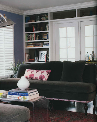
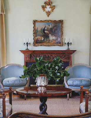
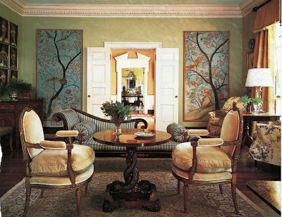
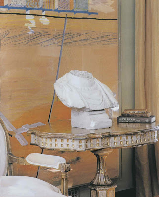
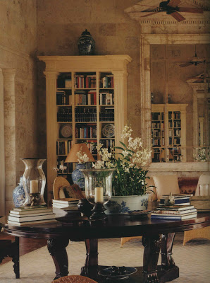
The images of Miles Redd’s work (1 – 7) are available on his site here, though I had some from previous publications;  the de la Rentas’ homes, top two from Vogue Living Houses Gardens People, the last from Vogue, December, 2008; Gil Schafer’s bedroom from his site, David Netto’s home from his site, originally Elle Decor October 2005; Markham Roberts via his site as well.  I know that Redd was speaking off of the top of his head; any oversight or omission was purely due to time and circumstance.  A personal aside – Nick Olson picked up when I called.  I was nervous as a school girl; he is a long-time blog-crush of mine.
rssrss      FacebooktwitterpinterestlinkedinmailFacebooktwitterpinterestlinkedinmail