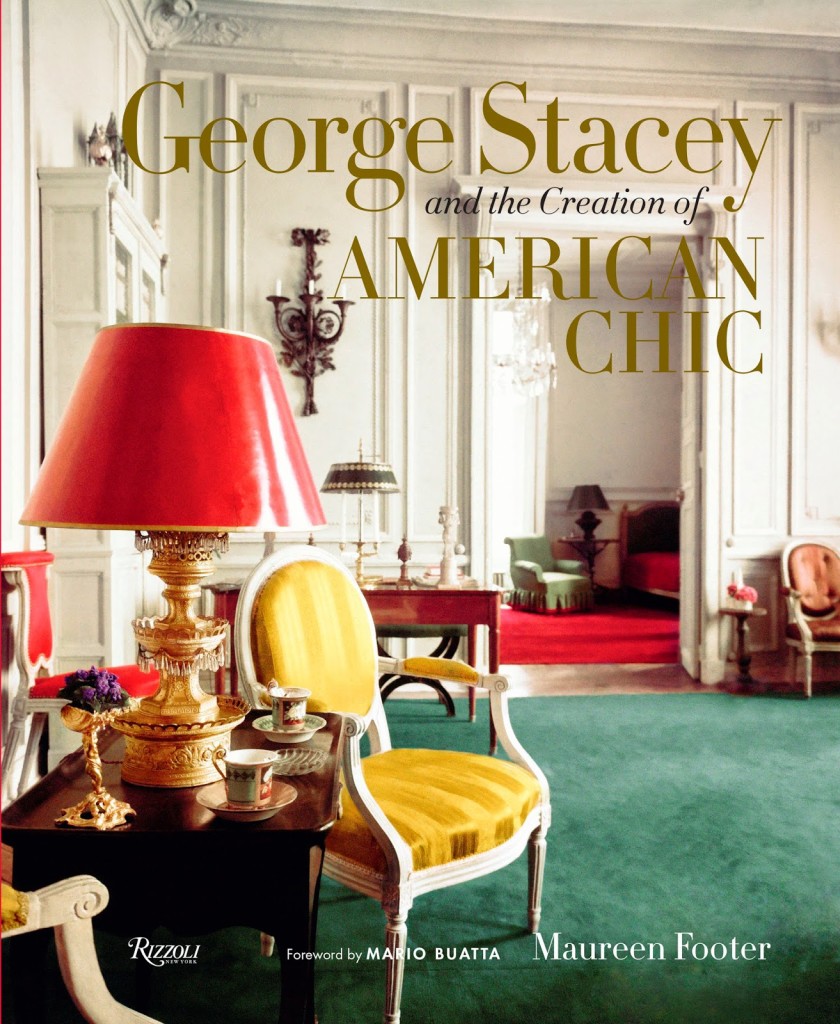
George Stacey and the Creation of American Chic

George Stacey leaned casually against my front door a week or so ago, waiting patiently for me to invite him in.  We’ve spent a lot of time together since and I’m delighted to know him better.

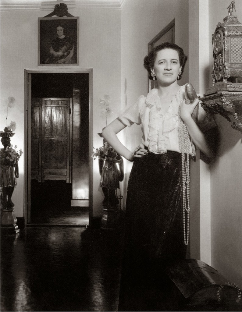
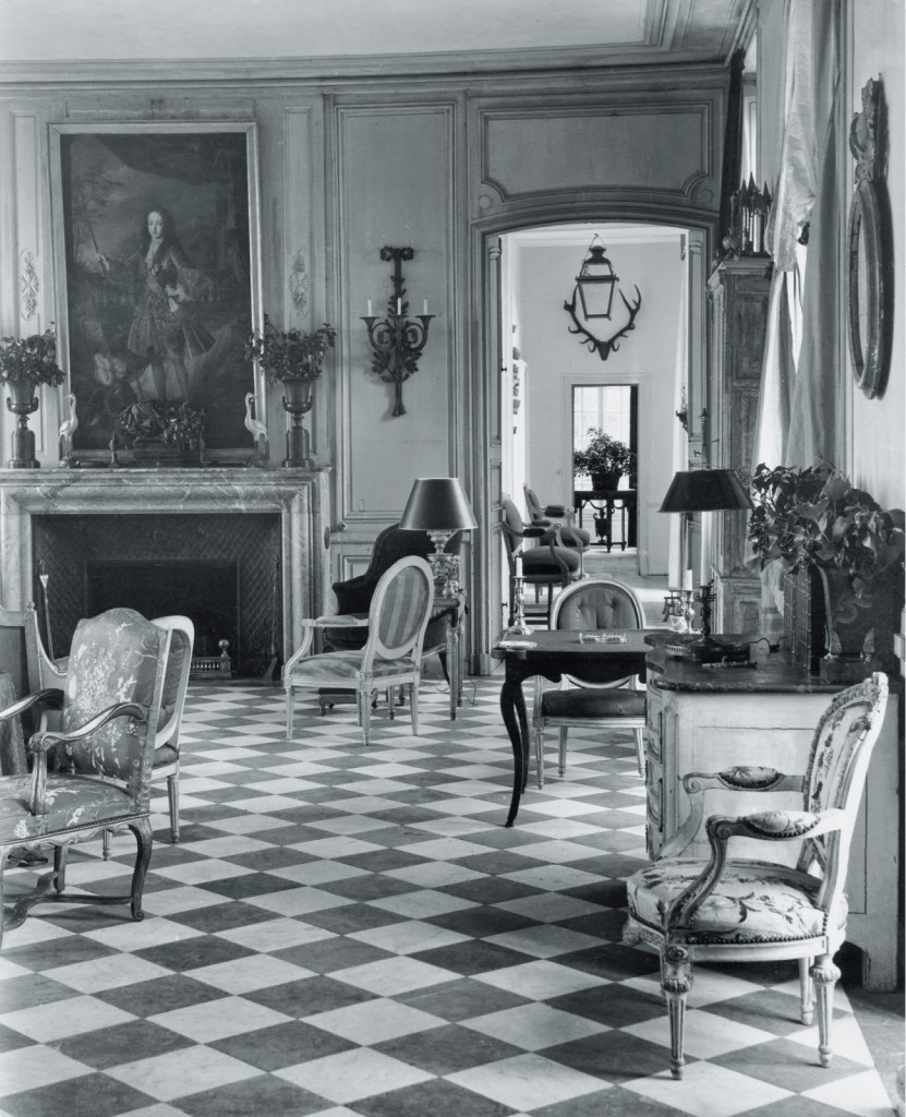
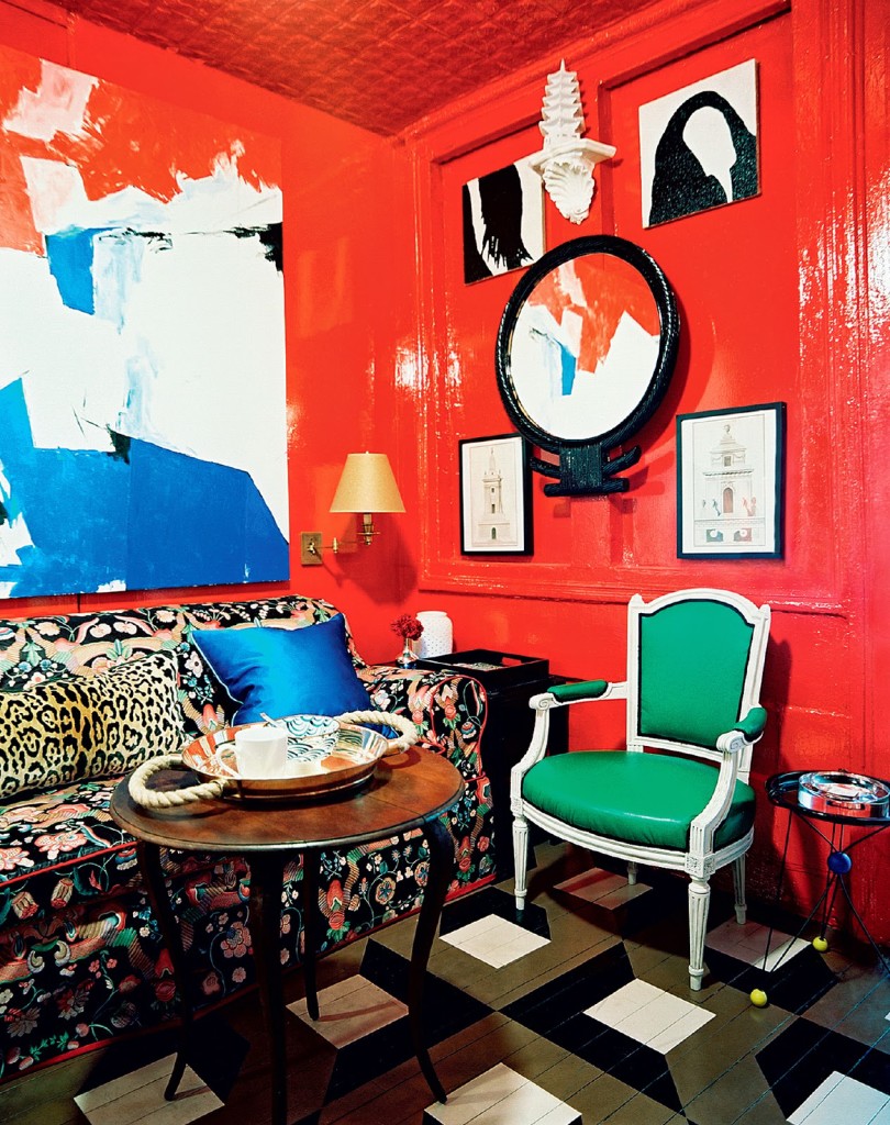
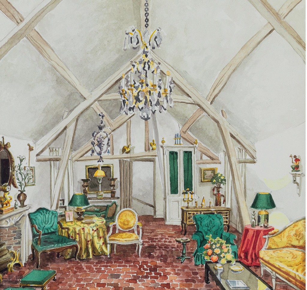
His aesthetic, admired by stylish luminaries such as Diana Vreeland, Babe Paley and Brenda Diana Duff Frazier, looks familiar with its mix of French antiques and garden chairs, but he led the charge in this melange of high/low goodness. Indeed, the deft handling of red and green that many designers manage today was a common element of Mr. Stacey’s work.

As I read Maureen Footer’s engaging and informative text in this new book, I imagined a series of posts where I ticked off designers’ Stacey has influenced: Mario Buatta (who penned the intro), Billy Baldwin, Michael Taylor, Stephen Sills, Tom Scheerer and Nick Olsen among them. But then I reached the final chapter and Footer has done it for me and undoubtedly with more elegance.

We are lucky that authors and publishers are circling back around to explore the lives and work of influential designers who did not publish in their day.  I’m thrilled that George Stacey and the Creation of American Chic is part of my design library.  I imagine any enthusiast would feel the same.

George Stacey and the Creation of American Chic by Maureen Footer, Rizzoli, 2014.  Available here.

All images courtesy of Rizzoli, from top: Mark Hampton, courtesy of Duane Hampton, Diana Vreeland from the estate of George Platt Ynes, Stacey’s home in France from his personal papers, Nick Olsen’s apartment, Patrick Cline, Lonny.com.

rssrss      FacebooktwitterpinterestlinkedinmailFacebooktwitterpinterestlinkedinmail

Into the Fold

I met St. Louis antique dealer, Rick Ege, a few years ago while I was in Chicago.  He’s charming and his wares are terrific.  We are not friends, as we haven’t had enough opportunity to be, but we are friendly and are connected on Facebook.  
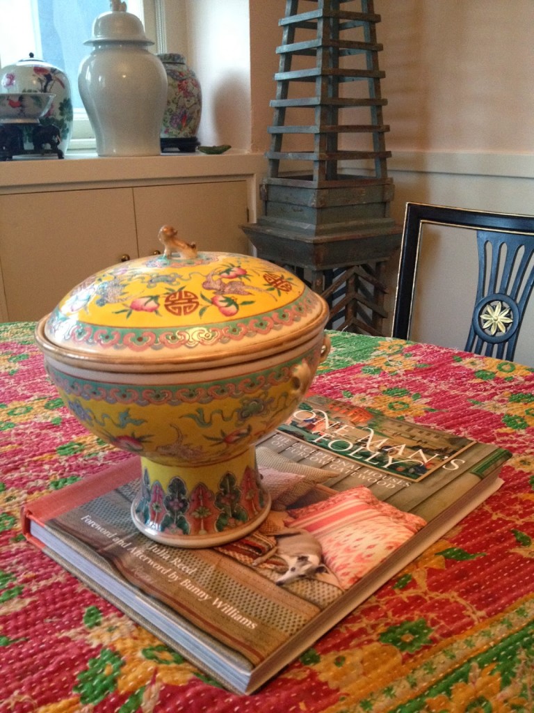
One day he loaded an image that included a Chinese rice server that I found irresistible.  Yellow!  Plums! Bats! What could be better?

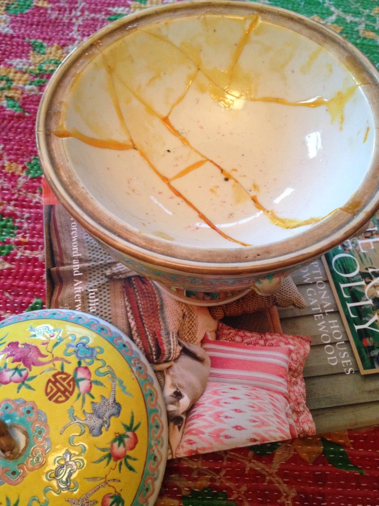
“It’s been damaged on the inside and has had some repair,” he told me.  He was wary, perhaps that that sort of thing would matter.

I didn’t pause.  “Yes, well, haven’t we all? She’ll be in good company.  Wrap her up,” I replied.

She arrived by friendly transport last week.  She hasn’t missed a beat, just settled in among the rest of the rusted and the dinged.  She smiles at me from atop my mother’s desk in the kitchen and doesn’t mind a bit when I sing Zac Brown off key.

If you in St. Louis, do stop by and say “hello” to Rick.  If not, you can visit his site here or see him at the Chicago Botanical Antique Show from April 11 – 13.

rssrss      FacebooktwitterpinterestlinkedinmailFacebooktwitterpinterestlinkedinmail

Dust Up

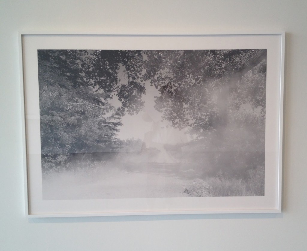
Have you driven down dirt roads? Looked back at the dust kicked up by the tires while on your knees, arms folded on the top of the seat long before children not wearing seat belts was criminal? Or watched the cloud rise up behind you in the rearview mirror, evidence of your movement, your existence in the world and your mark upon it? The crunch of the gravel under your tires grounds you to reality, the threat of puncture or ping ever present.  These roads are not so often monitored for speed and those most familiar with them fly.  For we who are cautious, as I am to a fault, it feels faster and scarier to navigate on a surface that is only layers of dirt. I cannot ignore that while seemingly packed firm, it is the road itself billowing about me.  Shifting. Still, I’ve grown up traveling these roads in Georgia, Oklahoma, Texas and Kansas and they represent something unchanging.  The dust comes in through the vents and coats the back of my throat and my hair, making them thicker. The smell of it settles on my skin.  For all their trepidation and mess, I cannot avoid these dusty paths.  Indeed, I seek them out.  They are both comforting and thrilling.

This remarkable photograph by Ahram Park is on exhibit at Haw Contemporary through April 5th.  There are others, though not nearly enough to satisfy me.  More on Mr. Park here.

rssrss      FacebooktwitterpinterestlinkedinmailFacebooktwitterpinterestlinkedinmail

Wes-terly Wind

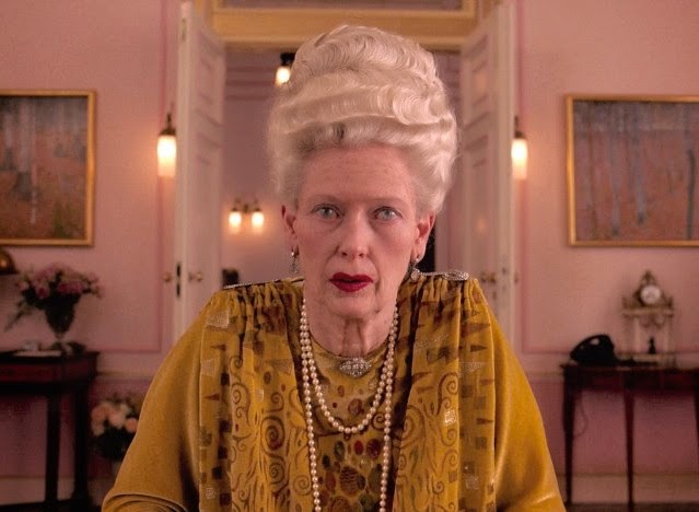
The Grand Budapest Hotel has not opened in Kansas City, so I went to see it Sunday night in New York in a humongeous multi-plex with escalators and balconies.  That alone was its own eye-opening experience (as was paying admission.  Yikes.) I had seen previews and posters and read reviews of the film, but it hadn’t occurred to me that I would be inspired by its pastel palette.  Once tucked in to my seat with my popcorn and my Milk Duds, however, I realized that the lighter shade of pink that glows throughout Mr. Anderson’s film is very close to the one on my dining room walls.

The true surprise, the delight, the inspiration, however, came with the combination of the aforementioned pink and this mustardy yellow, a color I love, but thought I was a bit past.  In a few rooms on the set, this golden hue appears on the dado with the pink above.  And there, right there, on a Sunday night in that crowded movie theater, slightly cursing the woman next to me who thought the arm rest was hers alone, I could see it on my dining room walls.  Perfect, not just in its combination, but  referencing the parts of me that have not changed even as I begin anew.

Photo swiped from IMDb, with no further credits available. I hope that Mr. Anderson and his people will forgive my using it if I tell you that the movie is a visual delight not to be missed.

rssrss      FacebooktwitterpinterestlinkedinmailFacebooktwitterpinterestlinkedinmail

The Power of Beauty

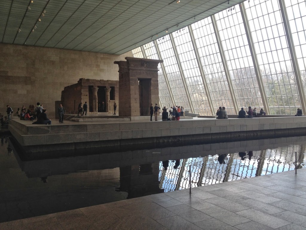
I was in New York last weekend and spent a long stretch at the Metropolitan Museum of Art.  I used to plan my days in the city in half-hour intervals to make sure that I was able to see everything I could: people, exhibits, shops. Now I am easier on myself.  I schedule time with friends, mostly around meals, then I tend to wander.

I hadn’t planned on being at the Met for four hours.  I walked in, turned right and let go.  I said to a man later, “The Met is so greedy.  It has so much.” He smiled at me and replied, “But it is there for all of us.”  Lucky, that.

So I gobbled it up.  I strolled through period rooms. I leaned close to study the detail of intaglios from half a dozen cultures or more, careful not to touch my nose to the glass. I stood back in wonder at large abstract paintings that never fail to lift my spirits.

Through all of it I noticed the occasional visitor who moved through galleries with a phone about a foot from his face, recording all that was there.  Sweeping the rooms with this device, never looking with his eye.  “You’re missing all of it,” I thought.  “You cannot feel the energy of these things that way.”  Certainly, a better quality video could be purchased.  What was the point of standing in that place, if you could not feel the personal intent and the passion of the creators?

Readers email me fairly often to tell me stories they think I will like, or recommend something, or just say, “hello.”  I share a lot of personal things here and it gives them the freedom to share back.   Recently, someone stopped in to let me know that she was glad I was blogging again.  In her short email, she briefly mentioned a recent personal tragedy that made me put my head on my desk and weep.  There is so much pain.

But as I walked through the galleries at this grand museum, I saw as I have not for a while, that there is so much beauty. We have this need to create, to enhance our lives with objects that could be utilitarian, but instead are decorative. To express our love, our wonder, our frustration, our disappointment, is so innate.  It has been there since the beginning.  If we take the time to see it, it is there for all of us.

rssrss      FacebooktwitterpinterestlinkedinmailFacebooktwitterpinterestlinkedinmail