Harmonious Convergence

I met Heidi Palmer a few years ago and was immediately impressed by her style.

I was fortunate to be assigned to write the article on her house in Sunset Hill for the April issue of Spaces.

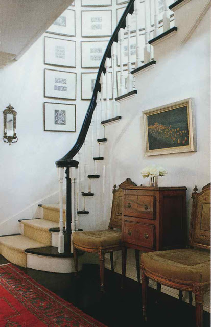
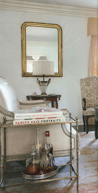
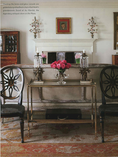
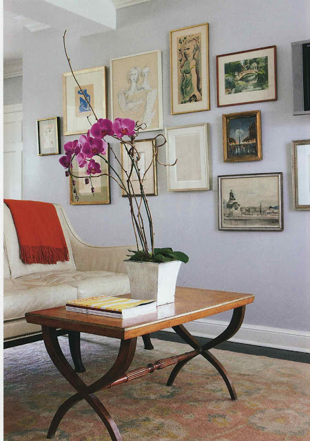
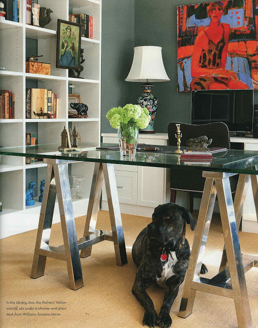
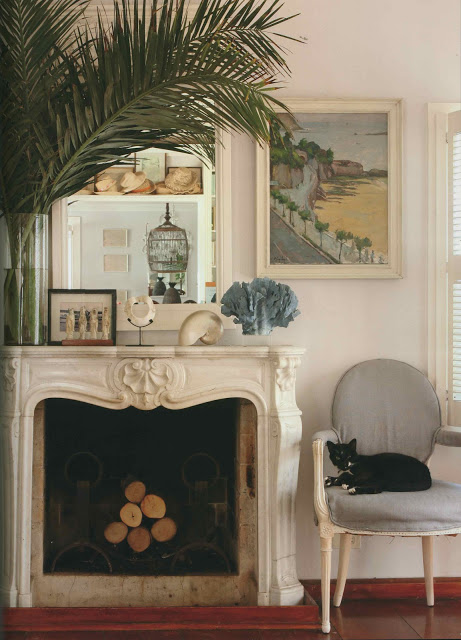
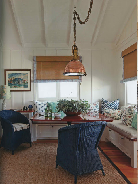
Palmer has decorated her house with a lovely collection of her grandmother’s and great-grandmother’s things along with art from her father and her own finds.

It is a terrific mix and an excellent example of how to live with antiques; there is nothing fussy or fancy here, though it is incredibly grounded and personal.

More images in the issue (plus words, if you like words.)  On sale now – pick it up today.

All images Spaces, Kansas City, April 2012; photography Aaron Leimkuehler.

rssrss      FacebooktwitterpinterestlinkedinmailFacebooktwitterpinterestlinkedinmail

By the Sea, By the Sea, By the Beautiful Sea

We’ve been back from the beach for two weeks, but it seems like ages.

People keep saying things like, “It’s as warm as Florida here!”  And it is.  And I don’t want to sound contrary, but there’s no ocean here.  It’s lovely, but not quite the same.

On the last day of our vacation I received an email from a friend who was jetting off to Japan.  “I am too tan and too blonde,” I told him.  (I cannot say “no” to the sun.)  He shot back, “Wear blue – it fixes everything.”  I did, and he was right.

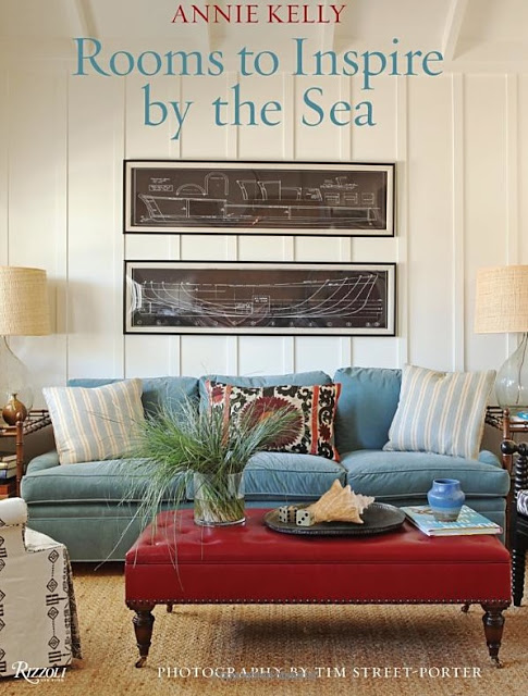
If cerulean shades are helping, so too is Rooms to Inspire by the Sea.  The books in the Rooms to Inspire series are personal favorites, and I think will prove themselves to be classics.  This particular edition is near and dear as I find beach houses irresistibly appealing.

You will find some favorites (of mine if not of yours): Peter Dunham for Susan and Spencer Croul, India Hicks and David Flint Wood and Tom Scheerer.  There are homes you might not have seen such as John Derian’s in Cape Cod, which I think was featured in World of Interiors and Olivier and Zoe de Givenchy.  You can see more here and Courtney Barnes has given the book nice attention on Style Court here.

All images Tim Street-Porter.  The homes featured are, from top India Hicks and David Flint Wood (both the first and the second,) Richard Shapiro and the final two Dunham. 

rssrss      FacebooktwitterpinterestlinkedinmailFacebooktwitterpinterestlinkedinmail

Light Boxing

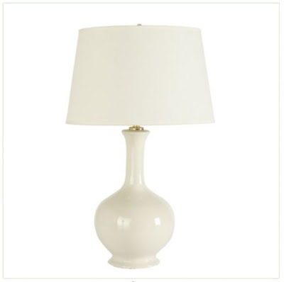
I must start making some decisions.  I’ve had the same pile of tear sheets and memos sitting on my desk for months.  One pressing issue is two lamps for the back wall of the living room.  Joni at Cote de Texas pointed out these really lovely Ballard Design Small Gourd Lamps by Suzanne Kasler.  Lovely.  Also, $139 each, which, let’s face it, is dreamy.

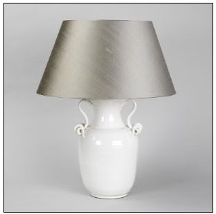
But there are a few others rattling around like this gal with her hands on hips from Vaughn (technically, Ceramic Vase with Curly Handles) that I like better.  At four times the price.  And I keep wondering if later, say fifteen minutes after I plug them in, I won’t really see the difference anymore.  That the perfectly lovely gourd lamps will leave a little room for the purchase of something that might be really terrific.  Thoughts?

rssrss      FacebooktwitterpinterestlinkedinmailFacebooktwitterpinterestlinkedinmail

I Love Magazines

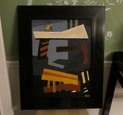
I bought a painting from Christopher Filley a few months ago – before the holidays – and it sort of brought into focus what I’d like to see happen in the family room.  A little grasscloth, a little Peter Dunham textile, a dhurrie rug and an ottoman instead of a coffee table that digs into the back of your heel when you put your feet on it.  So far I have the painting.

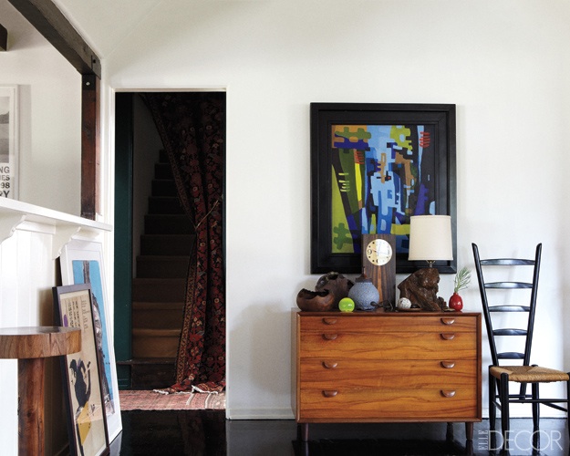
But I didn’t know how to frame it.  Then, flipping through March’s Elle Decor, there it was.

It just drops in your lap sometimes, you know?  You’re not thinking about framing at all, in fact, you’re thinking about how you’ve messed up the Spring Break flights and your husband is going to be furious (he wasn’t) and there it is.  The answer.

I didn’t want anything lighter around the painting and I wanted the frame to have the same linear, blocky feel.  And I am very, very fortunate to have Dolphin Gallery nearby as Scott and John tinkered happily until we were all satisfied.

Now I just have to order the grasscloth and the fabric and the rug and the ottoman.

Special thanks to designer Steven Johankneckt for unknowingly providing the inspiration, image top,  in Elle Decor, March 2012, photography William Abranowicz; produced by Anita Sarsidi.

rssrss      FacebooktwitterpinterestlinkedinmailFacebooktwitterpinterestlinkedinmail