I took my oldest son to see Eames; The Architect and The Painter last night and we both loved it. If you need a dose of passion and creativity you might enjoy it, too. Screening locations and DVD purchase available here.
Cut and Paste
Over the last couple of years I’ve noticed an increasing number of decorating books being organized by room. This results in a parade of entry halls, living rooms, dining rooms, bedrooms and on. It comes off as a sort of scrap book, disjointed images of a common theme cobbled together on large pages. Like printed Pinterest.
I am confounded. I have a few books that are organized by color and I have found these handy when casting about for inspiration or stumped by combination. Southern Accents on Color comes to mind and I still refer to it nine years after I bought it. Others, focusing on one object or another – chairs, wallpaper, curtains – serve as handy reference books.
But finding a catalogue of living rooms leaves me cold. Worse still if I know that all the rooms of the house are, indeed, included, leaving me flipping back and forth trying to piece the puzzle together. It’s like meeting someone at a cocktail party and visiting for ten minutes, “Well, she seems nice.” A fleeting impression, but no depth, no perspective, no relation.
Seeing the house as a whole allows me to see it better. Seeing how each room relates to another shows me how the decorator tackled the challenges that the space presented, shows me where and why he chose to make a statement and where he chose to take a breath and demur. Having the house portioned out creates that often jarring experience one has at show houses; no common thread.
Beyond that, it shifts the focus from home to things. Perhaps this is the crux of the matter and it matters only to me. I think homes tell stories. True, some tell sad and neglected stories and some tell desperate and pretentious stories and some tell heartfelt and lasting stories; they all speak to me. When there is no narrative, when we don’t know that that particular African mask was brought back from the bachelor’s grandfather’s grand tour or if it was uncovered at a Paris flea market or simply received a good sanding after its purchase at Pier One, it is just a thing. It tells us nothing.
I look to all this stuff, the books, the magazines, the style sections and sites to open my eyes to how to do it better. Not just decorate, but create a home for my family and friends. When I see those rooms all lined up like shoebox dioramas on a schoolroom shelf, it makes me want to open my scissor and drag the blade along the fold; to set the house in order.
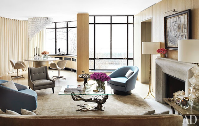
Image, Pablo Picasso, Studio with Plaster Head, 1925.
Idol Worship
I have an issue with my mailman. Or I have no issues with my mailman, depending on how you look at it. I think that I have mentioned before the rarity of my big mail delivery. Perhaps he feels this 1950 ranch should have 1950-size mail; for most days letter size is my only prize. About once a week my mail slot is crammed, stuffed, smushed with catalogues and magazines. Except for February’s. No February magazines at all.
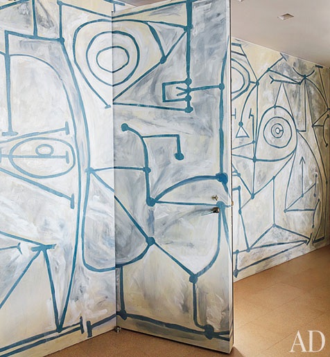
So I bought them. (This annoys Bill and when they eventually arrive he will say, sadly lifting them from the kitchen island, “Oh. That’s too bad.” It’s as if he thinks they have died in vain.) Worth the double dip as I found Claire Weiss awaiting me on the pages of AD in that remarkable vintage Azzedine Alaia dress. And those pearls. In front of that mural.
Speechless.
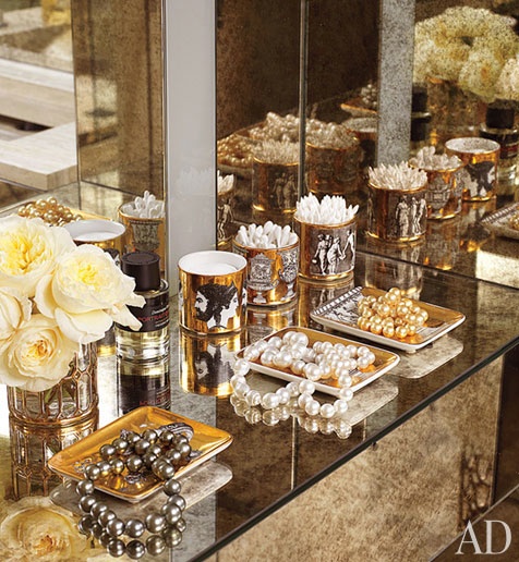
The Cartier pearls are “the only jewelry she wears.” (They rest atop vintage Fornasetti trays, which is, well, perfect.) The grandness of this overwhelms me. It is the kind of thing that I would proclaim and then find myself a week later mouthing “liar” in the mirror. Still, I wish I were a little more Weiss-like. Read the whole article here.
Images, Architectural Digest, February 2012; architecture, Steven Harris; design, Lucian Rees Roberts; photography, Thomas Loof; produced by Robert Rufino and the balance of the number of small object in the piece is nothing short of miraculous.
Off the Rack – Luxe de Luxe
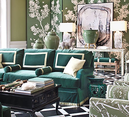
Just a heads up that Luxe Interiors + Design has wonderful images from the recent Maison de Luxe show house in their Winter 2012 issue. Michelle Nussbaumer’s green and black and white foyer and card room are offering some personal inspiration, but all the rooms have photographed beautifully.
Great coverage of the house at both the Peak of Chic and Style Beat.
Progress Report
We are in flux. I’m offering a quick update on Dexter. He is big. In fact, the boys are delighted as I call him a “big galoot” (“galute” is also an accepted spelling) and they think I have made up this word. Dexter, in his current state, could inspire the creation of the word “galoot.” He lumbers and lopes (when he is not running and leaping) and often bumps into things. He is ten months and Bill keeps saying, “I think he’s finished growing,” but his feet still seem too large for his (big) body and his ears are overly floppy, often backwards as a result of exuberance. I used to hold him while I worked and he doesn’t seem to realize that he’s rather outgrown this. He drapes himself across my lap and rests his chin on my desk. Remember, he was the runt. I adore him. He is soulful and I feel sure that he will be a noble beast. Currently, in flux.
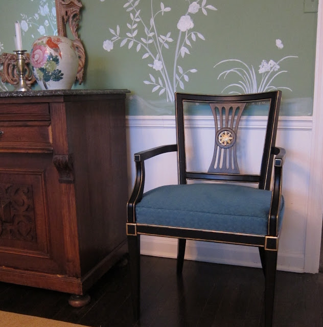
The chairs are back, but I have ordered a round table and now it needs a cloth. Flux.
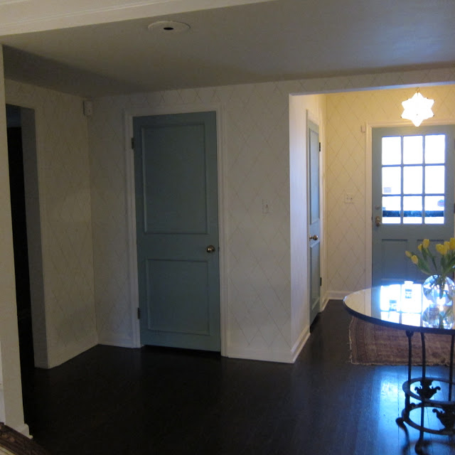
I’ve made progress on the hallway, but still have about half of this stretch to finish. Flux.
And I am adding lamps here and there, though there is still a cavernous dark spot in the back of the living room. Every time we entertain I drag lamps from the bedroom in there and think, “By the next dinner….” These are for the hall and await their shades. Flux.

