2011 Inspiration – Take It Where You Find It

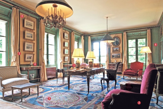
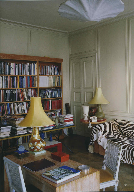
Not all my inspiration for 2011 came from magazines.  The Wall Street Journal’s Off Duty and Magazine have both provided loads of entertainment.  This particular piece by Timothy Corrigan inspired the ceiling color, Farrow and Ball Cream (No. 44), in Bill’s den.  You can see the article here.

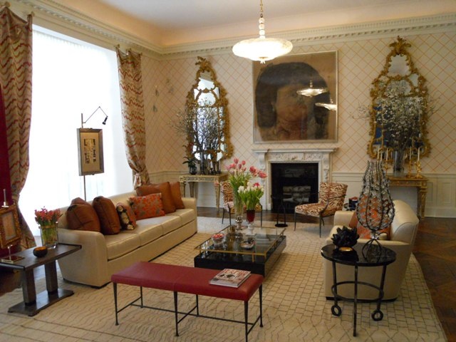
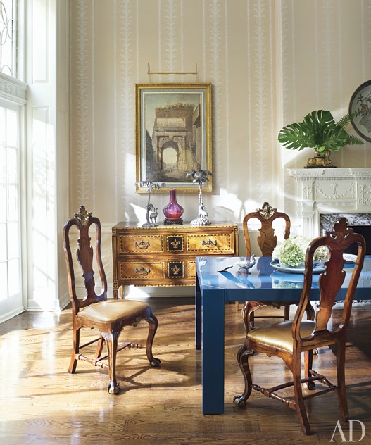
Richard Mishaan’s Phillip-Jeffries paper at Kips Bay Show House sparked a project for the front hall.

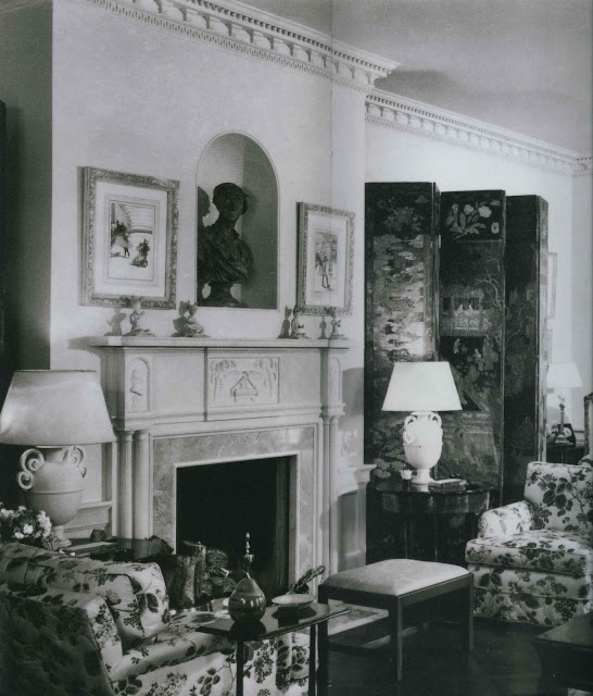
And, I am obsessed with the Giacometti lamps in Frances Elkins’s projects.  These in particular.  Obsessed.  Stephen Salny’s book is available here.

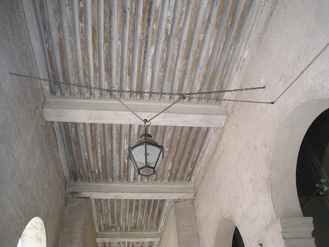
Paris was a great influence, but the color of the limestone was very sticky; I can’t shake it.

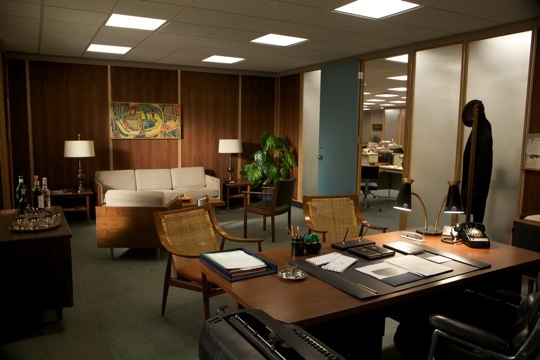
And, Mad Men, which I began watching this time last year (shut up in my room in the dark with my iPad for hours.)  What jumped?

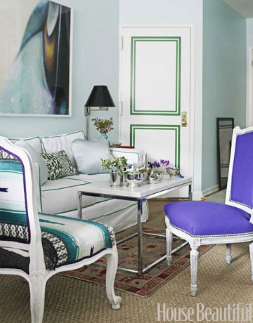
Jon Hamm?  Too obvious.  Sterling Cooper’s office door color.  Could not get enough.

rssrss      FacebooktwitterpinterestlinkedinmailFacebooktwitterpinterestlinkedinmail

2011 Top Ten – Six thru Ten

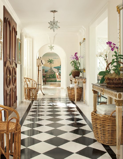
Veranda, July/August 2011, Lyford Cay home, design by Andrew Raquet,
photography Max Kim-Bee

As I said yesterday, don’t over-think it.

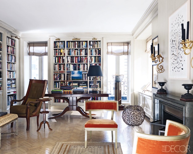
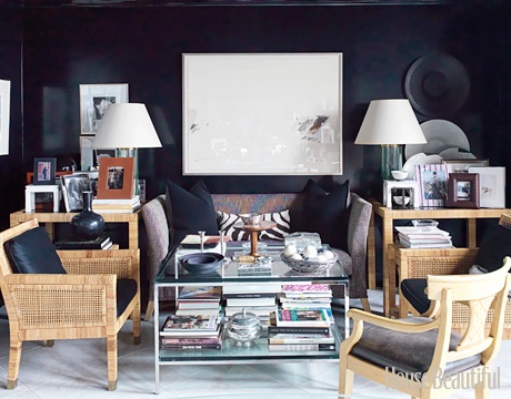
Elle Decor September 2011, Lynn Nesbit’s NY apartment, design by Coleman and Brockschmidt,
photography William Waldron

A little black and white.  A flash of gold.  Bare floors.

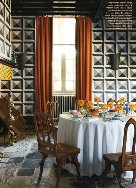
Veranda, October 2011, antique dealer Jean-Phillipe Demeyer’s Belgian home of his own design,
 photography Miguel Flores-Vianna

Rich color.

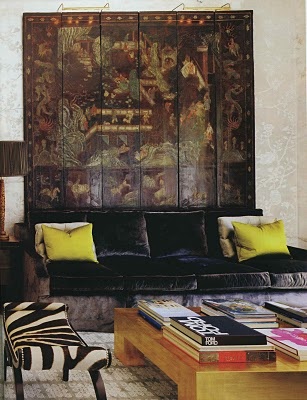
Architectural Digest, January 2011, design by Windsor Smith,
photography Erhard Pfeiffer
Books.  A little Chinoiserie.
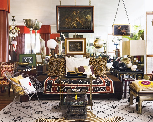
Elle Decor, December 2011, Fabrizio Rollo’s apartment of his own design,
photography Eric Piasecki

Mirror.    And all that personal jumbly goodness that says someone lives here.

rssrss      FacebooktwitterpinterestlinkedinmailFacebooktwitterpinterestlinkedinmail

2011 Top Ten – One Thru Five

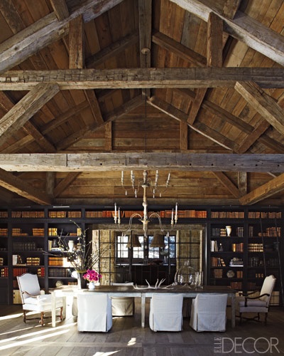
Elle Decor, December 2010/January 2011, Rusty and Mary Lynn Turner’s Idaho home of her design,
photography Miguel Flores-Vianna

I have done year end lists now and again, though last year I did not.  (Did not stitch ornaments, did not send out holiday cards, did not, did not, did not.)

House Beautiful, May 2011, Atlanta designer, Stan Topol’s office,
photography Thomas Loof

I don’t mean to imply that these are better or worse than any other, but they meant something to me.

World of Interiors, May 2011, Eileen Gray’s apartment, photography Roland Beaufre

It was a very structured and orderly process, if you consider sitting amidst a pile of magazines with a pad of sticky notes structured and orderly.

Architectural Digest, July 2011, Philadelphia townhouse design by Thomas Jayne,
photography Pieter Estersohn

Don’t look too hard for a common theme.

House Beautiful, July/August 2011, Rebecca Phillips’s Brooklyn apartment, design by Nick Olsen
photography Bjorn Wallander

They meant something to me.

Coincidentally there were ten rooms.  I’ve drawn specific inspiration from all of them, but they appeal in the big picture as well.  Six through ten tomorrow.

rssrss      FacebooktwitterpinterestlinkedinmailFacebooktwitterpinterestlinkedinmail

Hang Time

This has always been a jumbly stream of consciousness, so I am sure that you will understand that in the midst of cleaning up paper and breaking down boxes I stopped to look at Carrier and Company’s portfolio.  You can’t convince me that everyone doesn’t do this sort of thing.

Loads of pretty things there, but I was charmed by these hangers on.  Quick and easy curtains – you could make them while your children are playing X Box (or Wii or PS3 or Chinese Checkers if there are still children who play such things) – two small knobs, a finished square and a couple of loops.  No fuss, no muss, but it has the same casual elegance as Astaire’s handkerchief.

Images courtesy of Carrier and Company.

rssrss      FacebooktwitterpinterestlinkedinmailFacebooktwitterpinterestlinkedinmail

Twelve Days of Christmas

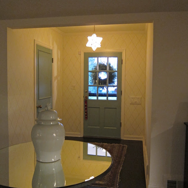
For heaven’s sake, I had not intended to be gone so long.  Just as at your house, things are in full swing around here.  I finished the diamonds in the foyer (the pattern will eventually – hopefully by the end of Winter Break – go all the way down the hall) despite the amount of bother they have caused.  The doors are Farrow & Ball Dix Blue and the color is delicious.  Details on all of this after the holiday.

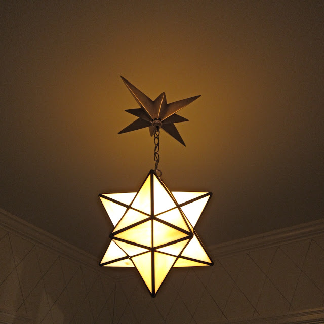
And, the lantern is in place.  The fabulous folks at the Light Shop in Kansas City helped me with the canopy.  Turns out that it is possible to order a light from Visual Comfort without the wiring.  I am pleased as punch.
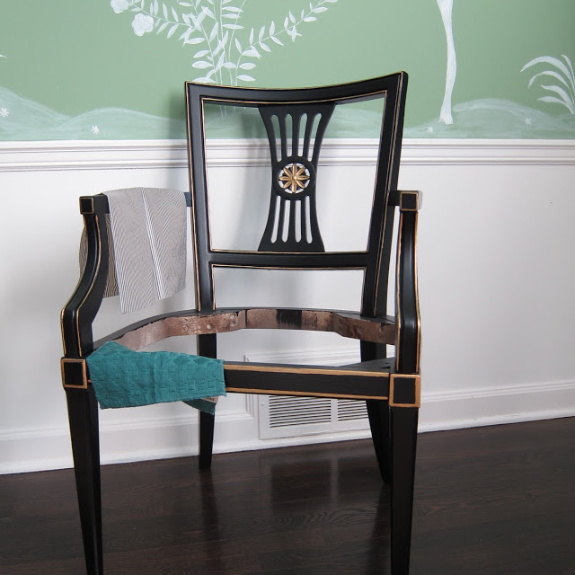
The chairs are finished and the fabric is off to the upholsterers for the cushions.
And I WON A WATERWORKS FAUCET.  I so rarely enter giveaways.  Oddly, as a blogger, I feel like they aren’t really for me, but I entered the Waterworks giveaway on Grant Gibson’s blog (which is terrific, by the way) as I love their product.  Waterworks has introduced Studio, a new more moderately priced line and its Three Hole Cross Handle Faucet from the Flyte Collection is sitting snugly in a box in my basement waiting for installation.  (The boys were most delighted by this development.  “You WON a faucet?  How does someone win a faucet?”  It was a Christmas miracle.)
As I was going through all my magazines from 2011 to see if I could come up with a “favorite rooms” post, Elle Decor reached out to say, “Do you have a favorite room from 2011?”  I do, and you can find it here, along with other terrific picks.

Finally, (well, Christmas will be “finally” – this is nearly finally) we hosted twenty-five friends for dinner on Wednesday.  I spent yesterday getting ready and most of today cleaning up.  Parties are a gift; there is nearly nothing I enjoy more than having our friends in our home.  I loved every minute.

I hope your house is filled to overflowing with joy this season.  We are wishing you the best.

rssrss      FacebooktwitterpinterestlinkedinmailFacebooktwitterpinterestlinkedinmail